Figures & data
Figure 1. Schematic representation of the tasks. From left to right: feature search, conjunction search, spatial configuration search.
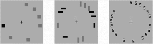
Figure 2. Search functions of the three tasks (feature search, conjunction search, spatial configuration search) used in this study. The error bars indicate the standard error.
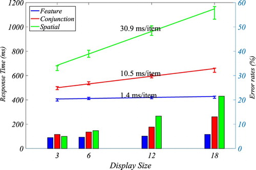
Figure 3. The graph at the top shows SAIM-WTA’s architecture. All nodes compete via global inhibitory neuron. The time course at the bottom shows an example of SAIM-WTA’s output activation. The line colours correspond to the network’s nodes. The dotted line indicates the threshold for this particular simulation. The simulation result came from the spatial configuration search with six search items and the parameters from the 8th participant (see Appendix I).
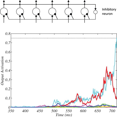
Figure 4. An illustrative example of how oKDE decomposes a distribution in several kernels with varying variance. The example also shows the location of the sigma points in this KDE which were relevant for the evaluation of the KDE (see Appendix III for details).
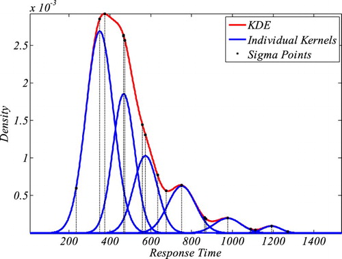
Figure 5. Results of fitting SAIM-WTA. The top-left graph shows the mean log-likelihood ratios (quality of fit) for the different tasks. The remaining graphs show the mean parameters. The error bars indicate the standard error.
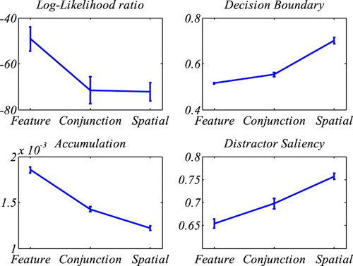
Figure 6. SAIM-WTA. KDE-based illustration of RT distributions and response errors. Note that these graphs show the RT distributions for three participants.
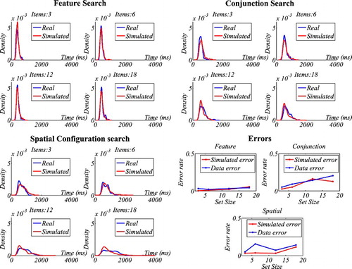
Figure 7. Results of fitting CGS. The top-left graph shows the mean log-likelihood ratios (quality of fit) for the different tasks. The remaining graphs show the means of CGS’s seven parameters for the three tasks (Feature Search = FS; Conjunction Search = CS; Spatial configuration search = SC). Note, for the purpose of a better illustration the target saliency parameter was scaled logarithmically. The results replicate Moran et al.’s (Citation2013) findings. The error bars indicate the standard error.
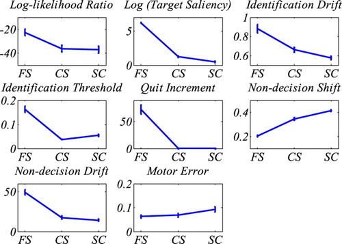
Figure 8. CGS. KDE-based illustration of RT distributions and response errors. Note that these graphs show the RT distributions for three participants.
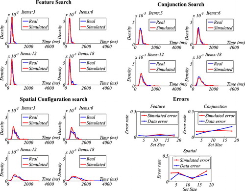
Figure 9. Comparison of mean log likelihood ratios from SAIM-WTA and CGS for the three tasks (feature search, conjunction search, spatial configuration). The graphs indicate the contributions from the different display size to the overall log likelihood ratios. The error bars indicate the standard error without within-participant variance (Cousineau, Citation2005). The graphs demonstrate that CGS was better at explaining the data than SAIM-WTA. However, they also show that the performance of both models is best at display size 6 and worse at all other display sizes (see main text for more discussion).
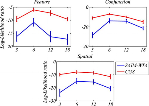
Figure 10. Comparison of BIC scores and AIC scores from SAIM-WTA and CGS for the three tasks (feature search, conjunction search, spatial configuration search). The error bars indicate the standard error without within-participant variance (Cousineau, Citation2005). BIC and AIC penalize the quality with the model complexity as measured with the number of parameters. The graphs indicate that CGS performed better than SAIM-WTA despite SAIM-WTA being the simpler model.
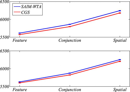
Table 1. Comparison of BIC scores and AIC scores from SAIM-WTA and CGS for the three tasks (feature search, conjunction search, spatial configuration search) using Wilcoxon sign-rank test.
Table
Table
Table
Table II.1 Comparison between Moran et al.’s (Citation2013) parameters and our parameters using Wilcoxon sum-rank test.
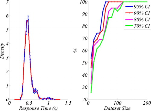
Figure III.1. The graph on the left shows the KDE of the original data with 70% confidence intervals (CI) at the sigma points. The graph on right shows the percentage of KDEs from different dataset sizes falling into the confidence intervals. The results indicate that for a 95% CI, data sets as small as 50 data points produce a 100% accurate representation of the original distribution.