
Figures & data
Table 1. Participant demographics.
Figure 1. Example items from the MaRs – IB. Panel A shows a simple item containing a one – relational change (i.e., only the colour changes) and answer options. The fourth option is the correct option. Panel B shows a harder item containing a three-relational change (i.e., shape, colour and position change). The third option is the correct option. Figure reproduced with permission.
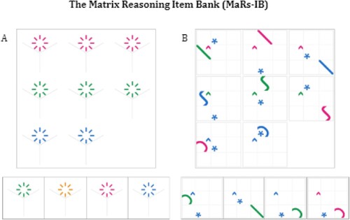
Table 2. Descriptive statistics.
Figure 2. MaRs-IB score distribution by group (DP or control). Panel a shows accuracy scores (i.e., proportion of trials completed in the maximum allowable time that were correct. Chance = 0.25, range was 0.19–0.94). Panel b shows number of correct trials completed in the maximum time allowed which was 30,000 ms per trial, overall maximum test duration was 8 min or when all 80 trials were completed – whichever occurred first. Maximum possible score = 80, observed range was 13–47. Panel c shows average median RT in ms (correct trials only). Panel d shows the total number of trials attempted within the allowable 8 min.
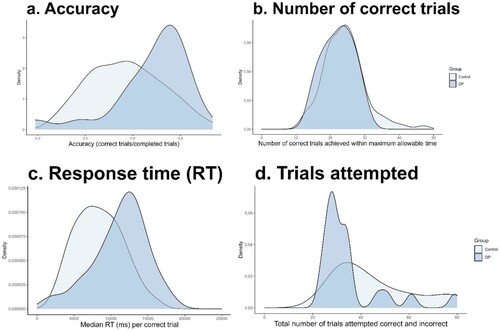
Figure 3. Comparison of RT difference between the DP and control groups across 20 easier trials and 20 more difficult MaRs-IB trials.
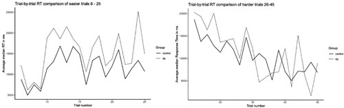
Figure 4. Panel a shows the difference in average standardized median item RT between groups and panel b the difference in balanced integration score (calculated as Zaccuracy minus ZRT) between the control and DP groups. Each dot represents a single data point, the box shows the interquartile range (IQR) and the mid line indicates the group median RT in ms. The end of each whisker line represents 1.5 x the IQR. Maximum allowable time per trial = 30,000 ms.
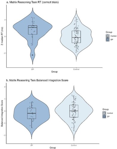
Figure 5. CBMT = Cambridge Bicycle Memory Test. Panel a shows the difference in average standardized accuracy and panel b the group difference in standardized RT between the control and DP groups. Each dot represents a single data point, the box shows the interquartile range (IQR) and the mid line indicates the group median RT in ms. The end of each whisker line represents 1.5x the IQR.
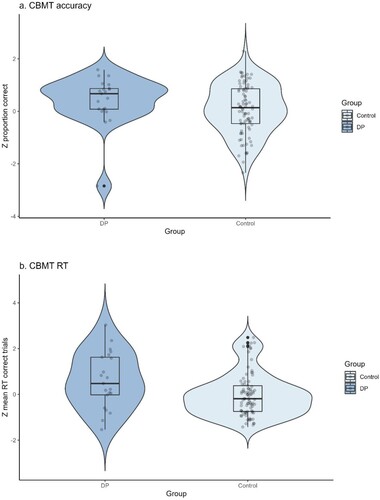
Table 3. Correlation tables matrix reasoning and bicycle memory tasks.