Figures & data
Figure 1. The s-curve Logistic model for Population size (P) as a function of time. Source: Authors’ calculations. Notes: P is population size, K is the dynamical steady state maximum for P, and tm is the midpoint where P = K/2. r is the exponential intrinsic population growth rate and its derivative, duration Δt, is the ‘characteristic time’ for the population to grow from 10% to 90%.
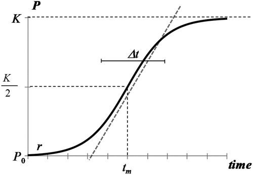
Figure 2. Jewish populations during the Ottoman Empire and British Mandate, 1800–1948. Main trendlines and backward extrapolation are shown. Source: as described in methods.
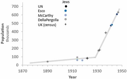
Figure 3. Historical Jewish population of Jerusalem during the Ottoman Empire and British Mandate, 1850–1948. Source: as described in methods.
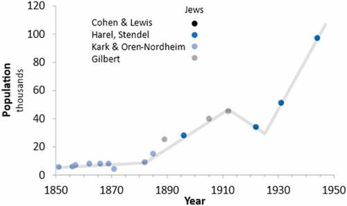
Figure 4. The path of Jewish population in the State of Israel and predecessors as a sequence of linear segments. Source: Israeli Central Bureau of Statistics. Notes: data is available for every year since 1950 and displayed here for every fifth year for simplicity.
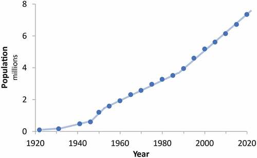
Figure 5. (a) Sum of Jewish immigration trends in the State of Israel and predecessors. (b) Logistic decomposition of the aggregate trend showing three distinct waves of immigration: 1) a long curve spanning 100 years (blue), a rapid wave originating during the 1930s (Orange) and another rapid wave originating in the mid-1970s (red). (c) Fisher-Pry transform of the three waves normalised to show their growth to the limit of the process, easing comparison of the speed and duration of the waves. Data source: Israel Central Bureau of Statistics.
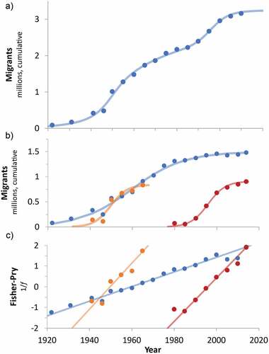
Figure 6. Estimated native Jewish population logistic trajectory and exponential fitted (dashed line) to data through 2000.
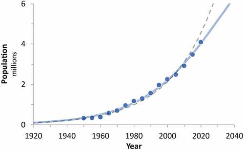
Figure 7. Composite Jewish population growth trajectory based on the generalised logistic model combining the migration wave model with the logistic model for native Israeli Jewish population.
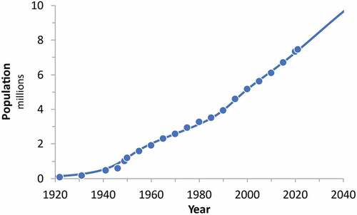
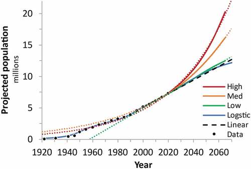
Figure 8. Historical data and projections of Jewish population in Israel since 1920. Source: Israel Central Bureau of Statistics and authors’ own projections.