Figures & data
Table 1. Regional and sectoral aggregation in the GTAP model.
Table 2. Definition of simulation scenarios.
Figure 1. Schematic of the analysis approach. Source: Authors’ construction.
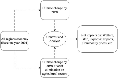
Figure 2. Regional distribution of average yield impacts across crops and climate projections. Source: Authors’ adaptation from IFPRI (Citation2010) and MNP (Citation2006).
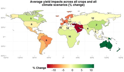
Table 3. Aggregate welfare impact and its decomposition by effect for the world region (2004 million USD).
Figure 3. Gross domestic product (GDP) impacts for Morocco by scenario (in % change). Source: Simulation results.
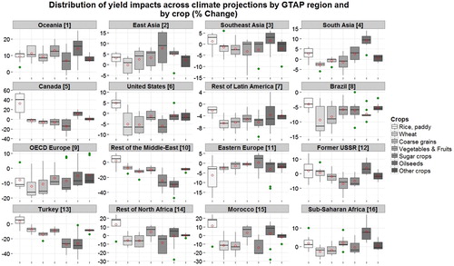
Note: Results are presented in box plots using the ‘ggplot2’ package in R. The lower and upper borders of the box plot represent respectively the 25th and 75th percentiles of the distribution of yield projections. The upper (lower) whisker extends from the box plot upper (lower) border to the highest (lowest) value that is within 1.5*IQR of the border, where IQR stands for inter-quartile range defined as the distance between the 25th and 75th percentiles. The black lines inside the box plot refer to the median of the distribution. The red dots represent the average of the distribution. Data beyond the end of the whiskers are outliers and are plotted as blue squares. For a detailed discussion, refer to McGill, Tukey, and Larsen (Citation1978).
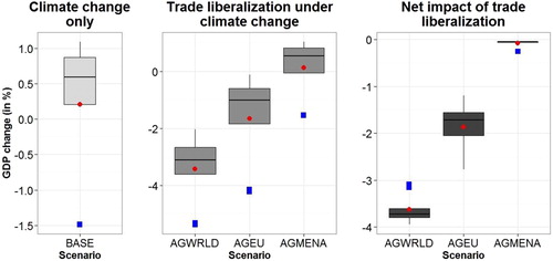
Figure 4. Average per cent change in exports and imports price and quantity indices for Morocco. Source: Simulation results.
Note: The bars measure the mean of the distribution across climate projections, and the error bars represent the mean ± standard deviation of the distribution.
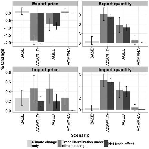
Table 4. Evolution of import sales disposal in Morocco by scenario, by agent type and by commodity group (in 2004 million USD and in % share).
Table 5. Evolution of the share of domestic, export, and import markets in total production and total consumption in Morocco by scenario (in % change from the baseline).
Figure 5. Gross domestic product (GDP) impacts for Turkey by scenario (in % change). Source: Simulation results.
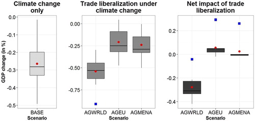
Figure 6. Average per cent change in export and import price and quantity indices for Turkey. Source: Simulation results.
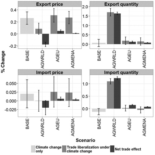
Table 6. Evolution of import sales disposal in Turkey by scenario, by agent type and by commodity group (in 2004 $US million and in % share).
Table 7. Evolution of the share of domestic, export, and import markets in total production and total consumption in Turkey by scenario (in % change from the baseline).
Figure A1. Distribution of climate change impacts on yield by 2050, by region and by crop (in % change). Source: Source: Authors’ adaptation from IFPRI (Citation2010) and IMAGE (2010).