Figures & data
Table 1. GIScience output of selected journals and impact by year.
Figure 1. Publication output by the covered GIScience journals during the 15-year period analysed by the study.
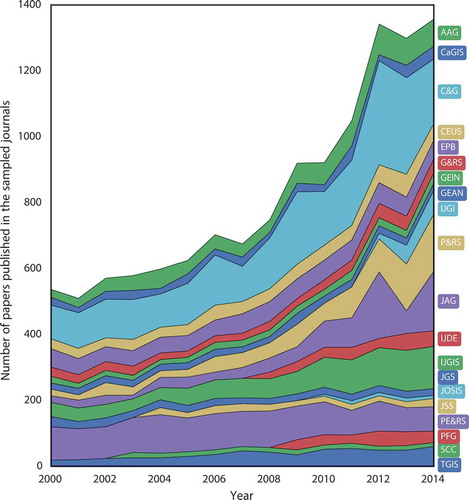
Table 2. Output and impact by journal.
Figure 2. Distribution of citations from publications indexed in Scopus. Papers that received more than 100 citations represent less than 2% of the population and are not shown here.
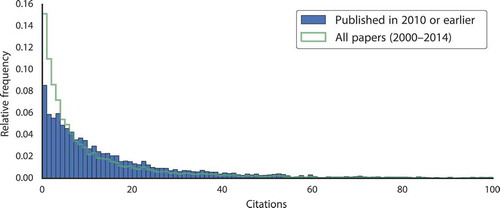
Figure 3. Mean number of Scopus citations for papers published in a year. Note that the x-axis is inverted to indicate ageing.
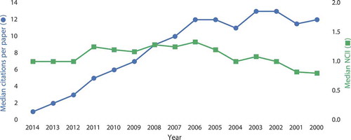
Table 3. Top 10 papers published in the covered journals in the observed period, ranked by the normalised received citations.
Figure 4. Affiliated countries per year, and the appearance of new participants.
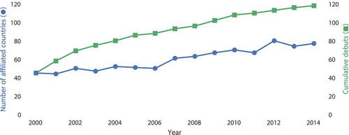
Table 4. Top 15 countries and cities ranked by the number of published GIScience papers in the sample (fractional distribution), and a comparison with the share of received citations.
Figure 5. Longitudinal share of the output of the top 10 countries and the rest of the world.
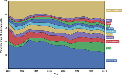
Table 5. Trends in the output of the top 10 players. The sparklines indicate the longitudinal trend of the sampled output for each country. The trend of the relative share is illustrated in .
Figure 6. Relation between a nation’s economic and GIScience wealth. The green line represents the average performance (0.2 papers/US$B of GDP). Pronounced countries are labelled according to ISO 3166. The GDP and population represent the mean of the period 2000–2014. Source of the economic and demographic data: World Development Indicators, World Bank (Citation2015).
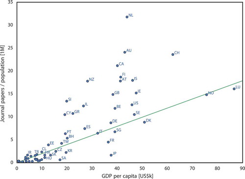
Table 6. Top countries by output efficiencya. The values in parentheses indicate the rank in relative impact based on the RCIb.
Figure 7. Most efficient countries based on the number of journal papers divided by GDP.
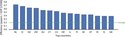
Figure 8. Temporal trend of the international collaboration in GIScience.
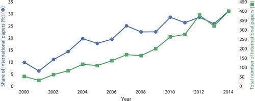
Table 7. Top 15 country-to-country and city-to-city collaborations, ranked by the number of papers published together.
Figure 9. Relation between the rate of international collaboration and the nation’s GIScience relative impact.
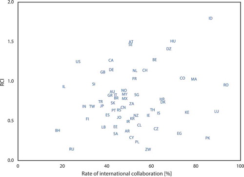
Figure 10. Dissecting the authorships: (a) distribution of the number of authors of a paper; and (b) the relative and absolute number of papers signed by a single author.
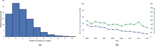
Figure 11. Length of papers through time, with the indicated dispersion (percentiles).
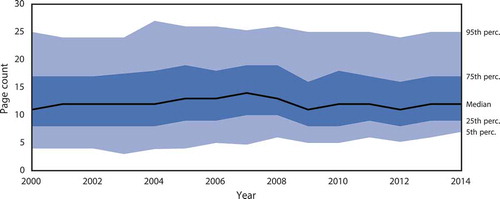
Figure 12. Relationship between the Altmetric score and the traditional impact of a journal. IF source: 2015 Journal Citation Reports (Thomson Reuters Citation2015).
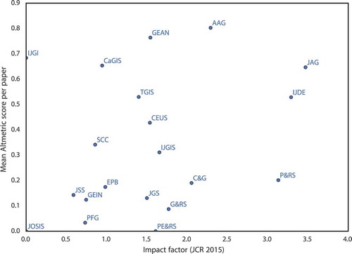
Figure 13. Mendeley readership statistics by year of publication. Note that the x-axis is inverted to indicate ageing.
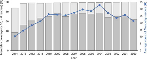
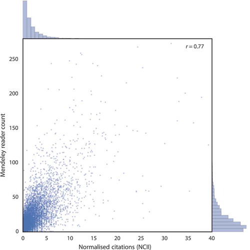
Figure 14. Mendeley readership volume correlates with citations.