
Figures & data
Figure 1. Participant interface used to present stimuli to participants and receive decisions.
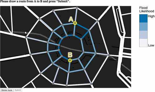
Figure 2. Examples of the six treatment conditions, each representing the risk of road blockage due to flood: Color hue red (a); Color hue blue (b); Symbol warning (c); Symbol circle (d); Pattern ‘sketchy’ (e); Pattern texture (f).
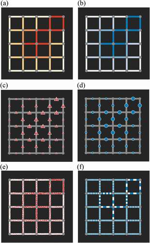
Figure 3. Example of two road network types used in the experiment: Grid network (a) and Radial network (b).
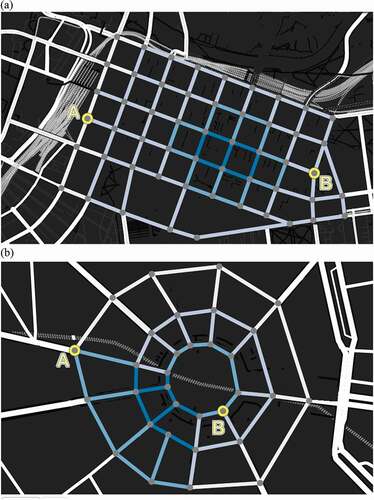
Figure 4. Interface showing simplified pre-experiment training exercise.
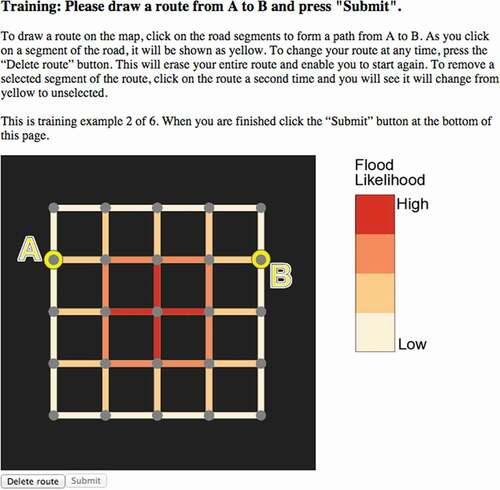
Figure 5. Example network illustrating the normalized risk measure for routes.
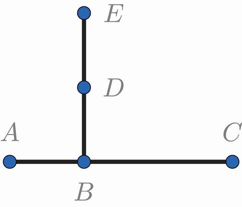
Figure 6. Example of two different strategies to navigate through a network: short route through high risk (left) and longer route through lower risk (right). In this case, the second route has a higher risk of blockage.
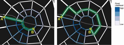
Figure 7. Histograms showing distribution of risk for each representation: Color hue red (a); Color hue blue (b); Symbol warning (c); Symbol circle (d); Pattern ‘sketchy’ (e); Pattern texture (f).
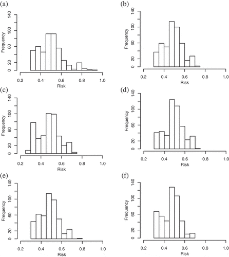
Table 1. Pairwise comparison of difference in mean risk by treatment condition. * denotes -values
0.05, ** denotes
-values
0.01 and *** denotes
-values
0.001. Numbers indicate differences in mean risk between row and column treatment condition (e.g. sketchy treatment exhibited mean risk 0.018 less than red treatment, significant at the 5% level.).
Figure 8. Logistic regression: Odds ratios for route traversal success a. under each treatment condition, relative to blue color-value treatment (left); b. for all treatment conditions, with odds ratio for grid (‘Melbourne’) network, relative to the radial (‘Paris’) network (right). Bars describe 95% confidence interval. * denotes -values
0.05, ** denotes
-values
0.01 and *** denotes
-values
0.001.
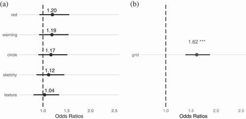
Figure 9. Logistic regression: Odds ratios for route traversal success for radial (‘Paris’) network only, a. under each treatment condition, relative to blue color-value treatment (left); b. for metaphorical-style treatment conditions (red color-value, red warning sign, red ‘sketchy’) relative to abstract-style treatment conditions (blue color-value, blue circle, blue texture) (right). Note: * denotes -values
0.05, ** denotes
-values
0.01 and *** denotes
-values
0.001.
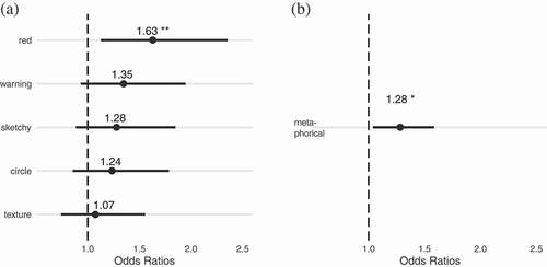
Table 2. Pairwise comparison of difference in mean time taken in seconds by participants by representation type: color (treatment conditions blue and red color-value); symbol (treatment conditions circle and warning symbol); and pattern (treatment conditions texture and sketchy). * denotes -values
0.05, ** denotes
-values
0.01 and *** denotes
-values
0.001. Numbers indicate differences in mean time between row and column treatment condition (e.g. symbol-based treatments exhibited required on average 4.3 s longer to decide than color-value treatments, significant at the 99.9% level.).
Figure 10. User preferences for representation of risk. The chart compares for each treatment condition the number of participants who selected that representation as their most preferred (light gray shaded bar) and least preferred (dark gray bar).
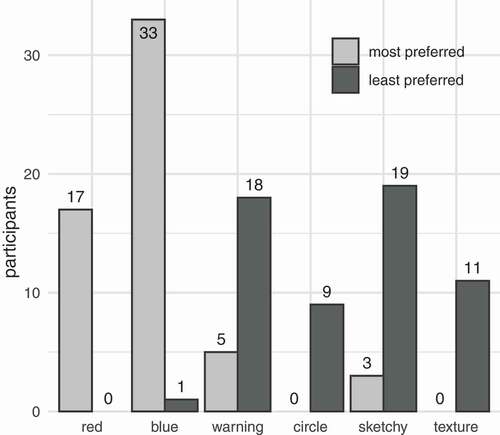
Figure 11. Frequency histograms of risks taken by participants across all treatments for: a. grid (‘Melbourne’) network (left); and b. radial (‘Paris’) network (right).
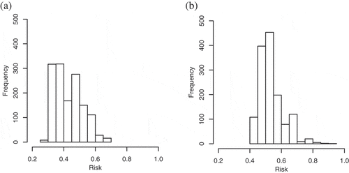
Table 3. Summary of mean risk of route, median time to decision, number of blocked routes, and participant preference, ranked.