Figures & data
Table 1. Reported crime records in Chicago, Illinois, US Chicago police department’s CLEAR (counts for the five bins used in this study) *relative total includes just the seven crime types considered in this study; the real value includes 30 crime types.
Table 2. Day selection for the five bins.
Figure 1. Feature selection using random forest.
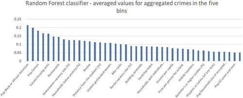
Figure 2. Data used in this case study.
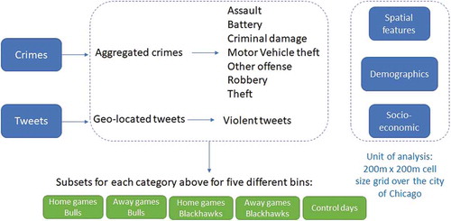
Table 3. Summary of predictor variables used in this analysis.
Figure 3. Prediction models design.
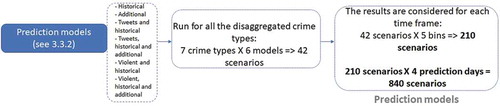
Figure 4. Example of surveillance plots for other offense for two different prediction days, home games Chicago Bulls.
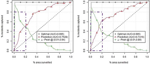
Figure 5. Density distribution of crimes around the venue, where gray squares represent areas with similar crime densities, and brown square with higher crime density during game days; red dots circle is the 1km buffer around the venue.
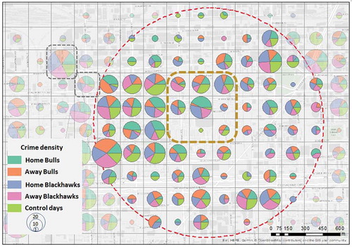
Figure 6. Density distribution of geo-located tweets around the venue; red dots circle is the 1km buffer around the venue.
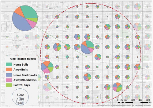
Figure 7. Density distribution of violent tweets around the venue; red dots circle is the 1km buffer around the venue.
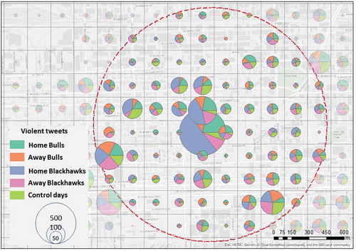
Figure 8. Moran’s I index for aggregated and disaggregated crime types, tweets and violent tweets; unit of analysis is the city of Chicago and a 1km buffer around united center.
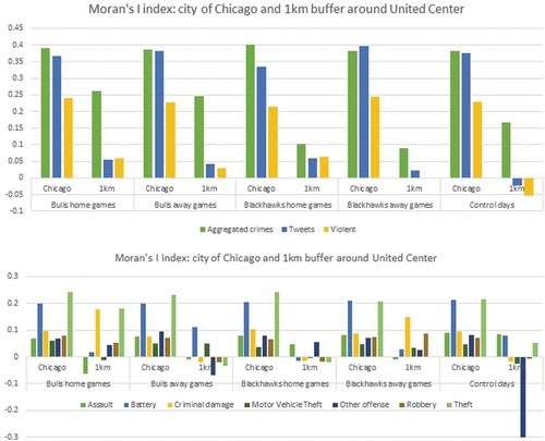
Figure 9. The sliding window prediction approach.
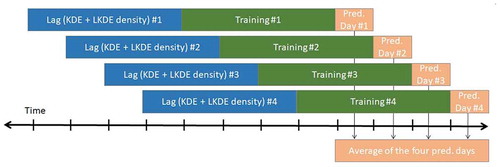
Figure 10. AUC and AUC improvement for the seven crime types *AUC real values are presented only for assault in order to save space.
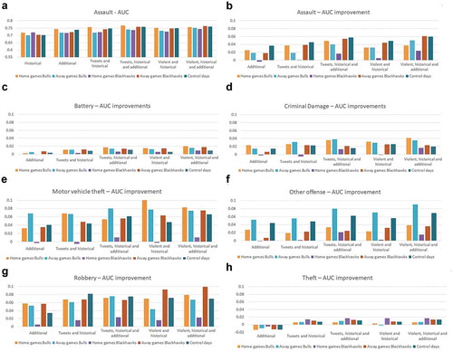
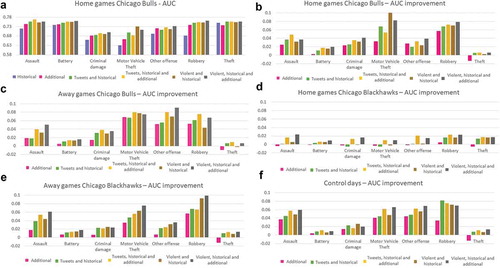
Figure 11. AUC and AUC improvement for the five bins *AUC real values are presented only for home games Chicago bulls in order to save space.