Figures & data
Figure 1. A raster-based least-cost polyline (solid line) and corresponding cells (shaded) between two termini (dots) deviates from the true least-cost curve (dashed line) between them
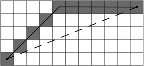
Figure 2. A raster-based least-cost corridor (shaded) between two termini deviates from a true least-cost corridor (enclosed by a dashed line) between them
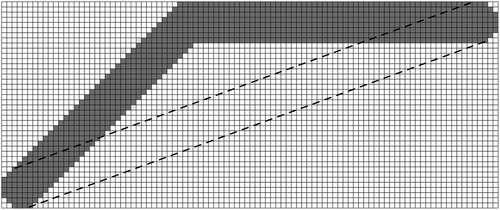
Figure 3. (a) A more connected raster with the 16 adjacency and (b) an extended raster converted from a grid. Note that each arrow represents the adjacency between two cells in (a) and two points placed on cell boundaries in (b)
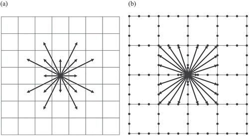
Figure 4. Example of testing for the three conditions in Tomlin’s algorithm. Note that more darkly shaded cells are of higher cost. Note that the dotted line connecting pairs of cells indicates that a test for Condition 3 is performed for those pairs
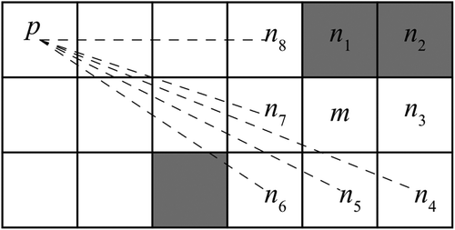
Figure 5. (a) to (c) Examples of transitions from three types of path fronts (enclosed by bold lines) to adjacent path fronts (shaded) and (d) an example of a corridor resulting from multiple such transitions, starting with an initial path front (enclosed by a bold line) and ending with a terminal path front (enclosed by a bold line)
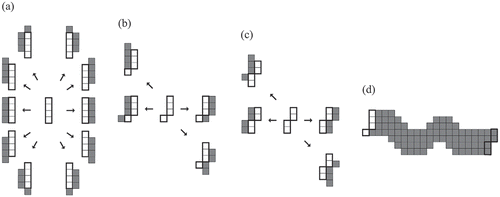
Figure 6. (a) Examples of transitions from an octagon (enclosed by a bold line) to 8-adjacent octagons and (b) an example of a corridor resulting from multiple such transitions, starting with an initial octagon (enclosed by a bold line) and ending with a terminal octagon (enclosed by a bold line). Note that the cells newly swept through transitions are shaded
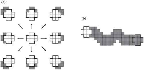
Figure 7. A straight corridor segment (shaded) added by threading from one octagon (enclosed by a bold line) to another (enclosed by a solid line). Its area is equal to that of the w-by-l rectangle (enclosed by a dashed line) where w is the corridor width and l is the length between the centers of the two octagons
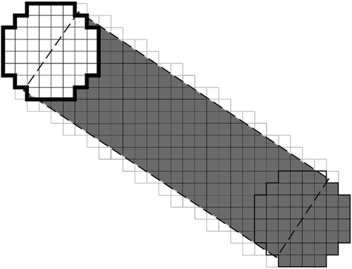
Figure 8. Examples of ‘cloudy’ cost surfaces with (a) 5 classes, (b) 10 classes, (c) 25 classes, (d) 50 classes, and (e) 100 classes. Note that the values of the cells in each cost surface range from 1 (most lightly shaded) to 100 (most darkly shaded) with a constant increment
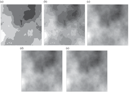
Figure 9. Examples of ‘patchy’ cost surfaces with (a) 5 different values, (b) 10 different values, (c) 25 different values, (d) 50 different values, and (e) 100 different values. Note that the values of the cells in each cost surface range from 1 (most lightly shaded) to 100 (most darkly shaded) with a constant increment
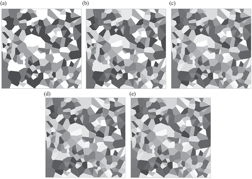
Figure 10. The cost surface over the study area. Note that the hatched areas represent water bodies and their immediate surroundings, which were considered impermeable. Note also that darker shades represent higher cost values
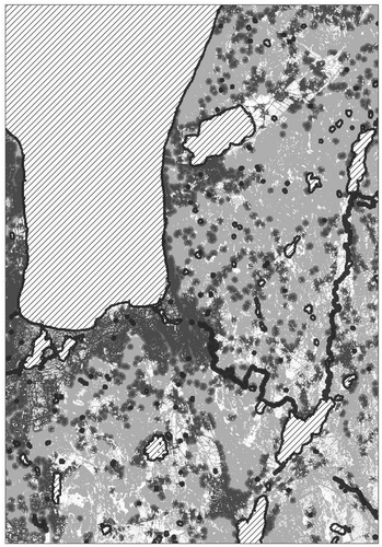
Figure 11. Examples of (a) a corridor (darkly shaded) with a width of 20 cell side lengths generated by Algorithm 0 and (b) a corridor (enclosed by a line) with the same width generated by Algorithm 1 on a cloudy cost surface with five classes. Note that in (b) the darkly shaded cells represent corridor segments defined by 8-adjacent octagons
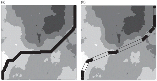
Table 1. Average percent distortion reductions for the 25 problem types on cloudy cost surfaces
Table 2. Average percent distortion reduction for the 25 problem types on patchy cost surfaces
Figure 12. Examples of (a) a corridor (darkly shaded) with a width of 20 cell side lengths generated by Algorithm 0 and (b) a corridor (enclosed by a line) with the same width generated by Algorithm 1 on a patchy cost surface with five classes. Note that in (b) the darkly shaded cells represent corridor segments defined by 8-adjacent octagons
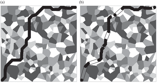
Table 3. Average running times of Algorithms 0 and 1 for 25 types of problems on 750-by-750 cost surfaces
Table 4. Frequency distribution of percent distortion reduction in Experiment 3
Figure 13. An example of a distortion reduction by threading non-8-adjacent octagons (outlined) over an area of constant cost
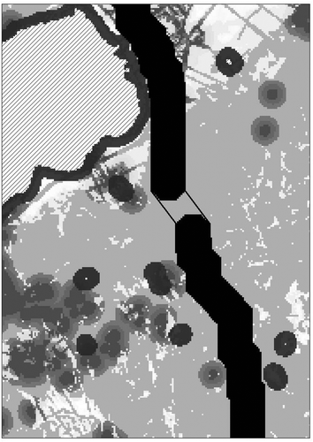
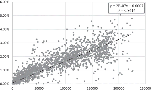
Figure 14. The plot of the percent reduction of distortion (y-axis) against the number of times the heuristic connected non-8-adjacent octagons to reduce distortion (x-axis) in each of the 5000 problem instances in Experiment 1. The linear regression line (dotted) was fitted to the plot, and its formula and coefficient of determination (r2) are reported in the inset at the top right corner