
Figures & data
Figure 1. Overview of the tweets analyzed in this article. The tweets originate from Sao Paulo, Brazil, and cover the period from 7 November 2016 to 14 June 2017. (a) The density of geotagged tweets per 10000 inhabitants aggregated into districts. (b) The power law distribution of the density of geotagged tweets per 10000 inhabitants. The coefficient of the distribution () was estimated by the maximum likelihood estimation (MLE) as described in Gillespie (Citation2015) and available in
R package. CDF corresponds to the cumulative distribution function. The black circles, blue line and red dotted line represent the city districts, the power law fit and the mean of the distribution, respectively
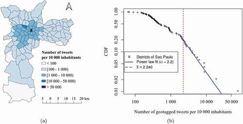
Figure 2. Overview of the analysis framework to investigate the spatial heterogeneity of the social media response to rainfall events from Twitter activity. Boxes with solid frames represent the main analytical steps, while the dashed line boxes represent the validation procedure. The arrows represent the data flows
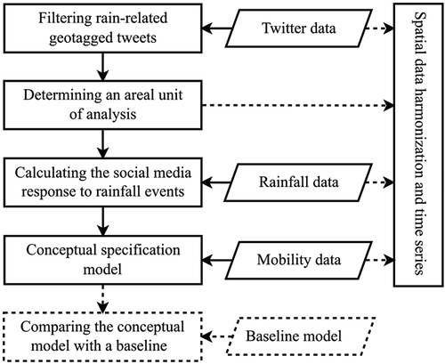
Figure 3. A sample of daily rainfall (top) and the frequency of rain-related tweets (bottom) from 7 November 2016 to 14 June 2017 for a particular areal unit located in the city center (k = 46)
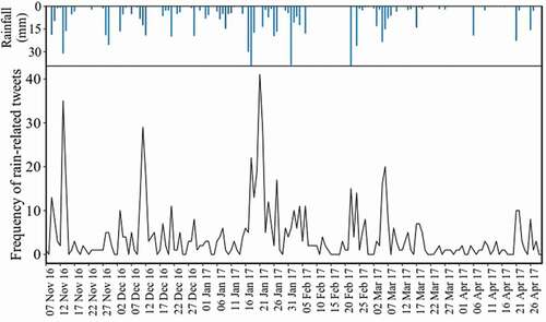
Figure 4. Polygonal overlay problem between the areal units of 30 km2 and (a) census tracts and (b) traffic zones
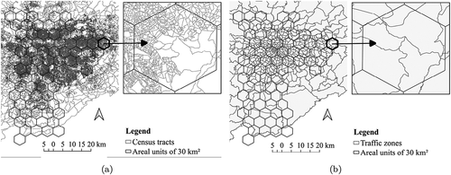
Figure 5. Mobility flows patterns between districts of the city of Sao Paulo coloured according to the zone of their district of origin (red = centre, green = north zone, purple = south zone, yellow = east zone, blue = west zone). (a) Flows from all districts. (b) Flows departing from the districts of the central area. (c) Flows departing from from the districts of the north zone. (d) Flows departing from the districts of the south zone. (e) Flow departing from the districts of the east zone. (f) Flows departing from the districts of the west zone
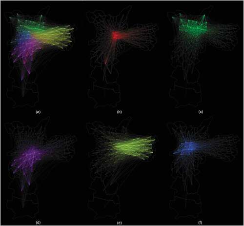
Figure 6. Maps of the degree to which rainfall events are reflected in Twitter data during the period from 7 November 2016 to 14 June 2017. (a) Quintile map overlapping with the average income variable. (b) Quintile map overlapping with the population variable
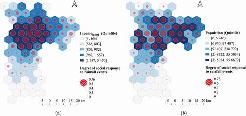
Table 1. Statistic results of the baseline models and our proposed model
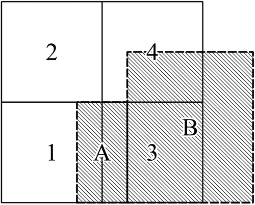
Figure A1. Two incompatible zoning system ( and A,B) with
and
, respectively (see EquationEquation (4))
(4)
(4)
Data and codes availability statement
The data and code that support the findings of this study are available in ‘figshare.com’ with the identifier https://doi.org/10.6084/m9.figshare.12921974.