Figures & data
Table 1. Number and percentage of respondents in each ethnic group, using 10 ethnic group classifications, Understanding Society, Wave 3 (England).
Figure 1. (a) Percent of ethnic group with mixed-ethnic network, by poverty status and (b) percent of ethnic group with mixed-neighbourhood network, by poverty status.
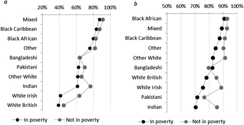
Figure 2. Deprivation score (IMD) of neighbourhoods of residence for ethnic groups (box plots indicating median, interquartile range and range of deprivation scores).
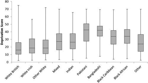
Figure 3. Percentage of ethnic group living in the most deprived neighbourhoods (bottom 10% on IMD score) by poverty status.
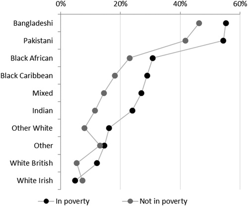
Table 2. Multilevel model showing predictors of an individual’s poverty status: control variables only.
Table 3. Multilevel model showing predictors of an individuals’s poverty status continued: network, neighbourhood and model specific variables.
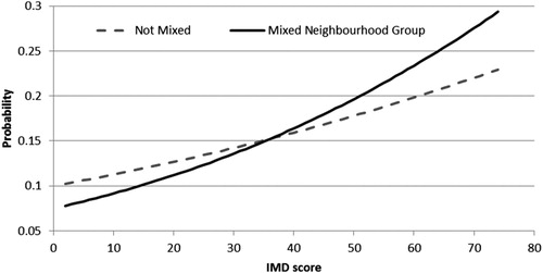
Figure 4. The likelihood of an individual being poorer by neighbourhood deprivation, for those with and without a mixed neighbourhood social network.