
Figures & data
Figure 1. Structure of the decision model.
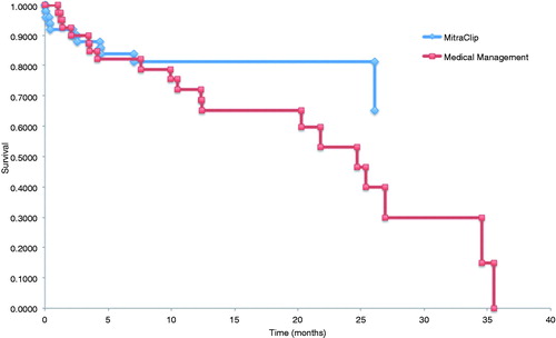
Table 1. Baseline characteristics of MitraClip and medical management cohorts.
Figure 2. (A) Kaplan-Meier survival curves for MitraClip and medical management cohorts. (B) Kaplan-Meier survival curves with Weibull extrapolations for MitraClip and medical therapy cohorts.
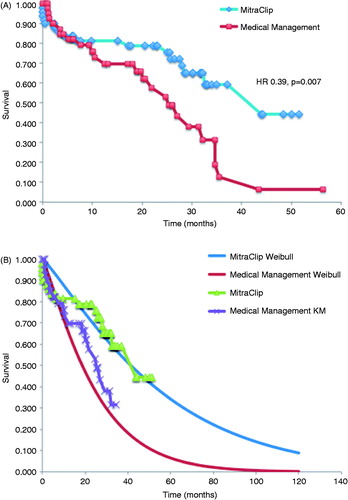
Table 2. Comparison of outcomes in MitraClip and medical therapy cohorts at 30 days and 1 year.
Table 3. Economic outcomes for MitraClip and medical therapy.
Figure 3. Tornado diagram.
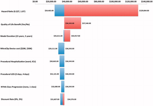
Figure 4. (A) Incremental cost-effectiveness of MitraClip compared with medical therapy. Scatterplot of incremental cost (in Canadian dollars; $CDN) vs incremental quality-adjusted life year (QALY) for the 10,000 simulations comparing MitraClip with medical therapy (a willingness-to-pay threshold of $100,000 CAD is indicated). (B) Cost-effectiveness acceptability curve created from a probabilistic sensitivity analysis performed with 10,000 Monte Carlo simulations.
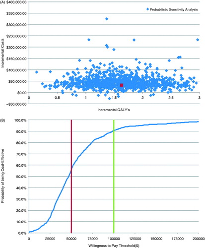
Table 4. Comparison of outcomes in MitraClip cohort with published registry data.