Figures & data
Figure 1. Schematic view of the dynamic transmission model.
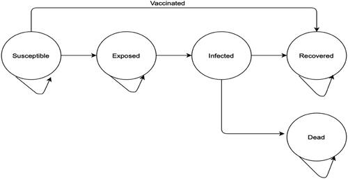
Table 1. Model input parameters – baseline values, ranges, and distributions applied for sensitivity analyses.
Table 2. Infections, deaths and DALYs averted by vaccination in a population of 1,000.
Figure 2. Graphical representation of dynamic transmission model without (Panel A) and with vaccination (Panel B).
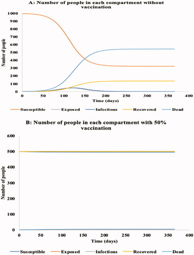
Table 3. Results of base case cost-effectiveness analysis.
Figure 3. Results of one-way sensitivity analyses. Abbreviations. ICER, incremental cost effectiveness ratio; DALY, disability adjusted life year.
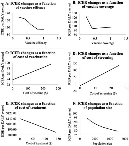
Figure 4. Tornado plot showing compiled one-way sensitivity analyses of model parameters. Middle line represents the base case incremental cost utility ratio (ICER) per disability adjusted life year (DALY) averted ($94.51). Horizonal bars represent the variations in the ICERs as a result of variations in model parameters.
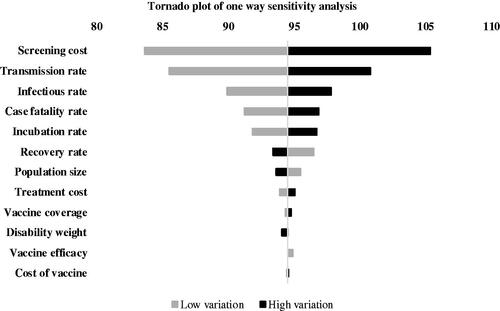
Figure 5. Heat maps showing incremental cost-effectiveness ratio (ICER) per disability-adjusted life year (DALY) averted from varying vaccination coverage and other parameters. Green areas represent favorable ICERs, red areas represent least favorable ICERs.
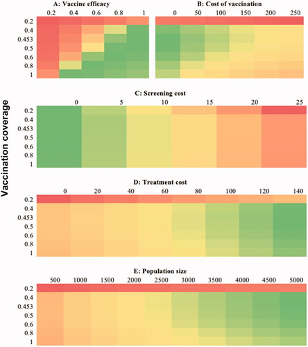
Figure 6. Incremental cost-effectiveness ratio (ICER) planes for the cost-effectiveness of EVD vaccine. Abbreviation. DALY, disability adjusted life year. Upper panel represents iterations of ICERs per infections and deaths averted. Lower B represents iterations of ICER per DALY averted.
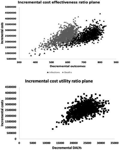
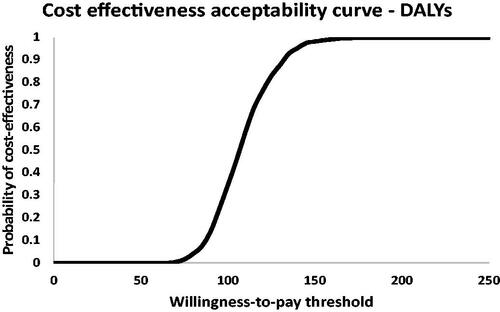
Figure 7. Cost-effectiveness ratio acceptability curve for the cost-effectiveness of EVD vaccine in terms of DALYs averted. Abbreviation. DALY, disability adjusted life year.