
Figures & data
Figure 1. PRISMA flow diagram illustrating the systematic literature review study selection process.
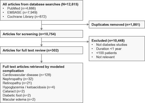
Figure 2. Schematic diagram of the PRIME T2D Model. *Model averaging is used in this controller; †Denotes complications with an increased risk of mortality in the year of complication onset and in subsequent years; ‡Denotes complications with an increased risk of mortality associated with a history of this complication. Abbreviations. QoL, quality of life; RNG, random number generator; SPSL, severe pressure sensation loss.
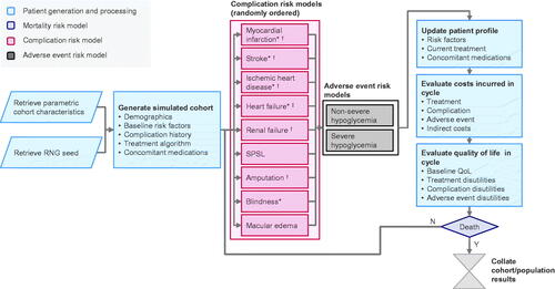
Figure 3. Cost-effectiveness scatterplot from the example anlaysis of intensive versus conventional multifactorial management in the Steno-2 trial. £, 2019 Pounds Sterling (GBP); QALY, quality adjusted life years. The scatterplot shows data for 1,000,000 simulated patients, with each point representing the mean from 5,000 patients. The ellipsis indicates points inside the 95% credible interval for incremental values.
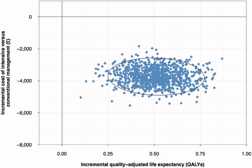
Table 1. Summary health economic outcomes in the example analysis of intensive versus conventional multifactorial management in the Steno-2 trial.
Figure 4. Scatterplot of the PRIME T2D Model validation analysis. Each point on the graph represents a cumulative incidence value from the PRIME T2D Model and the corresponding published study value for validation (expressed as cumulative incidence of a given diabetes-related complication). Values from the PRIME T2D Model are plotted as the y-axis and the corresponding cumulative incidence values from the published study on the x-axis. A perfect match would see all points on the y = x line.
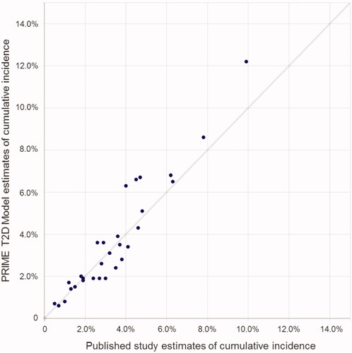
Table 2. Results from PRIME T2D Model validation exercises.