Figures & data
Figure 1. (A) Study design. This figure depicts the variable time following a patient’s lung transplantation and their index of CLAD, 12 months after the initial transplant. (B). Study design. This figure depicts the time before the first CLAD claim (pre-index) and the time following the first CLAD claim (post-index) in the time following lung transplantation.
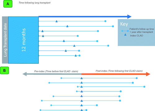
Figure 2. Patient attrition, inclusion and exclusion criteria. This figure depicts the study inclusion and exclusion criteria that was applied to the initial sample, and the corresponding attrition at various criterium.
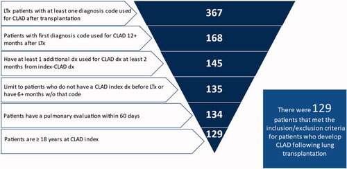
Table 1. Study Patient Demographic and Clinical Characteristics at Baseline (pre-transplant).
Figure 3. Incidence of CLAD diagnosis relative to lung transplantation. This figure depicts the incidence of CLAD relative to lung transplantation. The horizontal axis depicts the months since lung transplant. The vertical axis depicts the number of incident diagnoses.
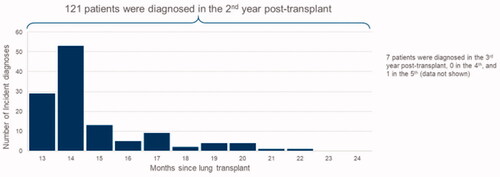
Table 2. Observable time for study patients.
Figure 4. (A) Average number of inpatient admissions per patient per month. This figure depicts the average number of inpatient admissions per patient per month. The horizontal axis depicts the months since index diagnosis, negative values corresponding to the pre-period, and positive values corresponding to the post-period. The vertical axis depicts the mean inpatient admissions per patient per month. The solid area of the plot depicts inpatient admissions without ICU. The stripped area of the plot depicts inpatient admissions with ICU. (B) Average number of outpatient services per patient per month. This figure depicts the average number of outpatient services per patient per month. The horizontal axis depicts the months since index diagnosis, negative values corresponding to the pre-period, and positive values corresponding to the post-period. The vertical axis depicts the mean outpatient services per patient per month. (C) Average number of prescription fills per patient per month. This figure depicts the average number of prescription fills per patient per month. The horizontal axis depicts the months since index diagnosis, negative values corresponding to the pre-period, and positive values corresponding to the post-period. The vertical axis depicts the mean prescription fills per patient per month.
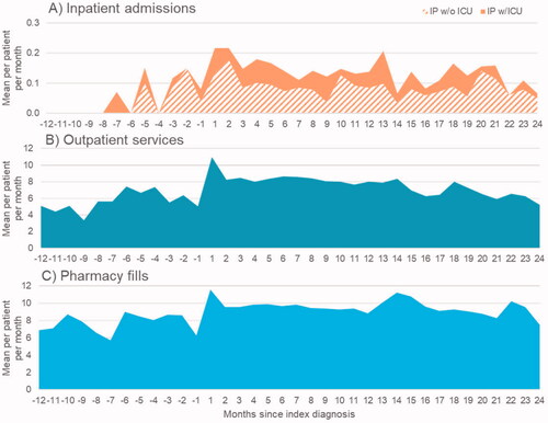
Table 3. Hospitalizations length of stay.
Figure 5. Mean per patient per month direct medical costs overall. This figure depicts the mean direct medical costs per patient per month. The horizontal axis depicts the months since index diagnosis, negative values corresponding to the pre-period, and positive values corresponding to the post-period. The vertical axis depicts the mean per patient per month cost. The vertical line for each bar on the vertical axis depicts the standard deviation.
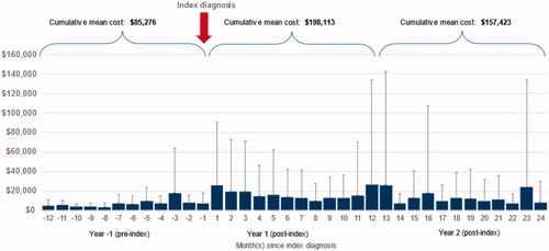
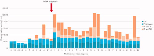
Figure 6. Mean per patient per month direct medical costs by category. This figure depicts the mean direct medical costs per patient per month by category. The horizontal axis depicts the months since index diagnosis, negative values corresponding to the pre-period, and positive values corresponding to the post-period. The vertical axis depicts the mean per patient per month cost. The plot has been stratified to correspond to the categories of outpatient services, pharmacy, inpatient admissions without ICU, and inpatient admissions with ICU.