
Figures & data
Figure 1. Cost-of-Illness and burden- of- disease analysis overview.
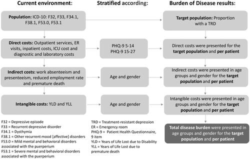
Figure 2. Patient-flow.
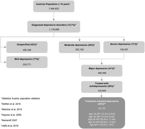
Table 1. Input data direct costs.
Table 2. Input data indirect costs.
Table 3. Input data intangible costs.
Table 4. Base-case cost-of-illness results.
Table 5. Base-case cost-of-illness subgroup results.
Figure 3. Deterministic sensitivity analysis visualized as Tornado plots where each bar represents a one-way sensitivity analysis (OWSA), and the width of bars represents the impact on total cost-of-illness or DALYs lost. The total cost-of-illness or DALYs are plotted on the x-axis. (a) OWSA for cost-of-illness. (b) OWSA for DALYs.
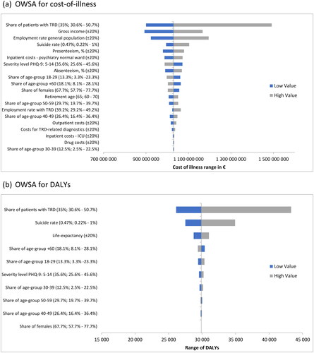
Table 6. Disability adjusted life years.
Supplemental material