
Figures & data
Figure 1. Patient flow diagram. EHR: electronic health record
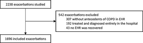
Table 1. Descriptive characteristics of the sample and their relation to 30-day mortality in the univariate analysis.
Figure 2. Calibration plot. Solid line represents a model with perfect calibration. Dashed line represents a non-parametric smooth curve for the relation between observed frequency and predicted probability. Triangles are based on quintiles of patients with similar predicted probabilities. Vertical lines above the x axis represents the distribution of predicted probabilities.
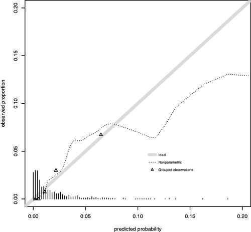
Figure 3. Receiver operating characteristic curve. Dashed line is the no discrimination line (AUROC: 0.5). Solid line represents the model developed (AUROC: 0.811 (95% CI, 0.72–0.902)).
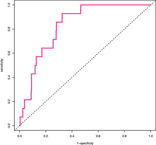
Table 2. Characteristics of each risk category and associated recommendation.
Figure 4. Decision curve. Solid black line represents ‘no intervention’ (derive all). Solid grey line represents the net benefit for ‘intervention in all’ (derive none). Dashed line represents the net benefit for the model.
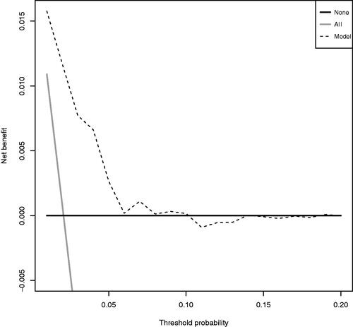
Table 3. EXAGGERATE score.