Figures & data
Figure 1. Patient flow with symptom severity and impact on daily activities during follow-up. Patients (absolute numbers are shown) are divided per follow-up moment with respect to symptom resolution and those still symptomatic to severity of symptoms. Total numbers of patients in the study: 266 at week 2, 264 at week 4, 257 at week 8, and 248 at week 12.
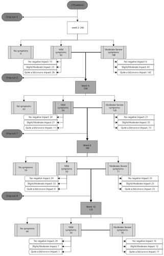
Table 1. Characteristics of COVID-19 outpatients at inclusion.
Figure 2. Frequency and severity of self-reported symptoms in COVID-19 outpatients over 12 weeks after a positive SARS-CoV-2 test. Absolute numbers of patients reporting each individual symptom are shown, with severity distribution.
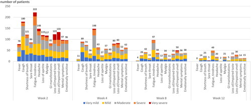
Figure 3. Correlation of COVID-19-related symptoms between week 2 and week 12. Univariate correlation between presence and severity of symptoms at week 2 (column) and week 12 (row). Darker tones correspond to stronger correlations. Empty cells indicate no patients with that particular symptom combination at week 2 and 12.
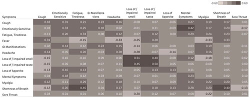
Table 2. Impact on daily activities reported by outpatients with lingering COVID-19-related symptoms.
Figure 4. Correlations between COVID-19-related symptoms at week 2 and their impact on daily life variables at week 12. Univariate correlations between presence and severity of symptoms week 2 (column) and impact on daily life at week 12 (row). Darker tones correspond to stronger correlation.
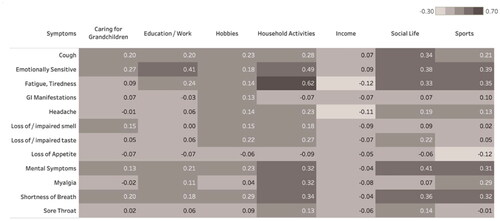
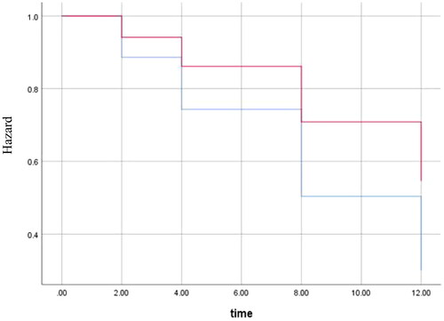
Figure 5. Cox regression for time to return to usual health for obese patients compared to non-obese. Graph shows the hazard for obese patients (red) and non-obese patients (blue). Outcomes were adjusted for age, sex, sore throat and gastrointestinal manifestations (variables included in the final model, p-value = 0.007). Y-axis starts at 0.3 to better visualise the difference between lines. The X-axis shows number of weeks.