Figures & data
Figure 1. Metabolic network describing glycolysis in Saccharomyces. cerevisiae with ethanol and glycerol formation. (a) The initial full network. (b) Final reduced network after timescale analysis-based model reduction.
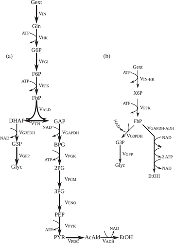
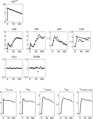
Figure 2. Available experimental data obtained from [Citation9]. Metabolite levels are given on y-axis, presented in fold changes with respect to the reference state (presented in ) and x-axis represents time in seconds.
![Figure 2. Available experimental data obtained from [Citation9]. Metabolite levels are given on y-axis, presented in fold changes with respect to the reference state (presented in Table 1) and x-axis represents time in seconds.](/cms/asset/9592b542-7007-46e2-9f1c-c577a1664c00/nmcm_a_548167_o_f0002g.gif)
Table 1. Reference conditions for the case study. Further details on experimental conditions can be found in [Citation9]. Biomass (C x) is ing DW/L, Dilution rate (D) is in h−1, metabolites levels are in μmol/gDW (intracellular, X 0) and in mmol/L (extracellular, C 0). The q-rates and the intracellular fluxes (J) are given in mmol/gDW/hr
Table 2. The initial elasticity matrix for the skeleton model, considering only substrates and products, allosteric interactions are omitted
Figure 3. Considering timescale analysis for model reduction. (a): the pools G6P and F6P are in equilibrium, depicted as the parity plot. The dashed line represents the 45° line. Both axes are fold changes in concentration relative to reference state. (b–d) The pools 2PG + 3PG, PEP and PYR are pseudo-steady-state pools, calculated from ATP, FdP′ and NAD. In each case, dots represent the available experimental data and the line represents the model prediction. x-axis represents the time in seconds and the y-axis represents the metabolite levels presented in fold changes relative to reference state.
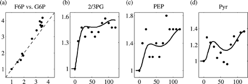
Table 3. The turnover times of the metabolites in the network of (a), calculated by dividing the metabolite level at steady state by the total incoming flux to the corresponding pool. For FdP′, the turnover time is actually higher because the pool contains GAP and DHAP, but as there is no measurement on those, only the level of FdP is taken into account
Figure 4. Simulation of the glucose perturbation with the estimated parameters. The metabolites are presented on y-axis as fold changes relative to reference steady state, and x-axis represents the time in seconds.