Figures & data
Table 1 Etiology of hearing loss across both ears in the 45 subjects
Figure 1 Postoperative MP1 + 2 impedances measured intra-operatively (n = 40), at activation (n = 39) and at the 6 month follow-up (n = 33). The median is indicated with a solid mid line and the mean, a square. The boxes show the 25–75th percentile interval and the whiskers the 5–95 percentile intervals. Outliers are shown as individual points.
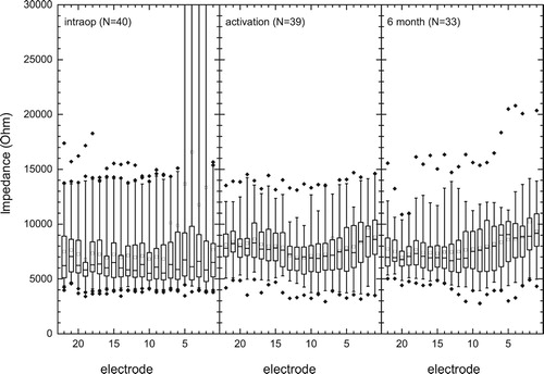
Figure 2 ECAP thresholds intra-operatively (n = 40) and at activation (n = 28) in current levels. Intra-operative thresholds for electrodes E1–E13 were significantly greater than those for E17–E22 (P < 0.001). The median is indicated with a solid mid line and the mean, a square. The boxes show the 25–75th percentile interval and the whiskers the 5–95 percentile intervals. Outliers are shown as individual points.
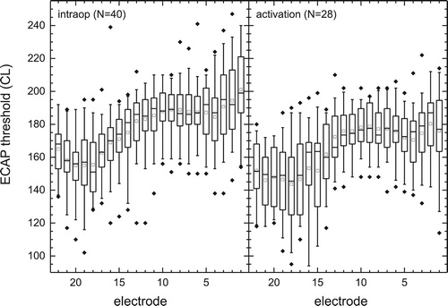
Figure 3 C levels of the patients map at activation (n = 44) and at 6 months (n = 34) in charge (nC) per phase. The median is indicated with a solid mid line and the mean, a quadrat. The boxes show the 25–75th percentile interval and the whiskers the 5–95 percentile intervals. Outliers are shown as individual points.
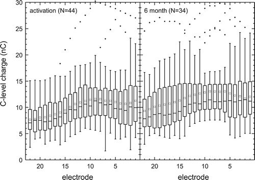
Figure 4 The left hand graph shows median pre- and post-operative threshold levels in the 44 implant ears. Arrows indicate levels exceeded audiometer limits (i.e. 250 Hz at 6 months). Gray/faint lines indicate 25th percentile change in thresholds. The right hand graph shows a summary of pre-operative pure-tone threshold data the 44 contra-lateral ears. Open squares are medians, gray dashed line minima and dotted black lines inter-quartile range. Maximum thresholds were above audiometer limits.
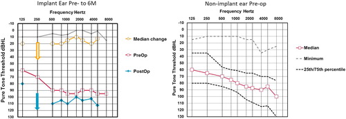
Figure 5 Phoneme scores for monosyllabic words presented in Quiet to Implant ear alone (left graph, n = 41) and to both ears ‘best-aided’ (right graph, n = 40). The median is indicated with a solid mid line and the mean, a square. The boxes show the 25–75th percentile interval and the whiskers the 5–95 percentile intervals. Outliers are shown as individual points. *Significant difference (Post-hoc Tukey tests, P < 0.05), ≡ no significant difference.
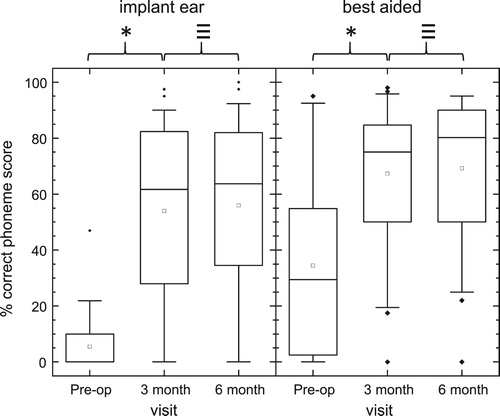
Figure 6 Word scores for sentences presented in 10 dB SNR to the Implant ear alone (left graph, n = 41) and to both ears ‘best-aided’ (right graph, n = 42). The median is indicated with a solid mid line and the mean, a square. The boxes show the 25–75th percentile interval and the whiskers the 5–95 percentile intervals. Outliers are shown as individual points. *Significant difference (Post-hoc Tukey tests, < 0.05), ≡ no significant difference.
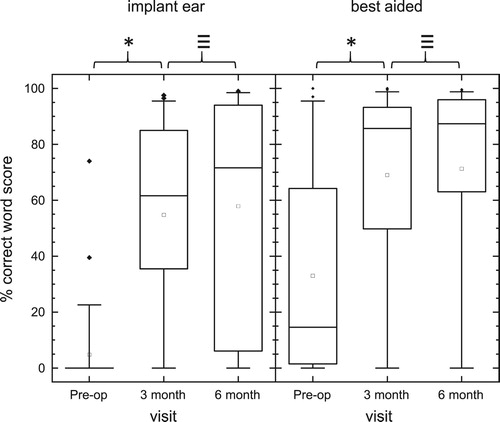
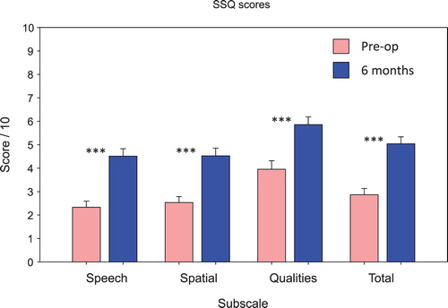
Figure 7 Scores for the speech, spatial, qualities (SSQ) questionnaire subscales and total score pre-operatively and at the six-month follow-up. Thirty-nine out of the 44 subjects provided completed questionnaires for both assessment visits. ***Significant difference, P < 0.001.