
Figures & data
Table 1. Models in the scenario database.
Figure 1. Energy CO2 emissions 2005–2050, all models, moderate and strong policy scenarios.
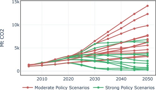
Figure 2. Scenario forecast GDP per capita growth rates, benchmarked against historical performance in emerging countries.
Note: MER = Market exchange rates. IND = India, CHN = China, KOR = South Korea, ZAF = South Africa, THA = Thailand, BRA = Brazil.
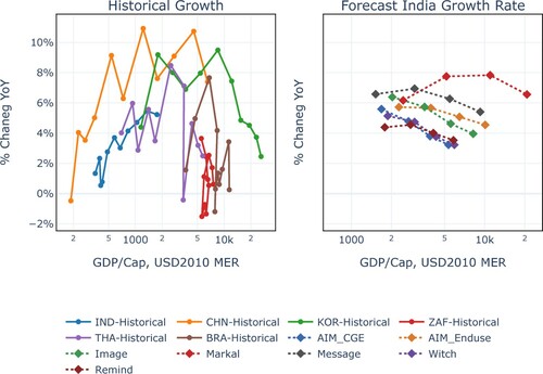
Figure 3. 2050 Final energy demand versus 2050 total GDP.
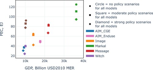
Figure 4. Industrial FEC per Capita, India scenarios for 2050 versus historical cross-country benchmarks.
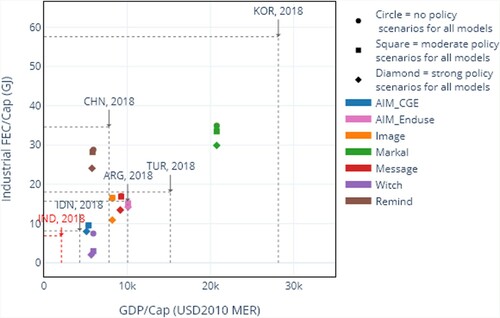
Figure 5. Transport FEC per Capita, India scenarios for 2050 versus historical cross-country benchmarks.
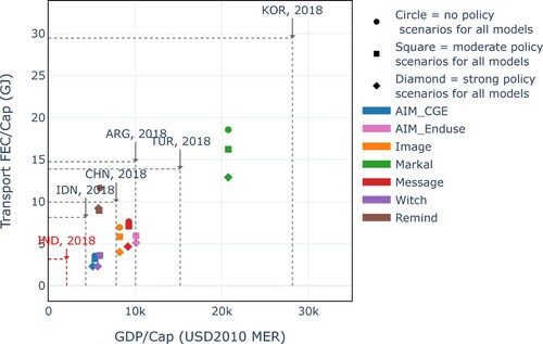
Figure 6. Buildings FEC per Capita, India scenarios for 2050 versus historical cross-country benchmarks.
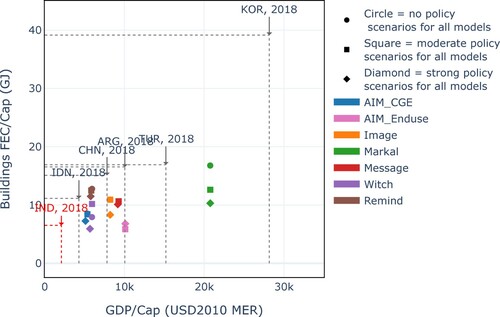
Figure 7. Carbon intensity of FEC in global versus national models and FEC Mix in 2010 and 2050 in moderate and strong policy scenarios.
Note: CI = carbon intensity. In the top two panels, solid lines represent moderate policy scenarios, dashed lines represent strong policy scenarios.
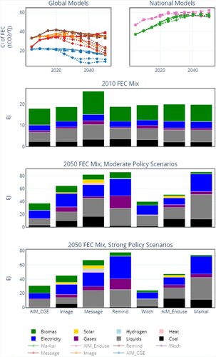
Figure 8. Carbon intensity of electricity generation.
Note: solid lines represent moderate policy scenarios, dashed lines represent strong policy scenarios.
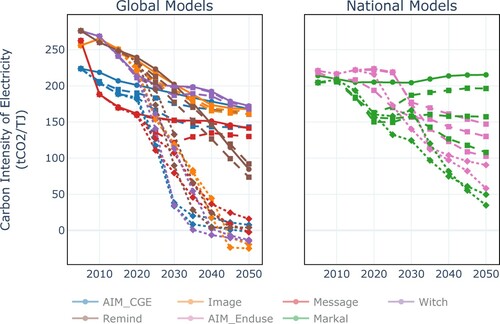
Figure 9. Carbon intensity of TPES in global versus national models and FEC Mix in 2010 and 2050 in moderate and strong policy scenarios.
Note: in the top two panels, solid lines represent moderate policy scenarios, dashed lines represent strong policy scenarios.
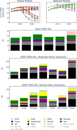
Figure 10. Scenario summary, 2050 energy and CO2 indicators, moderate policy scenarios.
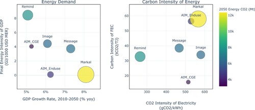
Table 2. Scenario grouping and storylines.
Supplemental Material
Download MS Word (15 KB)Data availability statement
The scenario data used in this paper are available at https://data.ene.iiasa.ac.at/cd-links/.