
Figures & data
Table 1 . Emission targets according to authors’ calculations based on IPCC (Citation2021) and emissions data for 2010 and 2019.
Table 2 . Summary of the different approaches per cluster and their corresponding methodologies.
Table 3. GHG emission reductions based on NDCs and comparison with CO2 emission reduction ranges from the assessed effort sharing approaches. A negative percentage reduction represents an emissions increase.
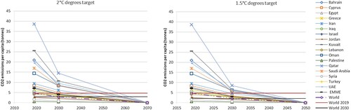
Figure 1 . CO2 emissions per capita projections in line with the Paris agreement targets for approach 3.3. The first graph illustrates the case for 2 °C and the second graph for 1.5 °C. The corresponding global per capita emissions in 2019 and 2030 are shown with horizontal lines.
Supplemental material