
Figures & data
Figure 1. Clients submit ‘parent orders’ to execution services and different trading desks. For example, these could be high touch (HT) and low touch (LT) desks. Parent orders are sliced into child orders via ‘Desks’ and ‘Algos’ and routed to different venues for cost-efficient execution. Usually, a routing system (SOR) determines to which venue a child order is sent.
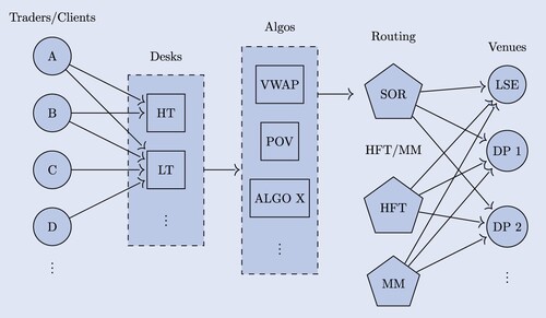
Figure 2. Different views of the same LOB snapshot. Note, only the omniscient view has complete information about the queue priority of each order. (a) anonymized view (b) Broker view (c) Omniscient view.
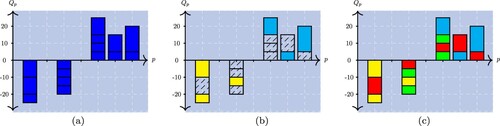
Figure 3. Exemplary embedding using the first three eigenvectors of the normalized Laplacian matrix using the spectral embedding method from Belkin and Niyogi (Citation2002). The color of the nodes indicates the values of the associated feature. The brighter the points, the higher the value of the corresponding feature. (a) Mean creation time (b) Ratio of specified limit price.
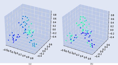
Table 1. Table indicating the ARI between K-means and spectral clustering.
Table 2. The variance between an observation and its corresponding cluster.
Table 3. Exemplary centroids setting K = 4 for one of the 25 most liquid STOXX 600 instruments during December 2019.
Table 4. Summary of agent types.
Figure 4. Embedding of first stage cluster centers from the single time slice clustering process. Colors indicate the first stage clustering result. As discovered in table , Res is positioned in-between the other three clusters. (a) Different tickers, same time period. (b) Same ticker, different time periods.
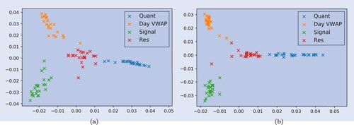
Figure 5. Exemplary centroid features of one ticker for 24 months. The solid lines indicate the actual values over the months, the dashed horizontal lines indicate the average over all months. (a) Number of orders (log scale) (b) Mean submission time (c) Cancellation rate.
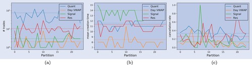
Table 5. Log-weighted average entropy and maximum affiliation probability of the agents.
Table 6. Affiliation of clusters to meta clusters for different tickers (time periods in parentheses).
Figure 6. Distribution of the number of trades and the executed quantity. (a) Number of submitted orders (b) Fraction of executed quantity.
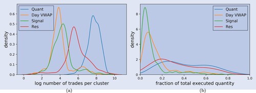
Table 7. Average values of the distributions of clients, trades and executed quantities across different clusters.
Table 8. Aggregated statistics of child orders by clusters.
Table 9. Table indicating the mean cumulative inventory of the clusters.
Table 10. Correlation matrix of net inventory between different components.
Table 11. Tables indicating the correlation of the order flow imbalance between different components.
Table 12. Table indicating the average for agent types in basis points (bps).
Figure 7. Cumulative PnL in basis points (bps) of agent types over different time horizons,
. (a) l = 0 (b) l = 1 (c) l = 10 (d) l = 20.
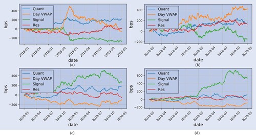
Figure 8. Order flow imbalance by cluster, during days of returns with large magnitude.
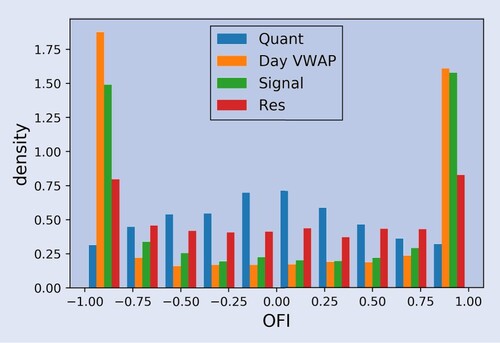
Table 13. Correlation between OFI and returns of stocks (column logOC) and return of the index (column logOC_index).
Table 14. Correlation between OFI and returns of stocks (column logOC) and return of the index (column logOC_index).
Figure 9. Aggregated parent order flow distributions for one stock, over two years, for Quant. (a) Order counts: QUANT order flow. (b) Order size distribution: QUANT order flow (c) Submission times (d) Fraction of buy orders.
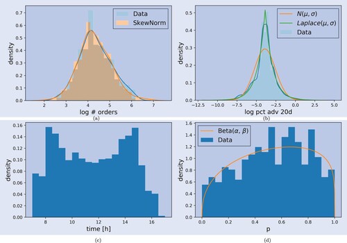
Figure 10. Aggregated parent order sizes (on a log scale) for one stock over two years for Day VWAP.
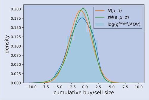
Figure 11. Aggregated parent order flow distributions for one stock over two years for Signal. (a) Order counts (b) Order sizes (c) Submission times.
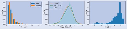
Table A1. Feature list used for the clustering.