
Figures & data
Figure 1. Illustration of trade co-occurrence. This figure visualizes the idea of trade co-occurrence; given a user-defined neighbourhood size δ, trade arrives within the δ-neighbourhood of trade
, and thus they co-occur. In contrast, trade
locates outside
's neighbourhood, and thus the two trades do not co-occur. Both trades
and
co-occur with trade
, but they do not co-occur with each other.
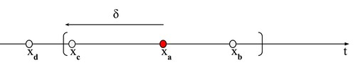
Figure 2. Illustration of trade types, conditioning on co-occurrence. We showcase the distinct categorical labels of trade . Colour indicates the stock corresponding to a trade. Thus
is for the same stock as
, while
is for a different stock. First line:
is an isolated (iso) trade with empty δ-neighbourhood; second to fourth lines:
is a non-isolated (nis) trade with nonempty δ-neighbourhood; second line:
is a non-self-isolated (‘nis-s’) trade with only other trades for the same stock in its δ-neighbourhood; third line:
is an non-cross-isolated (‘nis-c’) trade with only other trades for the different stocks in its δ-neighbourhood; last line:
is a non-both-isolated (‘nis-b’) trade with both other trades for the same and different stocks in its δ-neighbourhood.
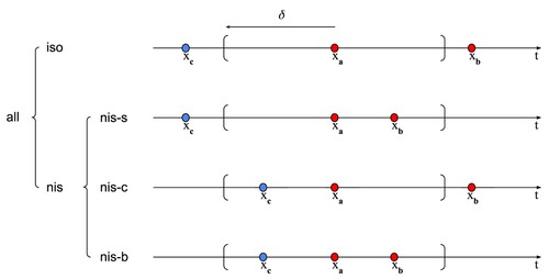
Table 1. Difference between null and empirical probability.
Figure 3. Co-occurrence probability: null versus empirical. The table plots the null and empirical probabilities of each type of trades, over 5 minute intervals, averaged over stocks and days, for selected values of δs.
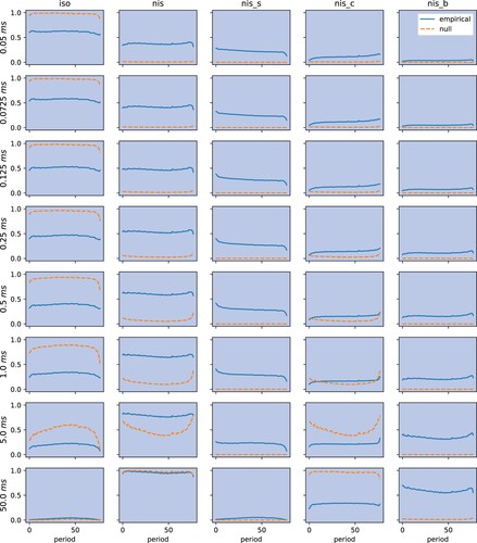
Table 2. Null and empirical probability of each type of trade flows.
Figure 4. Intraday distributions of the number of each type of trades. We calculate numbers of each types of trades in percentage of the total number of trades, for non-overlapping 5-min intervals during normal trading hours from 9:30 to 16:00 for all stock over the period from 2017-01-03 to 2020-12-31. This figure plots intraday 5-min counts of different types of trades, averaged over both time series and cross-section.
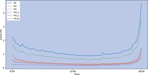
Table 3. Summary statistics for all groups of trades.
Table 4. Summary statistics for all groups of trades and order imbalances.
Figure 5. Pearson correlation of order imbalances. For each type of order imbalance, we first consider the vector of daily values during 2017-01-03 to 2020-12-31, then compute the correlation matrix and finally average across all stocks.
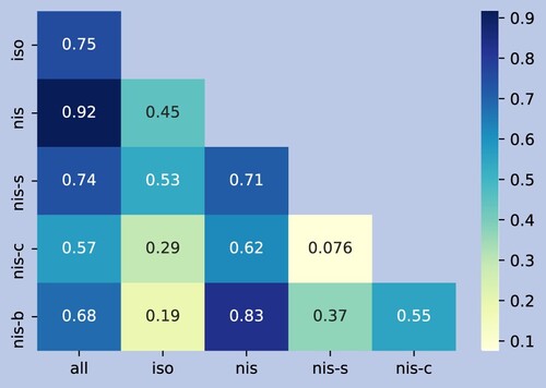
Table 5. Contemporaneous regression against individual COIs.
Table 6. Contemporaneous regression against multiple COIs.
Table 7. Predictive regression against individual COIs.
Table 8. Predictive regression against multiple COIs.
Table 9. Summary of single-sort portfolios.
Table 10. Annualized returns of double-sort portfolios.
Table 11. Profitability of long-short portfolios.
Table 12. Abnormal returns of long-short portfolios.
Figure 6. Cumulative returns of portfolios. This figure plots cumulative returns of five portfolios from 2017-01-03 to 2020-12-31. The portfolios include (1) ‘iso’: the long-short portfolio single-sorted on iso COI; (2) ‘isonis’: the long-short portfolio double-sorted on iso and nis COIs; (3) ‘iso
nis-c’: the long-short portfolio double-sorted on iso and nis-c COIs; (4) ‘all’: the long-short portfolio single-sorted on COI of undecomposed trade flows; (5) ‘return momentum’: the long-short portfolio single-sorted on previous day's returns; (6) ‘equal weight’: equally-weighted portfolio of the selected 457 stocks; (7) ‘SPY ETF (open to close)’: cumulative open to close returns of the SPDR S
P 500 ETF Trust which tracks the S
P 500 Index; (8) ‘SPY ETF’: cumulative close to close returns of the SPDR S
P 500 ETF.
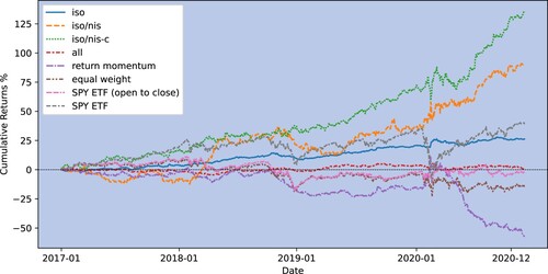
Table 13. Abnormal returns of long-short portfolios.
Table B1. Description of the sample universe.
Table C1. Yearly contemporaneous regression against individual COIs.
Table C2. Yearly contemporaneous regression against multiple COIs.
Table C3. Yearly predictive regression against individual COIs.
Table C4. Yearly predictive regression against multiple COIs.
Table D1. Contemporaneous time series regressions.
Table D2. Predictive time series regressions.
Figure A1. Distributions of coefficients of contemporaneous time series regressions. This figure displays the histogram and kernel density estimation of the coefficients of contemporaneous time series regressions. The orange line indicates the mean of the coefficients.
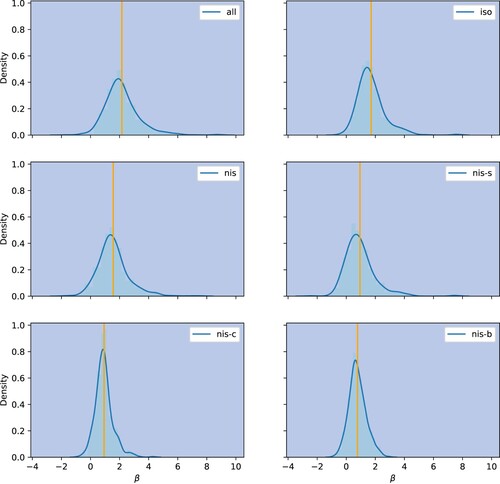
Figure A2. Distributions of adjusted of contemporaneous time series regressions. This figure displays the histogram and kernel density estimation of the adjusted
of contemporaneous time series regressions. The orange line indicates the mean of the adjusted
.
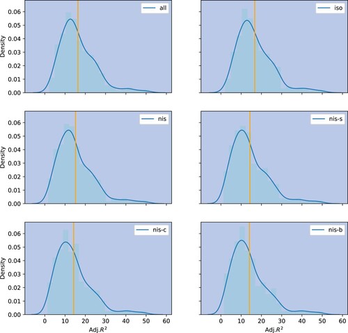
Figure A3. Distributions of coefficients of predictive time series regressions. This figure shows the histogram and kernel density estimation of the coefficients of predictive time series regressions. The orange line indicates the mean of the coefficients.
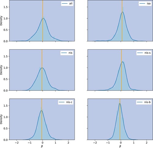
Figure A4. Distributions of adjusted of predictive time series regressions. This figure displays the histogram and kernel density estimation of the adjusted
of predictive time series regressions. The orange line indicates the mean of the adjusted
.
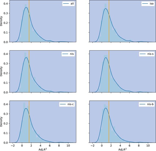
Table E1. Additional evaluation for regression analysis.
Figure A5. Average of regressing contemporaneous returns against COIs for different δs.
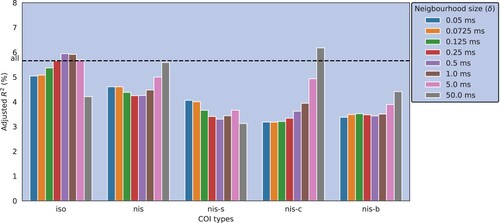
Figure A6. Sharpe ratios of COI-based long-short portfolios for different δs.
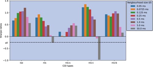
Table G1. Trades and COIs by universe of stocks.
Table H1. COIs by time period.
Table I1. COIs measured by volume.
Table J1. Annualized returns and Sharpe ratios of selected and benchmark portfolios.