Figures & data
Table 1. Characteristics of the elite and non-elite participants, mean ± SD.
Figure 1. Data processing from raw data to normalised strokes. (a) The raw data in the x- (dark grey), y- (light grey) and z-direction (grey). (b) The filtered data in y-direction and the zero-crossings that were detected (black dots). (c) The normalised strokes obtained from the Euclidean norm using the zero-crossings depicted in (b), each line represents a different stroke. (d) The average, normalised stroke (black line) and corresponding standard deviation (dotted lines).
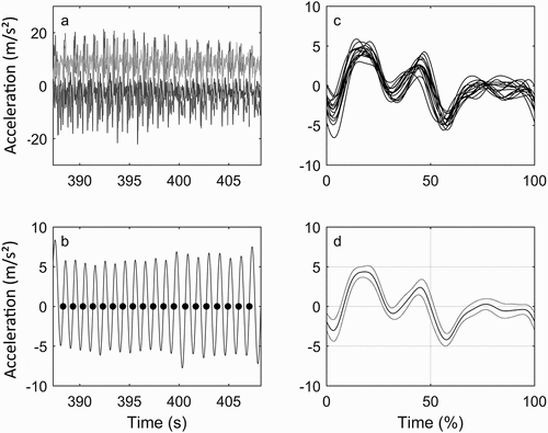
Table 2. Summary of the results for the elite and non-elite swimmers, including the results of the statistical tests, mean ± SD.
Figure 2. The relation between JC for each swimmer and performance level. NE = non-elite swimmers represented by the black dots and E = elite swimmers represented by the grey triangles. The formulas for the linear relations with the corresponding R2 are given within the rectangles.
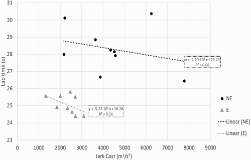
Figure 3. R2 (in %) of the three different regression models and the parts that were explained by stroke rate (SR, in grey), count of stroke cycles per lap (SC, in dark grey) and jerk cost (JC, in light grey), depicted from bottom to top. The partial R2 (in %) for the variables is indicated by the numbers in white. The three models were for the entire group of swimmers (All), the non-elite (NE) and the elite swimmers (E).
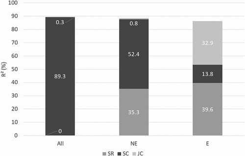
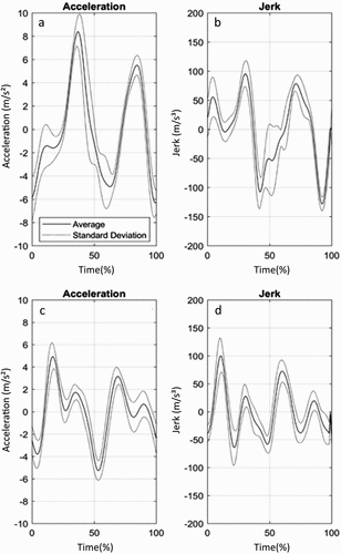
Figure 4. Average stoke patterns of a non-elite (a and b) and an elite swimmer (c and d). (a) and (c) show the acceleration, (b) and (d) the jerk. The average stroke patterns are indicated by the black lines, the corresponding standard deviations by the dotted lines. The strokes have been time-normalised from 0% to 100%.