
Figures & data
Figure 1. Diagram of the approach to calculate the combined ICER from the base-case results of the two phenotype-specific CEMs.
* Population weighting was performed on the health and cost model outcomes, i.e. LYs, QALYs, and total healthcare costs of each treatment arm (empagliflozin + SoC and SoC), separately. Abbreviations: CEM, cost-effectiveness model; HF, heart failure; HFrEF, heart failure with reduced ejection fraction; HF > 40%EF, heart failure with > 40% ejection fraction; ICER, incremental cost-effectiveness ratio; LY, life-year; QALY, quality-adjusted life-year; SoC, standard of care.
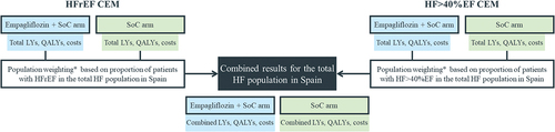
Table 1. Combined deterministic results for the overall ITT population.
Figure 2. Cost-effectiveness plane for empagliflozin + SoC compared to SoC alone for the overall ITT population. The graph visually represents the incremental differences in costs and QALYs between treatment groups.
Abbreviations: ITT, intention-to-treat; QALY, quality-adjusted life-year; PSA, probabilistic sensitivity analysis; SoC, standard of care; WTP, willingness-to-pay.
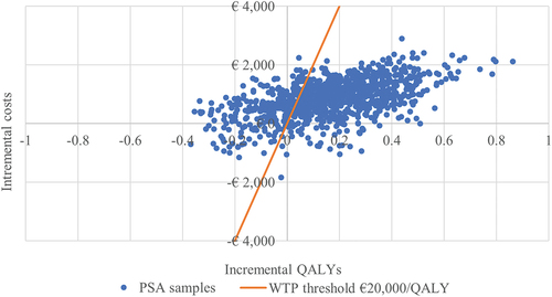
Figure 3. Cost-effectiveness acceptability curve for empagliflozin + SoC compared to SoC alone.
Abbreviations: SoC, standard of care.
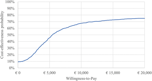
Table 2. Results (in terms of ICER) of subgroup analyses.
Supplemental material