
Figures & data
Table 1. Summary of the three example-generation strategies identified by Antonini (Citation2006).
Figure 1. Overview of the course content (left) with the experimental tasks and their ordering for the four experimental groups (right). Task names include G where the task involves generation, and C where it involves classifying.
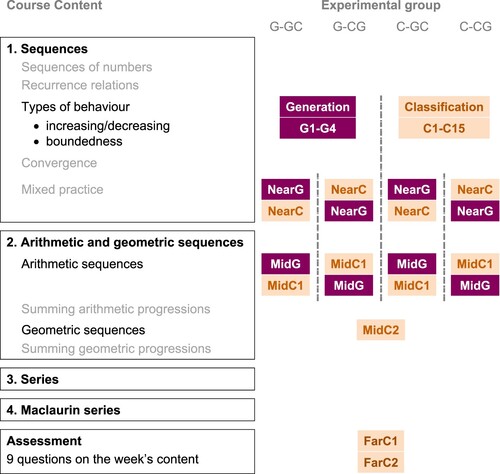
Table 2. Content of the initial learning tasks in Study 1.
Figure 2. Distribution of first responses to the classification task. Raw numbers are available in in the appendix.
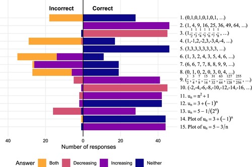
Table 3. Content of the subsequent tasks in Study 1, and the points awarded to each (based on one point for each distinct response).
Figure 3. Distribution of correct and incorrect first responses to the generation task.
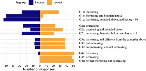
Figure 4. Distribution of correct and incorrect first responses to the subsequent tasks.
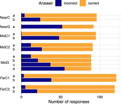
Figure 5. Marks attained in the subsequent tasks by each student in Study 1 (pale dots) together with the estimated mean for each group (solid dots with error bars), represented by the median and 95% HDI of the posterior distribution.
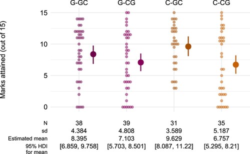
Figure 6. Estimates for the contrasts between different groups, as both raw scores and effect sizes (Cohen's d). The horizontal lines show the median and 95% HDI for the estimates, with the posterior distribution illustrated by 100 grey dots. The highlighted region around 0 is the region of practical equivalence, corresponding to a standardised effect size smaller than 0.1.
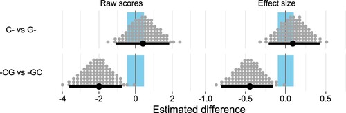
Figure 7. Marks attained in the subsequent tasks by each student in Study 2 (pale dots) together with the estimated mean for each group (solid dots with error bars), represented by the median and 95% HDI of the posterior distribution.
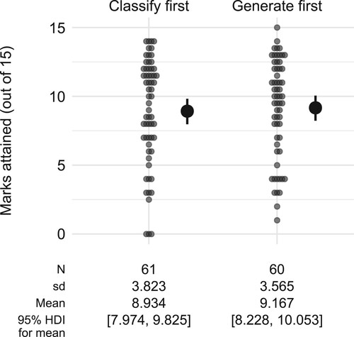
Figure 8. Scores on the Near and Mid classification and generation tasks across both studies, with students grouped according to the order the tasks were presented in, together with the estimated mean for each group (solid dots with error bars), represented by the median and 95% HDI of the posterior distribution.
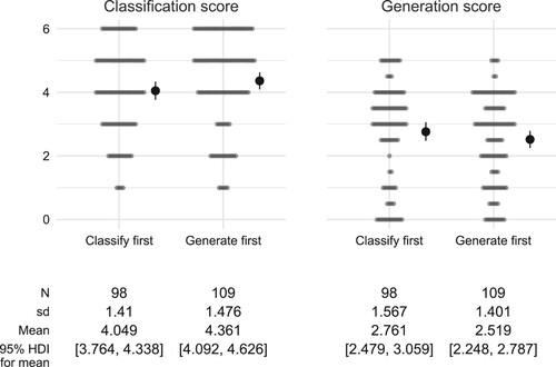
Table 4. Types of examples given by students in answer to NearG, broken down by group.
Table A1. Distribution of first responses to the classification task in Study 1.
Data availability statement
All data and analysis code is available at https://doi.org/10.17605/osf.io/gry6v.