Figures & data
Figure 1. Group averaged audiograms of the tested ears for NH and HI subjects with inter-individual standard deviations. The grey area shows the range of standard audiograms, from N2 to N4, where the dashed line represents the N3 standard audiogram (Bisgaard, Vlaming, and Dahlquist Citation2010).
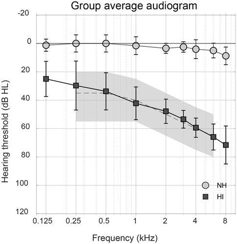
Figure 2. Block diagram of the NR algorithm used in this study. Each panel corresponds to essential steps in the signal processing. Temporal smoothing is introduced in the fourth panel. Here, the algorithm checks whether there is a decrease in gain with respect to the previous time-frame. If there is (yes), the new gain will be calculated with time constant τ. If there is no decrease in gain (no), the gain will not be altered in this panel.
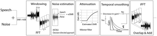
Figure 3. Time–frequency representation of the applied gain due to the NR algorithm, without level corrections. The grey scale in the spectrogram-like plot shows the amount of (negative) gain applied as a result of noise reduction with different time constants. Here, gain is defined as the difference in output per time–frequency unit between the processed and unprocessed condition. On top of the panels, the time signal of the noise reduced sentence in noise is shown for each condition (light-grey signal) combined with the unprocessed sentence in noise (dark-grey signal).
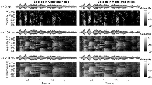
Table 1. Information on processing conditons: average ± standard deviations of the resulting SNR of all processing conditions per noise type.
Figure 4. Group averages of the speech intelligibility listening test for all listeners and conditions in terms of % correct repeated words. Results per listener group are pooled for both noise types. Error bars show 95% confidence intervals. NH subjects showed no significant differences between processing conditions. Horizontal bars show two significant differences between processing conditions for HI listeners.
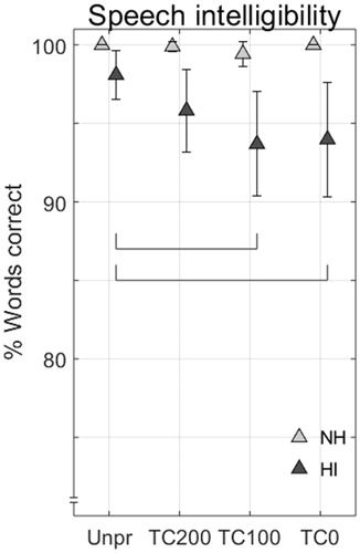
Figure 5. Group average percentage correct detection of all comparisons in the discrimination experiment, for NH and HI listeners. Error bars show 95% confidence intervals, the dashed horizontal line indicates the 33.3% chance level.
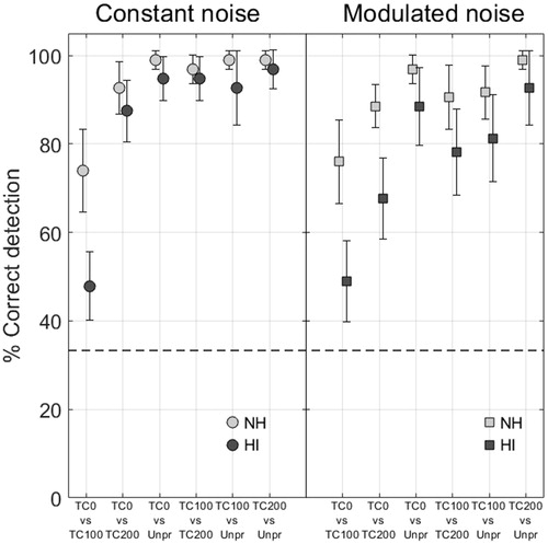
Figure 6. Group average results of the paired comparison experiment in NH subjects (left side) and HI subjects (right side) for the two noises and three judgment criteria (A, B, C). When there is a significant interaction between noise type and processing condition, both noise types are shown separately in the figure, otherwise the results are pooled for both noise types. Each condition is rated relative to the mean where the ‘noise annoyance’ scale is inverted. Error bars show 95% confidence intervals. Horizontal bars indicate which conditions differ significantly from each other. Positive values indicate a favorable outcome.
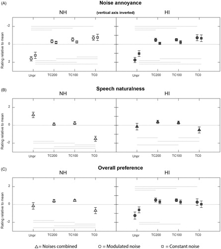
Table 2. F and p statistics of a mixed model ANOVA of the paired comparison listening test to determine listener preference.
Table 3. Results of the repeated measures ANOVA of the paired comparison listening test for NH listeners.
Table 4. Results of the repeated measures ANOVA of the paired comparison listening test for HI listeners.
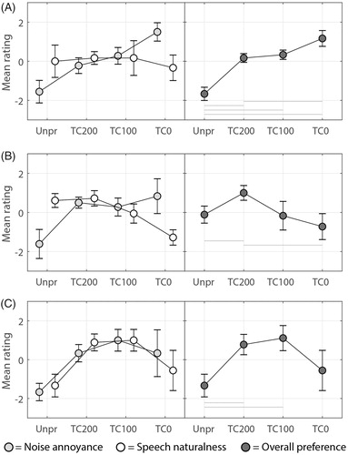
Figure 7. Paired comparison results of three HI individuals (A, B, C) for all processing conditions for both noise types combined. The vertical axis shows a relative rating for each processing condition which is based on the mean of three runs per comparison. Error bars show 95% confidence intervals. Speech naturalness ratings are shown with white markers, noise annoyance ratings with light-grey markers, both on the left side of the figure. The overall preference ratings are shown separately on the right side of the figure with dark-grey markers. Note that for the noise annoyance rating one should interpret a negative value on the y-axis as more annoying than a positive value on the y-axis. Horizontal bars indicate which conditions differ significantly from each other, for α = 0.05. Positive values indicate a favorable outcome.