Figures & data
Figure 1. Median audiogram and gains. The left panel shows the median pure-tone thresholds for participants’ tested ears. The right panel shows the median gains for participants’ tested ears. Error bars show interquartile ranges (25–75%). The dashed lines in the left panel show the better-ear thresholds of participants with the three lowest and three highest BE4FA thresholds. The dashed lines in the right panel show three lowest and three highest gains (averaged across frequencies).
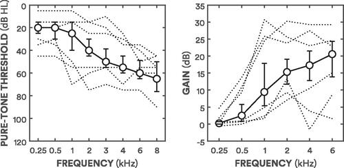
Figure 2. Spectra for adjustments. Each panel demonstrates the filter output (averaged across sentences) for each band-specific 4–12 dB (see legend for line specification) increment (blue) and decrement (red) from prescribed NAL-R gains for the median audiogram (solid black line).
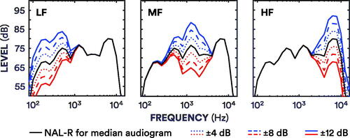
Figure 3. Total preferences across participants, and participants’ reliable preferences. The top panel shows preferences across participants for each adjustment. Purple lines with pluses show the percentage of “better” judgments, the orange lines with crosses show the percentage of “worse” judgments, and the black lines with circles show the percentage of “no different” judgments. Judgments for control adjustments were averaged and collapsed across frequencies. The bottom panel shows the percentage of participants with reliable responses for each adjustment. The purple lines with pluses show the percentage of participants with reliable “better” judgments. The orange lines with crosses show the percentage of participants with reliable “worse” judgments. The black lines with circles show the percentage of participants with reliable “no different” judgments. The dotted lines show the percentage of participants with unreliable judgments.
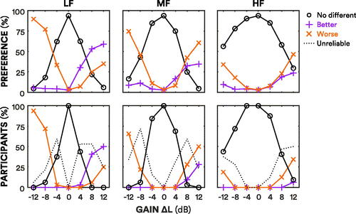
Figure 4. Box plots of preference thresholds. The red box plots show the decrement thresholds, while the blue box plots show the increment thresholds. The black lines refer to the median thresholds. Whiskers extend to the most extreme thresholds that are within 1.5 × the interquartile range. The upward- and downward-pointing triangles show the individual thresholds for increments and decrements, respectively.
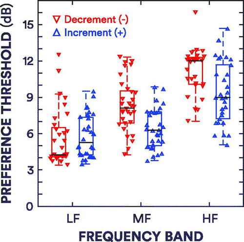
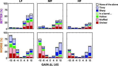
Figure 5. Total descriptor judgments across participants. The top panel shows the descriptors assigned across participants when an adjustment was judged to be “better” than the standard, or the standard was judged to be “worse” than an adjustment (e.g. “better: the adjustment was less muffled than the standard”). The heights of the bars correspond to the purple “better” lines in the top panel of . The bottom panel shows the descriptors assigned when an adjustment was judged to be “worse” than the standard, or when the standard was judged to be “better” than an adjustment (e.g. “worse: the adjustment was more sharp than the standard”). The heights of the bars correspond to the orange “worse” lines in the top panel of . The bars are stacked in the following order (from bottom to top, alternating dark and light shading): “unclear” and “muffled” in red; “hollow” and “in a barrel, tunnel, well” in green; “sharp” and “tinny” in blue; “none of the above” in white.