
Figures & data
Table 1. Summary of participant characteristics per participant group.
Table 2. Summary of outcome measures and their basic characteristics.
Table 3. Summary of the number of participants contributing data in each test and the number of participants who completed each questionnaire.
Table 4. Model summaries for Hypotheses 1 to 9.
Table 5. Model summary for Hypothesis 10, change in tinnitus.
Figure 1. Panel A: Air conduction pure-tone thresholds. Grey lines and points represent individual participants. Bold, coloured lines show the means for each group at each frequency. Shaded ribbons around the bold lines show 1 SD from the mean. Panel B: Mean air conduction thresholds. Mean of standard (0.25–8 kHz) and extended high (12.5 kHz) frequencies. Jittered, coloured points show the raw data. Boxplot whiskers show 1.5 times the interquartile range. The hollow point inside boxplots shows the mean. Distribution curves show the probability density.
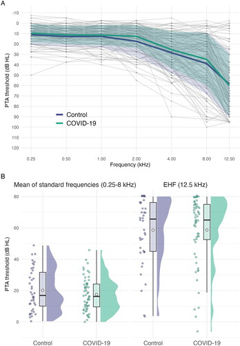
Figure 2. DPOAE levels: Means of standard (0.5 to 8 kHz) and extended high (10 kHz) frequencies. Jittered, coloured points show the raw data. Boxplot whiskers show 1.5 times the interquartile range. The hollow point inside boxplots shows the mean. Distribution curves show the probability density.
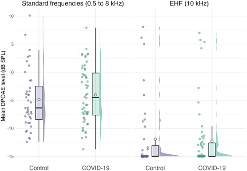
Figure 3. Mean ART. Jittered, coloured points show the raw data. Boxplot whiskers show 1.5 times the interquartile range. The hollow point inside boxplots shows the mean. Distribution curves show the probability density.
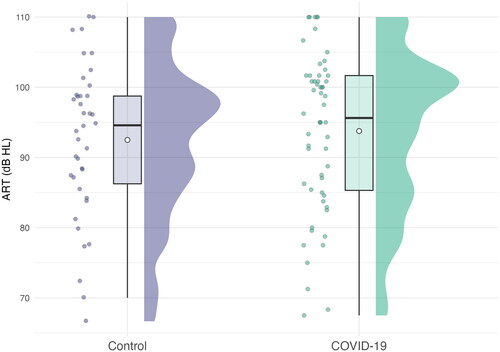
Figure 4. Panel A: Grand average waveforms for each group. Panel B: Wave I amplitude. Panel C: Wave I–V inter-peak interval. For panels B & C jittered, coloured points show the raw data. Boxplot whiskers show 1.5 times the interquartile range. The hollow point inside boxplots shows the mean. Distribution curves show the probability density.
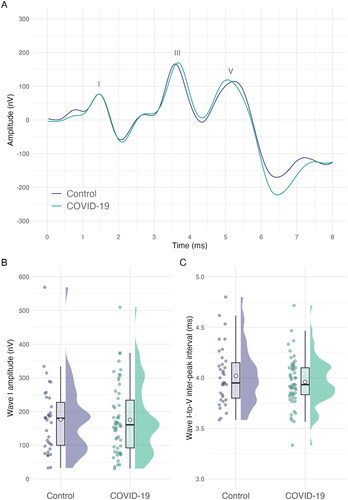
Figure 5. SNR threshold for digits-in-noise test. Jittered, coloured points show the raw data. Boxplot whiskers show 1.5 times the interquartile range. The hollow point inside boxplots shows the mean. Distribution curves show the probability density.
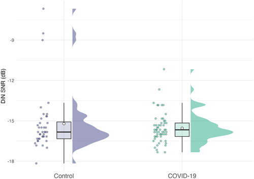
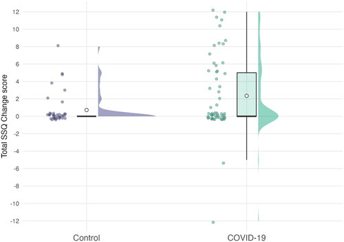
Figure 6. Total change scores on the SSQ12 questionnaire. Positive scores indicate a worsening of experience since hospitalisation. The range on the y-axis represents the minimum and maximum total scores possible. Jittered, coloured points show the raw data. Boxplot whiskers show 1.5 times the interquartile range. The hollow point inside boxplots shows the mean. Distribution curves show the probability density.
Data availability statement
Supplementary analyses, materials, code for analysis and de-identified data are available in the online repository for the project, which can be found at https://osf.io/rc5fu/, DOI: 10.17605/OSF.IO/RC5FU.