Figures & data
Figure 1. Distribution of the regions that attract and produce the most commuters.
Note: Data for 2011.Source: Own elaborations based on CSO data.
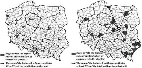
Table 1. Correlation between the inflow of commuters to the region (up to 11 orders of contiguity) and the employment in that unit.
Table 2. Summary statistics (mean values, 2003–2014) of unemployment, vacancy stocks and inflows, and outflow from unemployment to employment.
Figure 2. Vacancy inflow to unemployment stock ratio (a), and vacancy stock to unemployment stock ratio (b), LAU-1, 2003–2014 mean value.
Note: Labour market tightness indices: vacancy inflow to unemployment stock (on the left) and vacancy stock to unemployment stock (on the right). The labour market tightness index reflects how many job offers there are per worker. The darker the district, the tighter the labour market.Source: Own elaborations based on public employment offices data.
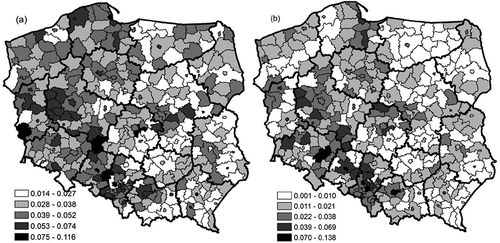
Figure 3. Exit rate at LAU-1, averaged over the years 2003–2014.
Note: The exit rate from unemployment: the ratio of the outflow from unemployment to employment to unemployment stock.Source: Own elaborations based on public employment offices data.
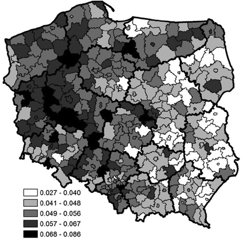
Table 3. Spatial model estimates, balanced panel: n = 379, T = 144, N = 54,576.
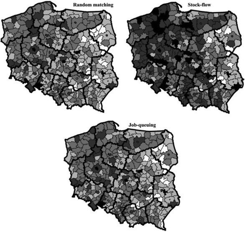
Table 4. Random matching, stock-flow matching, and job-queuing model estimates panel non-spatial models.
Table 5. Comparison tests for spatial models, balanced panel: n = 379, T = 144, N = 54,576.
Figure 4. Local specific influence on the outflow from unemployment to employment (fixed effects).
Note: The darker the region, the stronger the influence on the outflow from unemployment to employment.Source: Own elaborations based on public employment offices data.