Figures & data
Figure 1. More regional trade.
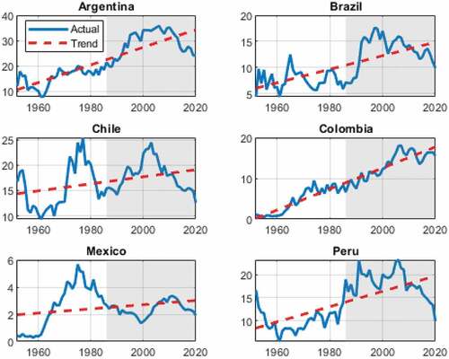
Figure 2. Improved macroeconomic outcome.
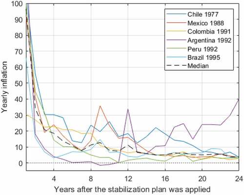
Table 1. Deeper financial integration
Table 2. Higher exchange rate correlations
Table 3. Stronger business cycles correlations
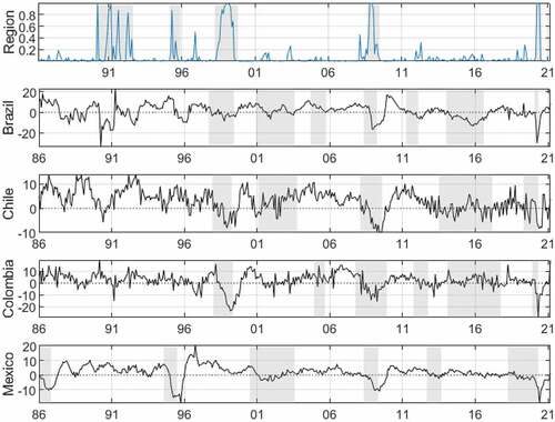
Figure 3. Regional recession probabilities.
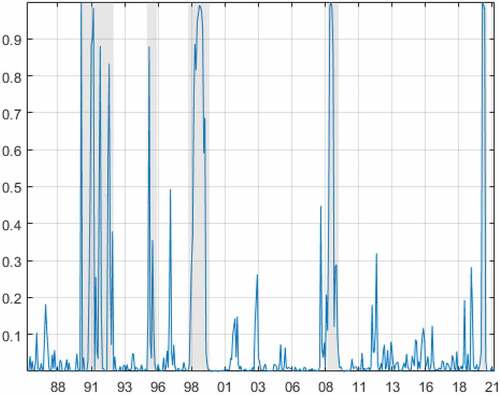
Figure 4. Industrial production yearly growth rates and regional recessions.
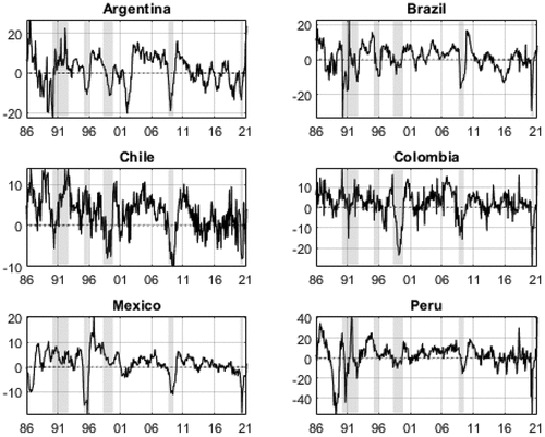
Figure 5. US financial conditions index.
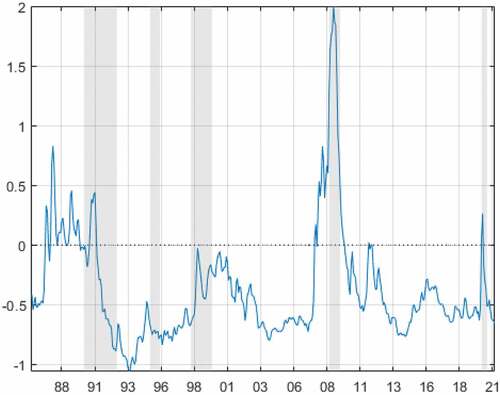
Figure 6. Total connectedness (%), 5 year rolling window.
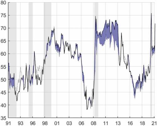
Figure 7. Net group connectedness (%), 5 year rolling window.
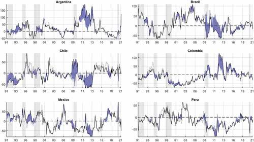
Figure 8. Net pairwise connectedness (%), 5 year rolling window.
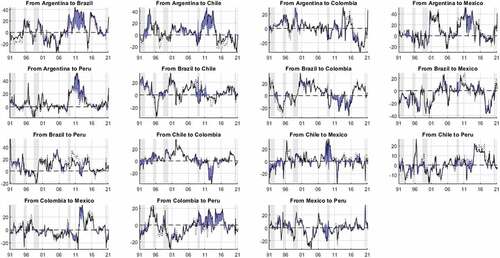
Figure A1. Regional recession probabilities, 12- and 1-month IPI variations.
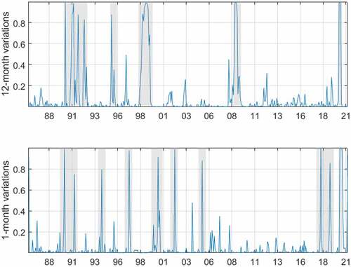
Figure A2. 1-month IPI variations and regional recessions.
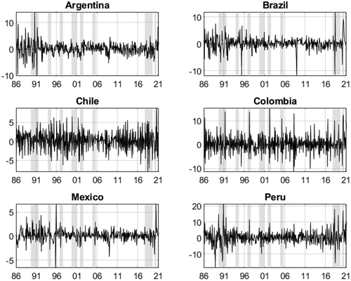
Figure A3. Total connectedness (%), 5 year rolling window, 12- and 1-month IPI variations.
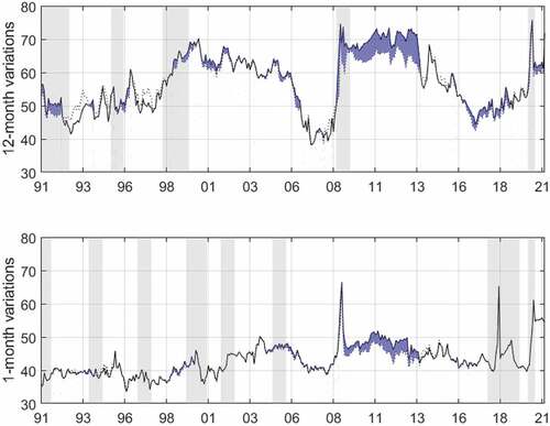
Figure A4. Regional recession probabilities and OCDE recessions.