
Figures & data
Figure 1. Relative levels of income per capita. The big grey circles are FRCs, the big white ones are the CUCs, the big black ones are the STCs and the small ones are the LGCs. Countries below the 45-degree line are better off in the last decade. The position of every country indicates their catching up performance – e.g., at the origin, the relative income of Hong Kong was about 60% off the frontier, in the 2010s it was well over 100%.
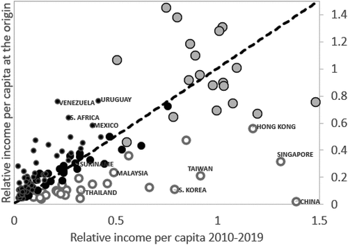
Figure 2. Relative levels of income per capita of CUCs (a), STCs (b), and LGCs (c). The upper solid-line is the frontier. The three thick dashed lines below the frontier are 10-year moving averages of relative income for clusters of countries over 1950s–2010s, 1960s–2010s, and 1970s–2010s. The thin dotted lines in (a) show represent the Asian Nics, the thin solid line the HInonOECDs. The dotted and solid lines in (b) and (c) represent the LICs and fragile countries, respectively.
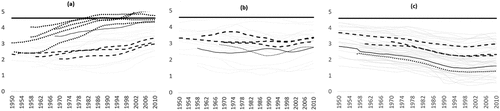
Figure 3. Growth gaps CUCs (a), STCs (b) and LGCs (c). The zero line is the frontier. The other three thick lines are time clusters over 1950s–2010s, 1960s–2010s, and 1970s–2010s. Thin dotted and dashed lines in (a) are the Nics and HInonOECDs, in (b) are the LICs and fragile states.
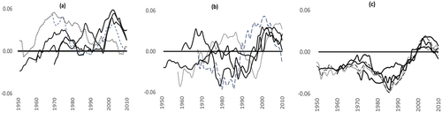
Figure 4. Time-distance to catching-up. FRCs (white), CUCs (grey), STCs (black bordered grey) and LGCs (black). Panel (a) assumes =0%. Panel (b) uses
=2.74%, the average across frontier countries. Other horizontal lines depict the maximum and minimum growth in countries at the frontier.
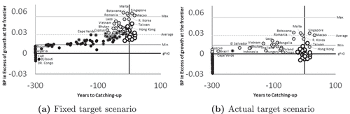
Figure 5. Relative income per-capita in the 1970s and growth gaps over 1970s-2010s. The thicker black line and grey circles are the FRCs. The dotted lines on the top and white circles are the CUCs before (black line) and after subtracting the Nics and HInOECDs (grey line). The dashed lines in the middle correspond to the STCs before (black line) and after subtracting LICs, HInOECDs, and Frags (grey line). The bottom-most dash-dotted lines correspond to the LGCs before and after subtracting LICs and Frags.
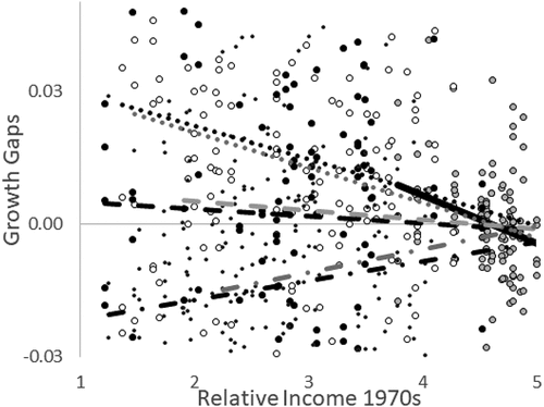
Table 1. Estimates of -convergence. The regressions are based on OLS-pooled regressions, the dependent variable is the growth gap over 1970s–2010s. The explanatory variable is relative income per capita in the 1970s. Decade dummies are included over 1980s-2010s. X-1 and X-2 denote regressions before and after controlling for the Nics, HInOECDs, LICs, and Frags. Sandwich-robust standard errors reported in parentheses. The half-life of adjustment denotes the years needed to eliminate a half of the income gap with the frontier, HLA=
. This is 115 years for the CUCs and 518 for the STCs. The positive
of the LGCs implies that the HLA goes to infinity.
Figure 6. Dispersion of the factors-only share and productivity conditional on the average at the frontier. The thick grey line depicts all countries, the thick black line the FRCs, the dashed line the CUCs, the dotted line the STCs, and the thin line the LGCs. Panel (a) shows the distribution based on a sample of 110 countries over 1970–2019 (24 FRCs, 21 CUCs, 25 STCs, 40 LGCs), panels (b) and (c) are based on an adjusted sample of 59 countries (20 FRCs, 11 CUCs, 12 STCs, 16 LGCs, excluding extreme country cases and adjusting the distribution at the frontier to remain between the 10th-90th percentiles). Panel (c) shows productivity share differences.
Figure 7. Productivity decomposition.
Table 2. Decade-averages of cross-country TFP changes and their components (for the FRCs (1970s): . Results obtained from the software DEAP (Coelli et al., Citation2005.).
