
Figures & data
Table 1. Example of daily case data from JHU.
Figure 1. The framework of the YuTu system to detect space-time clustering of COVID-19.
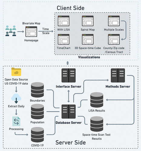
Figure 2. The illustration of space-time scan statistics.
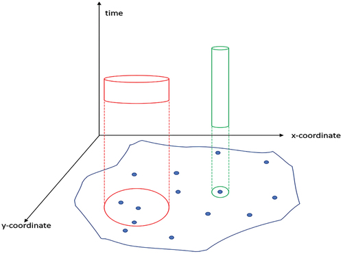
Figure 3. The animated bivariate map of space-time cluster using the space-time scan statistics.
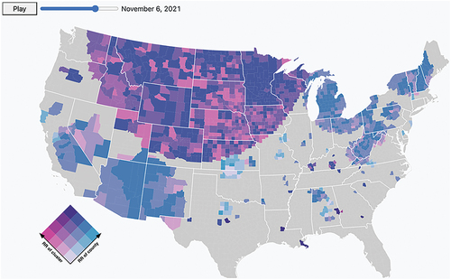
Figure 4. The animated bivariate map of space-time cluster using space-time scan statistic (left) and LISA (right) around 11 August 2022.
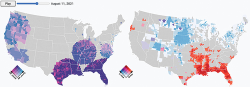
Figure 5. The animated bivariate map of space-time cluster using the space-time scan statistic (left) and a spiral map reflecting the average relative risk for each conterminous US state (right).
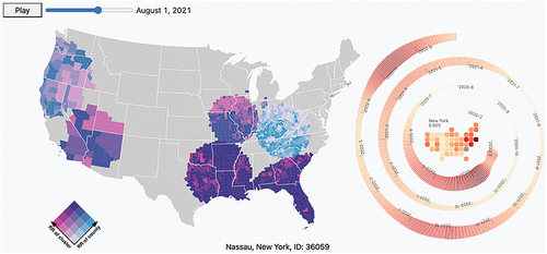
Figure 6. The animated bivariate map of space-time cluster using space-time scan statistic (top) and the TimeChart of different variables (bottom).
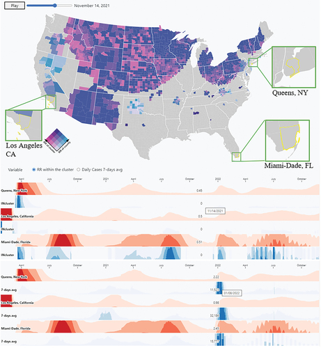
Figure 7. The 3D space-time cubes of clusters with displaying the relative risk of the cluster (left) and relative risk of the county (right).
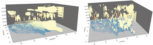
Figure 8. The four waves and their estimated peak dates using the data from WHO coronavirus (COVID-19) dashboard (World Health Organization, Citation2020).
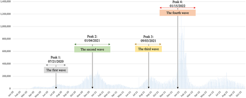
Figure 9. The animated bivariate maps at peak 1 using a) the prospective space-time scan statistics and b) LISA.
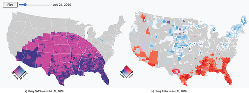
Figure 10. The animated bivariate maps at peak 2 using a) the prospective space-time scan statistics and b) LISA.
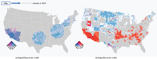
Figure 11. The animated bivariate maps on November 26th, 2020, 40 days before the second peak using a) the prospective space-time scan statistics and b) LISA.
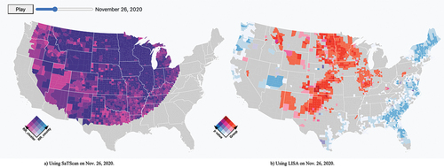
Figure 12. The animated bivariate maps a) & b) during the third peak, and c) & d) the maps on July 24th, 2021.
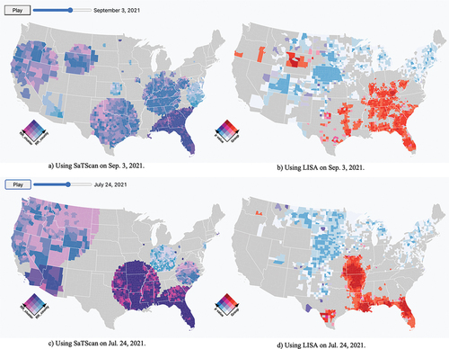
Figure 13. Animated bivariate maps at a) & b) peak 4 and c) & d) the maps on December 16th, 2021, 31 days before peak 4.
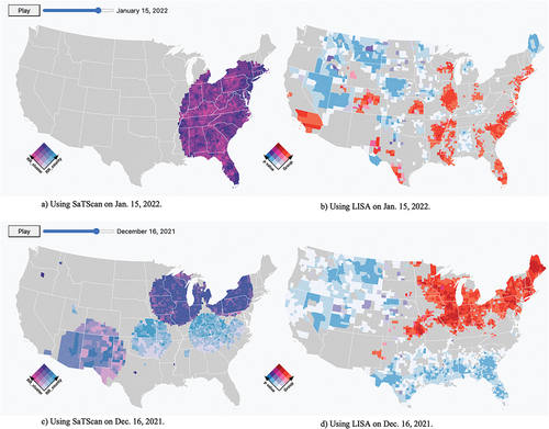
Figure 14. a) & b) The animated bivariate maps of selected three counties on the date that all of them reported most cases c) the TimeChart of 7-day average cases, and d) the timechart of relative risk of clusters.
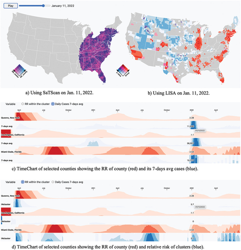
Figure 15. The 3D space-time cubes during the third wave from June 2020 to December 2020 with different threshold of relative risk.
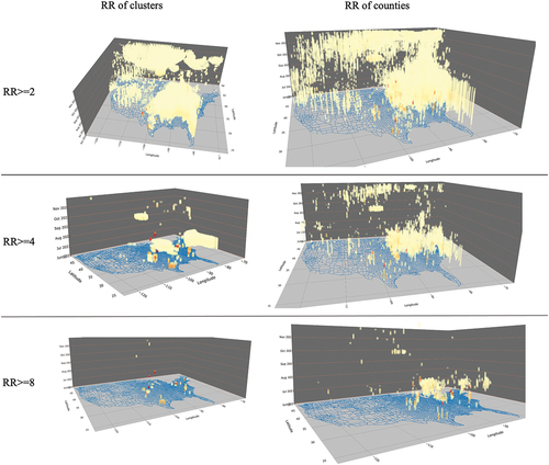
Figure 16. The animated bivariate (left) and spiral map (right) of Wisconsin for 20 January 2022 (the state of Wisconsin is highlighted by a red circle).
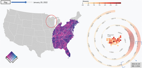
Figure 17. The animated bivariate map of Wisconsin at multiple levels on 1 December 2021. It included scales from a) the county levels with all other states, b) the county level with one state, c) the zip code level, and d) the census tract level.
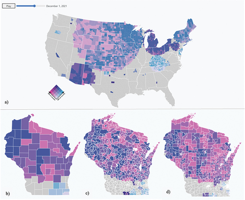
Figure 18. The animated bivariate map of Wisconsin at multiple levels on 5 January 2022. It included scales from a) the county levels with all other states, b) the county level with one state, c) the zip code level, and d) the census tract level.
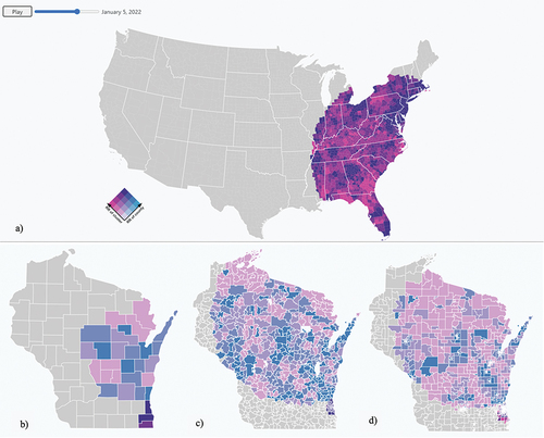
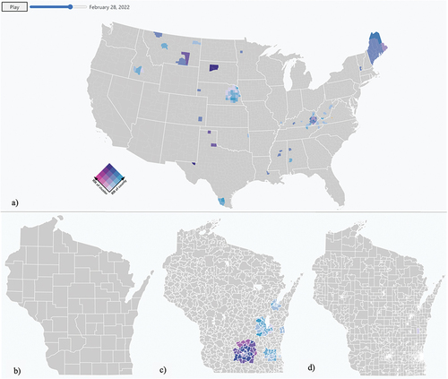
Figure 19. The animated bivariate map of Wisconsin at multiple levels on 28 February 2021. It included scales from a) the county levels with all other states, b) the county level with one state, c) the zip code level, and d) the census tract level.
Data availability statement
The data and codes that support the findings of this study are available on GitHub under the identifier https://github.com/YuLanGeoHealth/US-Covid-19-YuTu.