
Figures & data
Figure 1. The marine clay map (possibility of marine clay map including marine limit), NGU (Citation2022).
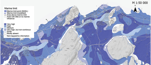
Figure 2. The current radon susceptibility map (NGU, Citation2022).
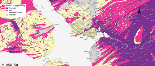
Table 1. Statistical tests and graphs used.
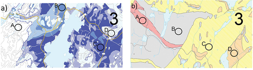
Figure 3. Map alternatives for the marine clay theme.
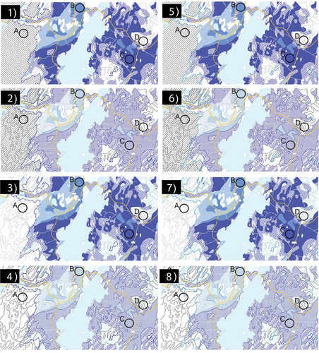
Table 2. Test scheme for the marine clay map.
Figure 4. Map alternatives maps for the radon susceptibility map.
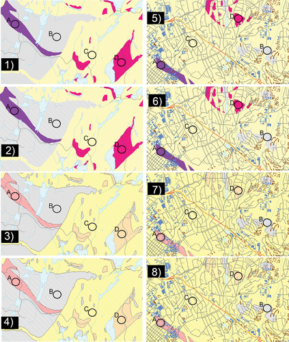
Table 3. Test scheme for the radon susceptibility map.
Figure 5. Graphs showing distribution of participants across a) age, b) gender, c) education level (completed), d) knowledge levels in geology and maps, GIS and cartography (self-reported), e) knowledge of NGU (activities) and f) previous knowledge of the maps in the experiment.
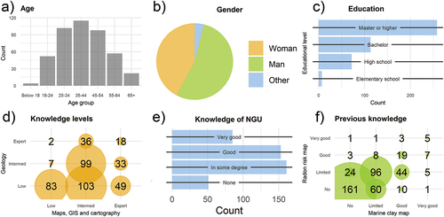
Figure 6. Bar graphs showing the percentage of answers for each category across map alternatives. The correct answers are A: Area above marine limit, B: High possibility for clay, C: Very high possibility, D: Mostly absent.
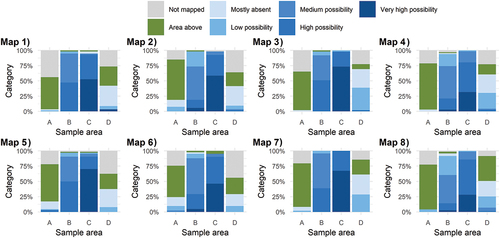
Figure 7. Line graphs showing the set of answers for all participants. The green line represents the percent of participants with the correct set of answers. Categories for possibility of clay (y-axis) are 1: No data, 1: Area above marine limit, 3: Mostly absent, 4: Low, 5: Medium, 6: High, 7: Very high possibility of clay.
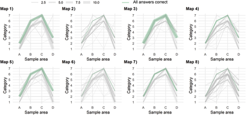
Figure 8. The line graphs show participant uncertainty (blue line) and information uncertainty (orange line) for the eight marine clay map alternatives.
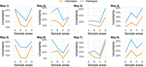
Table 4. Intuitiveness and confidence scores for the marine clay map alternatives.
Figure 9. Bar graphs showing the percentage of answers for each category and sample area across maps. Map alternative 3 has the most correct answers; “low” for sample area A, “not mapped/uncertain” for B, “high” for C and “medium” for D.
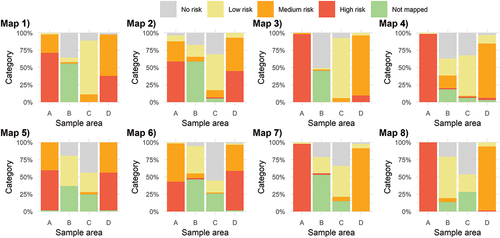
Figure 10. Line graphs showing the percent of participants marking the sample areas with participant (blue line) and information uncertainty (orange line).
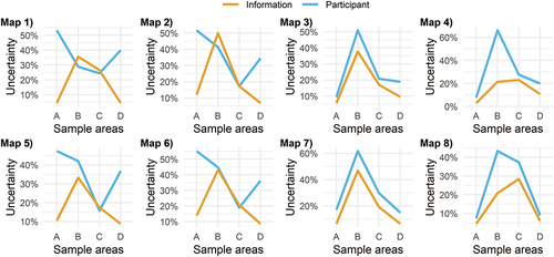
Figure 11. Line graphs showing all answers for the eight alternative radon map alternatives. The green line represents the percent of participants with the correct set of answers. The green line represents the group with all answers correct.
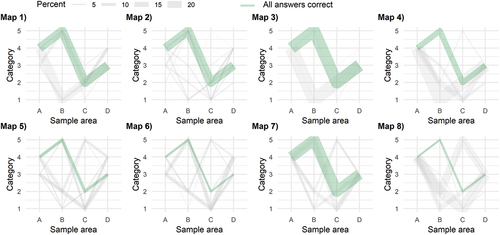
Table 5. Intuitiveness and confidence scores for the radon map alternatives.
Figure 12. Comparison of results for map alternative 3) and map 8) for marine clay.
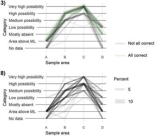
Figure 13. Comparing the answers from map alternative 3) and 6), where map alternative 3) has the overall best test results. For map alternative 6), participants struggle to order sample area for medium (D) and high susceptibility (A), and some also categorize the low susceptibility symbol as uncertain.
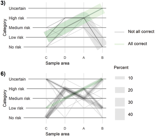
Figure 14. The two maps with the highest map intuitiveness scores.
Data availability statement
The data that support the findings of this study are openly available in Dataverse at https://doi.org/10.18710/FS2QXK.