
Figures & data
Figure 1. Model orography for the full model domain (a, top) and for the Qeqqata municipality (b, bottom). Sea points are given in blue, glacier-free land points in green/brown, and glacier points in white with added surface elevation contour lines. Also shown are the location of five villages and the S5, S6, and S9 weather stations (van de Wal et al. Citation2005). Three ice caps are given by letters A, B, and C and are named Qapiarfiup Sermia, Sukkertoppen Ice Cap, and Tasersiap Sermia, respectively. The fjord Kangerlussuaq is given by the letter D, and Watson River by the letter E. The Kangerlussuaq drainage basin is shown in magenta. The location of surface mass balance stations are given as red dots within two black ellipses
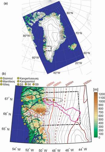
Table 1. List of all available CORDEX ARC-44 GCM-driven simulations used for comparison with the high-resolution run for Greenland
Figure 2. Quantile-quantile plots of monthly mean temperatures (model vs. observations). The global climate model (GCM)-driven historical simulation is shown in red while the ERA-I-driven simulation is shown in blue. Each panel represents a specific location and time period. (a) Sisimiut 1991–2010, (b) Kangerlussuaq 1991–2010, (c) weather station S5 1993–2010, (d) weather station S6 1995–2010, and (e) weather station S9 2000–2010
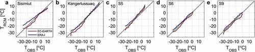
Figure 3. Scatter plot of observed and modeled surface mass balance (SMB) at 180 locations in Qeqqata municipality. An orthogonal linear fit to all data is shown in red together with statistics for the fit in the top left. Note that observations (and model data) cover uneven time periods, ranging from two months to as much as two years
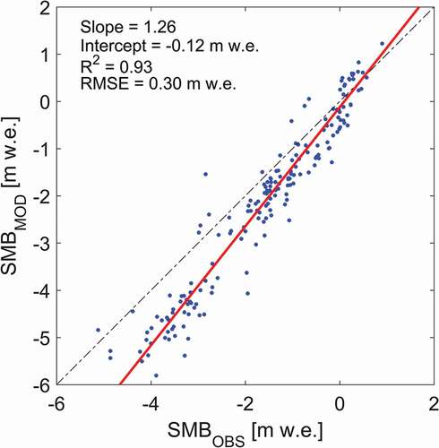
Figure 4. Change in snowmelt (solid lines) and total surface runoff (dashed lines) for the Kangerlussuaq drainage basin for the historical period (black), representative concentration pathway [RCP] 4.5 (blue), and RCP8.5 (red). Also shown, in green, is snowmelt and runoff for the ERA-I-driven run for 1980–2014
![Figure 4. Change in snowmelt (solid lines) and total surface runoff (dashed lines) for the Kangerlussuaq drainage basin for the historical period (black), representative concentration pathway [RCP] 4.5 (blue), and RCP8.5 (red). Also shown, in green, is snowmelt and runoff for the ERA-I-driven run for 1980–2014](/cms/asset/c903a227-de96-4512-aa4f-797da8359a19/uaar_a_1420862_f0004_oc.jpg)
Table 2. Changes in annual mean temperature and precipitation relative to the 1991–2010 historical period for five locations in Qeqqata
Figure 5. Change in annual temperature and precipitation for western Qeqqata. (a, e) representative concentration pathway [RCP] 4.5 2031–2050 change relative to 1991–2010; (b, f) RCP4.5 2081–2100 change relative to 1991–2010; (c, g) RCP8.5 2031–2050 change relative to 1991–2010; and (d, h) RCP8.5 2081–2100 change relative to 1991–2010. See the caption for an explanation of the yellow markers. The white line outlines the ice sheet
![Figure 5. Change in annual temperature and precipitation for western Qeqqata. (a, e) representative concentration pathway [RCP] 4.5 2031–2050 change relative to 1991–2010; (b, f) RCP4.5 2081–2100 change relative to 1991–2010; (c, g) RCP8.5 2031–2050 change relative to 1991–2010; and (d, h) RCP8.5 2081–2100 change relative to 1991–2010. See the Figure 1 caption for an explanation of the yellow markers. The white line outlines the ice sheet](/cms/asset/91469f74-217c-4954-8d76-46c541a2e2c5/uaar_a_1420862_f0005_oc.jpg)
Figure 6. Climate analogs for temperature (a) and precipitation (b) for grid points having an elevation within 200 m compared to the grid point representing Kangerlussuaq using the representative concentration pathway [RCP] 8.5 scenario only. For temperature, the orange color represents areas that for the 1991–2010 historical period have annual mean temperatures close to (±0.25°C) the annual mean temperature of Kangerlussuaq for the RCP8.5 scenario 2031–2050. Similarly, red color is for the RCP8.5 2081–2100 period. For precipitation, the interval is ±25 mm yr−1. The yellow symbols (from north to south) mark the location of Aasiaat, Kangerlussuaq, Nuuk, and Qaqortoq
![Figure 6. Climate analogs for temperature (a) and precipitation (b) for grid points having an elevation within 200 m compared to the grid point representing Kangerlussuaq using the representative concentration pathway [RCP] 8.5 scenario only. For temperature, the orange color represents areas that for the 1991–2010 historical period have annual mean temperatures close to (±0.25°C) the annual mean temperature of Kangerlussuaq for the RCP8.5 scenario 2031–2050. Similarly, red color is for the RCP8.5 2081–2100 period. For precipitation, the interval is ±25 mm yr−1. The yellow symbols (from north to south) mark the location of Aasiaat, Kangerlussuaq, Nuuk, and Qaqortoq](/cms/asset/92847bf3-eda0-42bd-afb1-52bec04a2931/uaar_a_1420862_f0006_oc.jpg)
Figure 7. Change in precipitation for model glacier grid points in Qeqqata using the 5.5 km simulation (a, b) compared with the ensemble median for the 50 km CORDEX Arctic runs (c, d). (a, c) representative concentration pathway [RCP] 8.5 2031–2050 change relative to 1991–2010; (b, d) RCP8.5 2081–2100 change relative to 1991–2010. The Kangerlussuaq drainage basin is shown in magenta. See the caption for an explanation of the yellow markers
![Figure 7. Change in precipitation for model glacier grid points in Qeqqata using the 5.5 km simulation (a, b) compared with the ensemble median for the 50 km CORDEX Arctic runs (c, d). (a, c) representative concentration pathway [RCP] 8.5 2031–2050 change relative to 1991–2010; (b, d) RCP8.5 2081–2100 change relative to 1991–2010. The Kangerlussuaq drainage basin is shown in magenta. See the Figure 1 caption for an explanation of the yellow markers](/cms/asset/d15753fd-639e-4285-85eb-52ff78a8ecd9/uaar_a_1420862_f0007_oc.jpg)
Figure 8. Change in surface mass balance for model glacier grid points in Qeqqata. (a) Representative concentration pathway [RCP] 4.5 2031–2050 change relative to 1991–2010; (b) RCP4.5 2081–2100 change relative to 1991–2010; (c) RCP8.5 2031–2050 change relative to 1991–2010; and (d) RCP8.5 2081–2100 change relative to 1991–2010. The Kangerlussuaq drainage basin is shown in magenta. See the caption for an explanation of the yellow markers
![Figure 8. Change in surface mass balance for model glacier grid points in Qeqqata. (a) Representative concentration pathway [RCP] 4.5 2031–2050 change relative to 1991–2010; (b) RCP4.5 2081–2100 change relative to 1991–2010; (c) RCP8.5 2031–2050 change relative to 1991–2010; and (d) RCP8.5 2081–2100 change relative to 1991–2010. The Kangerlussuaq drainage basin is shown in magenta. See the Figure 1 caption for an explanation of the yellow markers](/cms/asset/63fb5250-e066-4a5b-afe1-836771089661/uaar_a_1420862_f0008_oc.jpg)
Figure 9. Glacial retreat in Qeqqata for the representative concentration pathway [RCP] 8.5 2081–2100 scenario relative to the 1991–2010 historical period, assuming that changes in ice flow are negligible and that the area was in equilibrium during the 1991–2010 reference period. Nonglacier grid cells during the historical period are shown in transparent green/brown colors. Glacier grid cells during the historical period that become nonglacier during the RCP8.5 scenario are shown in nontransparent green/brown colors. For grid cells that are glacier during all of the scenario period, the magenta/blue color map represents the change in elevation, while the contour lines give the elevation at the end of the 21st century. See the caption for an explanation of the yellow markers
![Figure 9. Glacial retreat in Qeqqata for the representative concentration pathway [RCP] 8.5 2081–2100 scenario relative to the 1991–2010 historical period, assuming that changes in ice flow are negligible and that the area was in equilibrium during the 1991–2010 reference period. Nonglacier grid cells during the historical period are shown in transparent green/brown colors. Glacier grid cells during the historical period that become nonglacier during the RCP8.5 scenario are shown in nontransparent green/brown colors. For grid cells that are glacier during all of the scenario period, the magenta/blue color map represents the change in elevation, while the contour lines give the elevation at the end of the 21st century. See the Figure 1 caption for an explanation of the yellow markers](/cms/asset/0aa518e5-6c1d-4752-b303-7944316637c7/uaar_a_1420862_f0009_oc.jpg)