Figures & data
Figure 1. Map of the study area with ice-sheet catchments (Watson River catchment in red, Tasersiaq catchment in dark blue). Grey lines give the surface elevation above sea level. Background: Landsat imagery from July and August 2017. Tasersiap Sermia is also known as “Qaarajuttoq Ice Cap.“
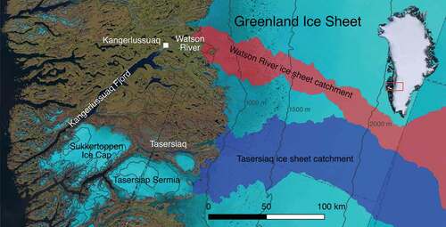
Figure 2. Average June–July–August air temperature recorded in Kangerlussuaq. The solid and dotted grey lines illustrate the 1949–2017 period average and standard deviation, respectively. Solid black lines give decadal averages. The ranking of the ten highest values is indicated at the top of the figure
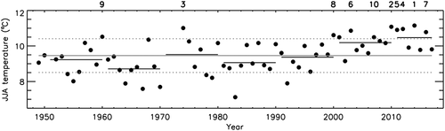
Table 1. Watson River discharge statistics for the 2006–2017 observational period. Values in brackets list rankings. Bold text signifies a top-three ranking
Figure 3. (A) Annual totals of Watson River discharge plotted against Tasersiaq discharge. (B) Annual totals of Watson River discharge plotted against annual sums of T3.4, where T is daily average temperature (above freezing) recorded in Kangerlussuaq. Black dots represent Watson River measurements, and red dots are discharge values reconstructed from the Tasersiaq time series. (C) same as (B), but with temperature T* calculated as the average between daily maximum and minimum temperature. Uncertainty ranges are indicated by error bars. Solid lines represent the best linear fits, and the dashed lines give the root-mean-square error. Discharge values for 2010 and 2012 are labeled with 10 and 12, respectively
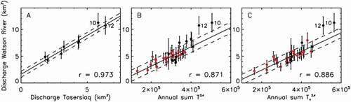
Figure 4. Annual totals of Watson River discharge from direct observations (black), and reconstructed from Tasersiaq discharge (red) and Kangerlussuaq air temperature (blue). The solid and dotted black lines illustrate the 1949–2000 average value and corresponding double standard deviations. Grey lines give the average and double standard deviations for 2001–2017. The ranking of the ten highest values is indicated at the top of the figure. The reconstructed time series of Greenland Ice Sheet meltwater discharge through the Watson River is provided in the supplementary material
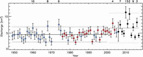
Figure 5. Hourly values of Watson River discharge for May–September 2006–2017 in grey with high-discharge years 2010, 2012, and 2016 plotted in color. The black line gives the 2006–2017 average. September peaks are the result of ice-dammed lake jökullaups
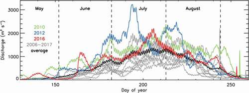
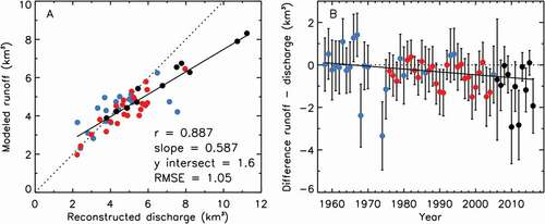
Figure 6. (A) Annual totals of 1958–2016 RACMO2-modeled freshwater runoff from the Kangerlussuaq ice sheet and proglacial catchment plotted against reconstructed Watson River discharge. The dotted line illustrates the 1:1 relation. (B) Difference between ice-sheet runoff and river discharge. Error bars give the Watson River reconstructed discharge uncertainty. Solid lines represent the best linear fits. For color coding, see