Figures & data
Table 1. Baseline patients and tumor characteristics.
Table 2. Summary of treatments.
Table 3. Summary of first line treatments.
Table 4. Differential gene expression between LR patients and EP patients. FC = fold change.
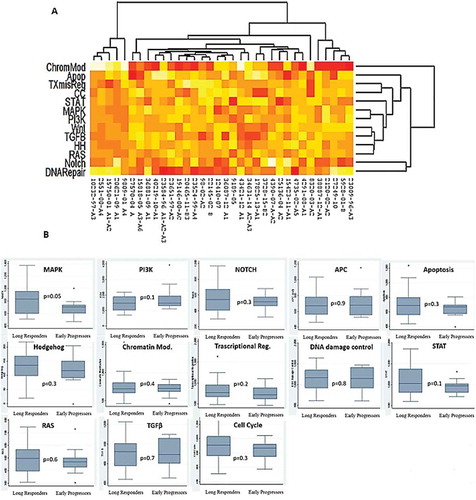
Table 5. Pathway deregulation score in LR patients and EP patients.
Figure 1. Hierarchical clustering based on RNA expression levels of 30 genes out of 770 genes analysed by PanCancer pathways panel. Rows, genes; columns: samples. Expression level of each gene in a single sample was related to its median level across all samples and is depicted according to a colour scale show above. Red and green represented the expression levels above and below the median, respectively.
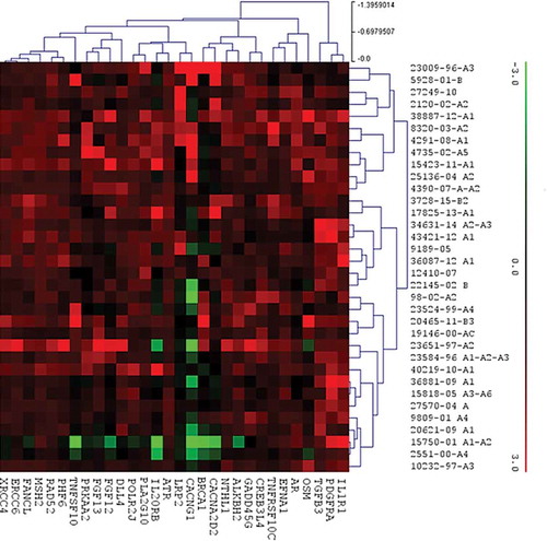
Figure 2. Distribution of the 30 genes differently expressed between the LR and EP groups within the molecular pathways.
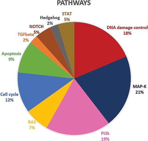
Figure 3. (A) Pathways deregulation score for each tumor sample on the basis of gene expression data. Each row corresponds to a pathway and each column to a sample. Pathways and samples are clustered according to pathways deregulation score. Red colour represents low score, yellow colour high score. (B) Boxplots of pathways deregulation scores. The distribution of Pathifier deregulation scores of each pathways is plotted for LR and EP. The top and the bottom of the box delineate the upper and lower quartile, while the thick line within each box represents the median. Whiskers extend capture all data within two standard deviations of the means.