Figures & data
Figure 1. Relationship between SUVmax and the total number of oncogenic alterations with Pearson correlation coefficient r = 0.27 (p = .005). Left panel shows the scatter plot of all patients (n = 102) with circles represent individual datapoints. Right panel shows the box plot for all patients excluding the group with 6 oncogenic alterations because there was only one patient in that group. The central thick black line indicates the median, and the bottom and top of the rectangle are the 25th (Q1) and 75th (Q3) percentiles. The circles represent outlier SUVmax, defined as either larger than Q3 + 1.5 × IQR or smaller than Q1 – 1.5 × IQR, where IQR = Q3 – Q1 is the interquartile range. The horizontal “whiskers” represent the largest and smallest non-outlier observations in the data set
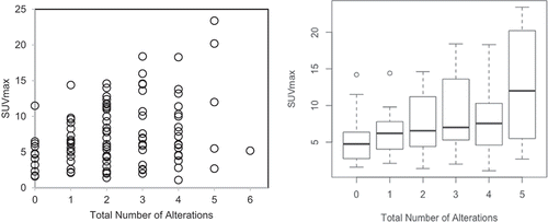
Table 1. Mean SUVmax and number of patients with or without genomic alteration (n = 102)
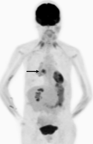
Figure 2. FDG PET projection image in a patient with adenocarcinoma of the lung. The biopsied right lung hypermetabolic lesion had SUVmax of 20.2 (arrow). This lesion had a total number of main oncogenic alterations of 5
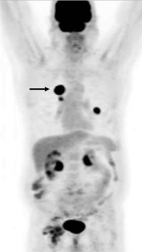
Figure 3. FDG PET projection image in a patient with adenocarcinoma of the lung. The biopsied right lung hypermetabolic lesion had SUVmax of 4.9 (arrow). This lesion had a total number of main oncogenic alterations of 0