
Figures & data
Figure 1. Bladder carcinoma data sets assessed at the level of individual gene expression and pathway activation. (A) principal component analysis (PCA) plot for transcriptomes from data sets obtained in Russia (red dots) and Canada (black dots), at the level of individual gene expression. (B) PCA plot at the level of molecular pathway activation. (C) hierarchical clustering dendrogram of the data sets obtained in Russia (marked white) and Canada (marked blue), at the level of molecular pathway activation.
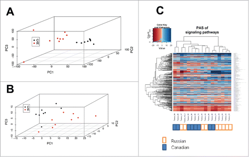
Table 1. Cross-platform comparisons for modeling the data aggregation effect.
Figure 2. Ratio of pathway-related and gene-related correlation coefficients between results obtained using hypothetical methods X and Y, as a function of the median gene number, N, in a pathway for 4 scenarios: (A, blue) – biased expression profile, noisy method Y; (B, red) – biased expression profile, exact method Y; (C, green) – unbiased expression profile, noisy method Y; (D, magenta) – unbiased expression exact method Y. The method X is always condsidered noisy
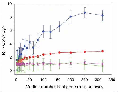
Figure 3. Distributions of values obtained during random trials using 2 different expression profiling methods X (horizontal axis) and Y (vertical axis). Median number of gene products in a pathway is 100. Left column: logCNR for individual gene products, method Y vs method X. Right column: PAS scoring method Y vs method X. Blue dots: scenario A (biased expression profile, noisy method Y). Red dots: scenario B (biased expression profile, exact method Y). Green dots: scenario C (unbiased expression profile, noisy method Y). Magenta dots: scenario D (unbiased expression profile, exact method Y). Method X is always considered noisy.
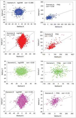
Table 2. Transcriptomic and proteomic data sets used to assess data aggregation effects.
Figure 4. Correlation between transcriptomic data obtained for the same representative renal carcinoma specimen using the Illumina HT12 (ordinate) and CustomArray (abscissa) microarray platforms. The panels represent (from left to right) correlation between the oligonucleotide expression tags, correlations at the level of individual genes, and correlation at the level of molecular pathways.
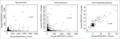
Figure 5. Dependence of the data aggregation effect (R) on the minimal expression profile bias β. Left panel: transcriptome-to-transcriptome comparisons for the same samples using different experimental platforms. Right panel: transcriptome-to-proteome comparisons for the same samples. The Cg threshold between the samples low and considerably correlated at the gene level was chosen as equal to 0.25; blue dots: low correlation at gene product level; red dots: considerable correlation at gene product level.
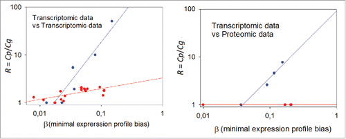
Figure 6. Data aggregation effect R for 5 pathway activation scoring methods (OncoFinder (OF), TAPPA, TBScore (TB), Pathway-Express (PE), and SPIA) on the renal carcinoma data set.
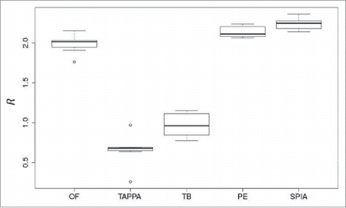
Figure 7. Distribution of Euclidean distances between the PAS vectors for different sample types taken from the MAQC data set (marked as B, C, and D) using different methods of PAS scoring. A unimodal distribution indicates lack of significant difference between within-platform and cross-platform distances. A bimodal distribution means that the cross-platform PAS distance (upper mode in the violin plots) is essentially higher that the within-platform distance. See text for descriptions of the different scoring methods.
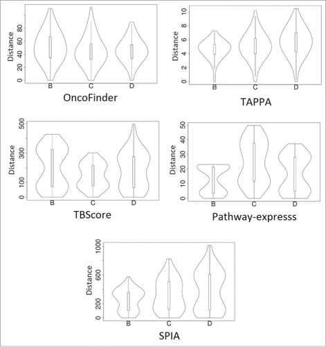
Table 3. Comparison of PAS scoring methods using functional and statistical tests.