Figures & data
Table 1. Baseline characteristics of study population.
Figure 1. Flowchart of case selection. AE: acute exacerbation; COPD: chronic obstructive pulmonary disease; CAT: COPD assessment test; mMRC: modified Medical Research Council.
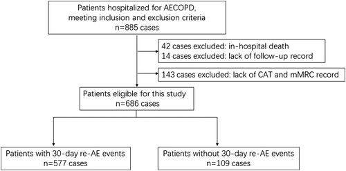
Table 2. Identification of predicted variables for nomogram.
Figure 2. The nomogram for predicting 30-day re-AE events in patients hospitalized for AECOPD. To use the nomogram for predicting an individual patient’s risk, we firstly locate the status of each variable on the horizontal scale, and draw a line vertically to the upward point line to determine the corresponding points. Then, we sum up the points of all variables and locate the total points on the total point scale. Finally, we draw a vertical line from the dot of the total point scale to the bottom risk scale and calculate the risk of 30-day re-AE. AECOPD: acute exacerbation of chronic obstructive pulmonary disease; CAT: COPD assessment test; ICU: intensive care unit; pre-AE: acute exacerbation in the previous year.
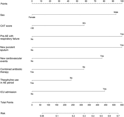
Table 3. Predictive risk points of each variable in the nomogram.
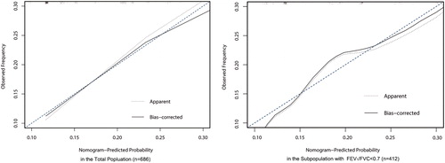
Figure 3. Calibration plot of the nomogram in total and subgroup population. For an individual patient, nomogram-predicted probability of 30-day re-exacerbation is plotted on the x-axis; observed probability is plotted on the y-axis. The apparent line represents the actual outcome of patients from the dataset. The bias-corrected line is calculated by the bootstrap algorithm with 1000 resamples. The lower deviation between the apparent line, the bias-corrected line and the diagonal line at 45° indicates the higher predictive accuracy of this nomogram.