Figures & data
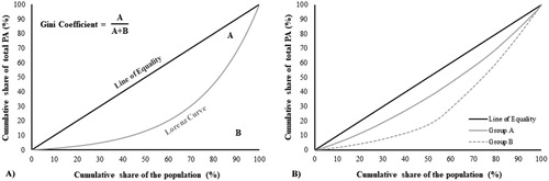
Figure 1. Illustration of physical activity inequality definition and an example with real data. 1A) The graph represents the cumulative percentage of the population on the x axis and the cumulative percentage of the share of the population’s total physical activity (e.g. steps/day) on the y axis. The diagonal line (line of equality) represents complete equality and the gray line represents the Lorenz curve. The Gini coefficient is calculated as the ratio of the area that lies between the line of equality and the Lorenz curve (A) by the total area under the line of equality (A + B). The further the Lorenz curve lies from the diagonal line, the higher the inequality. 1B) Representation of the Lorenz curves from two groups of patients with COPD. Group A: n = 78, Ginicoef: 0.190; Group B: n = 78, Ginicoef: 0.396 (data used to construct the curves are available in the supplementary spreadsheet file).