Figures & data
Table 1. General characteristic of study cohorts.
Figure 1. Panel of representative laboratory measurements in AECOPD patients and COPD + CAP patients. The data are presented as median (P25quartile, P75 quartile). *p < 0.05; **p < 0.01.
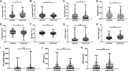
Table 2. Results of routine blood examination and coagulation function at admission.
Table 3. Results of T lymphocytes, inflammatory biomarkers and blood biochemistry examination at admission.
Table 4. Results of blood gas analysis at Admission.
Table 5. Phenotypes and endotypes of COPD in two groups.
Figure 2. Correlations between laboratory measurements in total subjects. Biomarkers in total subjects with absolute value of correlation coefficient greater than 0.4 and P value less than 0.05 were shown. Each edge represents a correlation colored by positive correlation(red) and negative correlation(blue). Depth of the color represents the strength of correlation. The darker color represents stronger correlation.
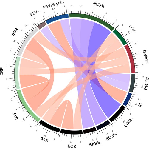
Figure 3. Correlations between laboratory measurements in AECOPD patients. Biomarkers in AECOPD patients with absolute value of correlation coefficient greater than 0.4 and P value less than 0.05 were shown. Each edge represents a correlation colored by positive correlation(red) and negative correlation(blue). Depth of the color represents the strength of correlation. The darker color represents stronger correlation.
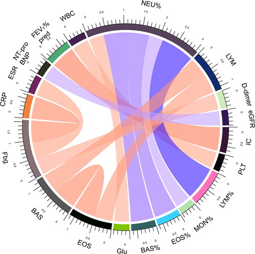
Figure 4. Correlations between laboratory measurements in COPD + CAP patients. Biomarkers in COPD + CAP patients with absolute value of correlation coefficient greater than 0.4 and P value less than 0.05 were shown. Each edge represents a correlation colored by positive correlation(red) and negative correlation(blue). Depth of the color represents the strength of correlation. The darker color represents stronger correlation.
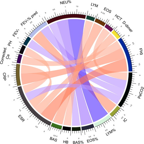
Figure 5. Helpful biomarkers for distinguishing COPD + CAP from AECOPD (as control) by logistic regression analysis. The filled squares and solid lines represent OR values and 95% CIs. Continuous variables were categorized by cutoff point.
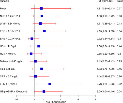
Figure 6. Receiver operating curve and AUC of helpful biomarkers for distinguishing COPD + CAP from AECOPD (as control). AUC: area under the curve. Variables were categorized by cutoff point.
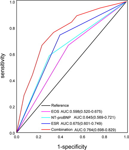
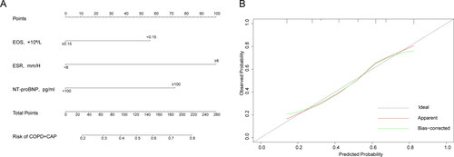
Figure 7. Nomogram for distinguishing COPD + CAP from AECOPD and the calibration curve. To use a nomogram(A), draw a vertical line to identify the corresponding points of each variable according to its status. Then sum the points of all variables to find the position on the total points axis. Draw a vertical line between the position and the lower line of the nomogram, you can determine the probability of COPD + CAP at the lower line of the nomogram. “Ideal” line in the calibration curve(B) represents the predicted probability is completely consistent with the observed probability. “Apparent” line represents the theoretical result. “Bias-corrected” line represents corrected result of actual phenomenon.