
Figures & data
Table 1. Studies from which we collected sRNA-mRNA interacting pairs
Table 2. Training and benchmarking data characteristics
Table 3. Parameters per ML method used for grid-search CV
Table 4. Final benchmarking dataset used for all three programs. The table lists the genome accession used, the number of sRNAs, the number of mRNAs, the number of confirmed interacting pairs (P), and the number of pairs considered non-interacting (N) per bacterial species (from top to bottom: E. coli, Synechocystis and P. multocida)
Table 5. 10-fold CV AUROC for the best model per classifier trained on sequence-derived features (trinucleotide frequency difference and tetra-nucleotide frequency difference) of 1490 sRNA-mRNA pairs
Figure 1. ROC curve for the three programs on Escherichia coli data. The plot shows the sensitivity (also called recall or true positive rate) as a function of the false-positive rate (FPR). The dash line indicates random classifier performance.
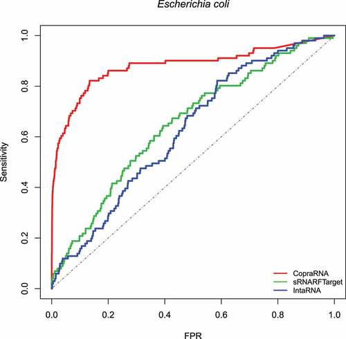
Figure 2. ROC curve for the three programs on Synechocystis data. The plot shows the sensitivity (also called recall or true positive rate) as a function of the false-positive rate (FPR). The dash line indicates random classifier performance.
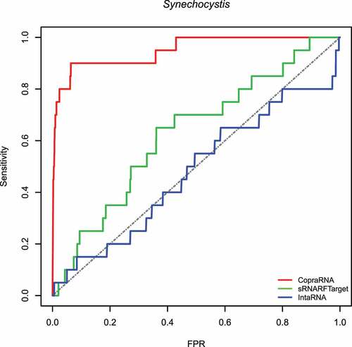
Figure 3. ROC curve for the three programs on Pasteurella multocida data. The plot shows the sensitivity (also called recall or true positive rate) as a function of the false-positive rate (FPR). The dash line indicates random classifier performance.
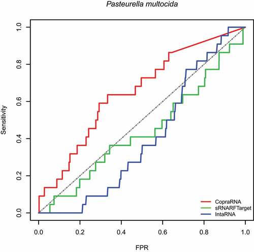
Table 6. AUROC obtained on each bacterial species included in the benchmark for all three programs assessed
Figure 4. Rank (lower = better) distribution of 102 Escherichia coli confirmed interacting pairs. The violin plot for each program shows the data density for different rank values and the horizontal line inside each box indicates the median rank of confirmed interacting pairs.
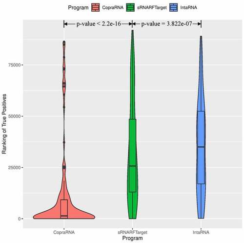
Figure 5. Rank (lower = better) distribution of 22 Synechocystis confirmed interacting pairs. The violin plot for each program shows the data density for different rank values and the horizontal line inside each box indicates the median rank of confirmed interacting pairs.
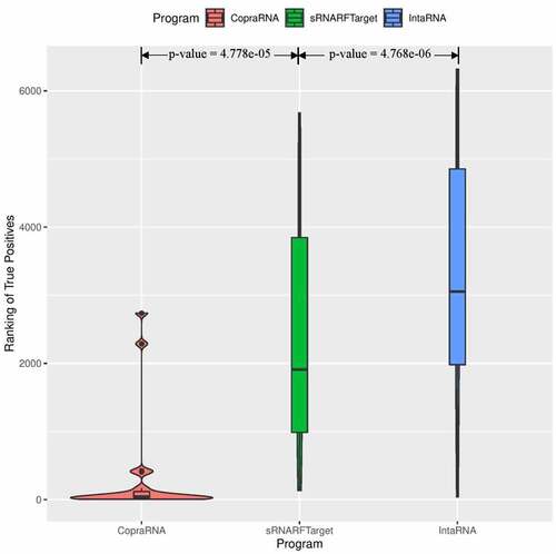
Figure 6. Rank (lower = better) distribution of 20 Pasteurella multocida confirmed interacting pairs. The violin plot for each program shows the data density for different rank values and the horizontal line inside each box indicates the median rank of confirmed interacting pairs.
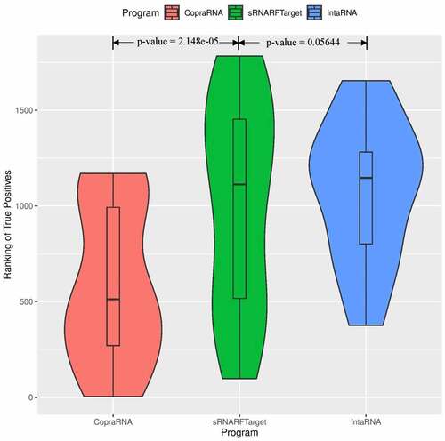
Figure 7. Percentage of Escherichia coli confirmed interacting sRNA-mRNA pairs (recall) as a function of percentage top predicted interacting pairs.
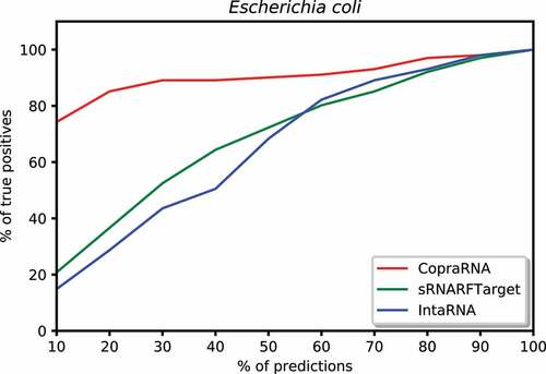
Figure 8. Percentage of Synechocystis confirmed interacting sRNA-mRNA pairs (recall) as a function of percentage top predicted interacting pairs.
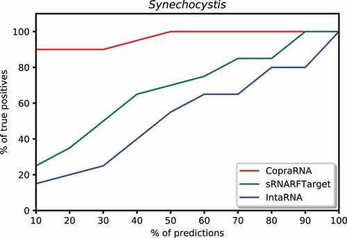
Figure 9. Percentage of Pasteurella multocida confirmed interacting sRNA-mRNA pairs (recall) as a function of percentage top predicted interacting pairs.
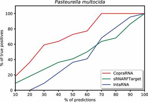
Figure 10. ROC curve for sRNARFTarget and IntaRNA on E. coli and Salmonella data. The plot shows the sensitivity (also called recall or true positive rate) as a function of the false-positive rate (FPR). The dash line indicates random classifier performance.
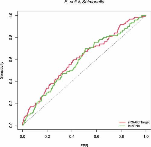
Figure 11. Rank (lower = better) distribution of 119 E. coli and Salmonella confirmed interacting pairs. The violin plot for each program shows the data density for different rank values and the horizontal line inside each box indicates the median rank of confirmed interacting pairs.
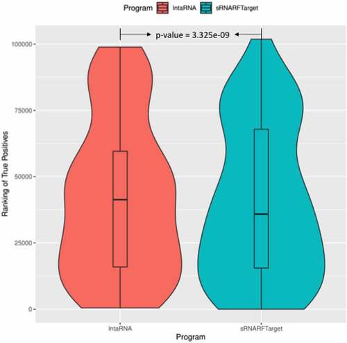
Table 7. Execution time for sRNARFTarget and IntaRNA on benchmarking data. Both programs were run on an Intel Core i7 (2.2 GHz) with 4 cores and 16 GB of RAM computer
Table 8. CopraRNA web server job execution time on selected sRNA for each bacterium on the benchmark data
Table 9. Sporulation-associated genes in sRNARFTarget top 10% predicted RCd1 targets. Smaller ranks indicate higher confidence of sRNARFTarget in the corresponding target prediction