
Figures & data
Figure 1. Study setup and expression variance analysis. (A) the data set consists of 55 mice, 28 of these were treated and 27 serve as a control group. Two samples were taken from each of the 55 mice – one from the skin of the left ear and one from the skin of the right ear. For the treated mice the left ear was exposed to NTP, and the samples were obtained at 5 different timepoints (0 minutes, 10 minutes, 30 minutes, 60 minutes, and 120 minutes). (B) the number of processed reads and the proportion aligned to the mouse genome. The bottom annotation indicates the sample type and timepoint. (C) Principal Component Analysis of the miRNA expressions. Outliers are excluded for visualization purpose. Colouration is done according to the five timepoints. Shapes indicate the treated and untreated mice. (D) Heatmap of the top 100 expressed miRNAs (log10) with hierarchical clustering. The top annotation rows provide information regarding the treatment status, the sample type and the timepoint. (E) Scatter plot of the FC (log2) of each timepoint to the minimal timepoint (0 minutes) versus the expression of each miRNA (log10). Coloured according to the five timepoints. The shapes correspond to treated and untreated mice. We differentiate between regulated and deregulated (FC ≥ 1.5 or FC ≤ 1/1.5) miRNAs according to the horizontal dashed lines. We assume that miRNA expressions left of the empirically determined threshold are dominated by noise. (F) Principal Variance Component Analysis of the miRNA expressions (log10). ‘Residual’ corresponds to the variance not covered by the properties.
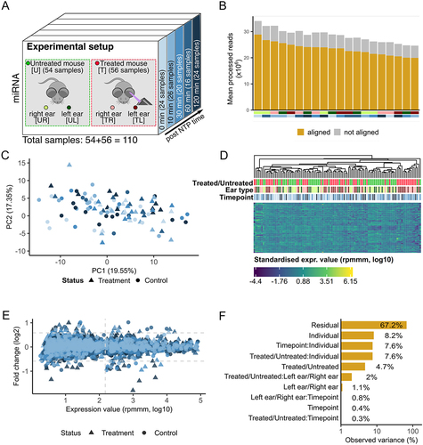
Figure 2. Group-based comparisons of miRNA expression. (A) the experimental setup with additional arrows indicating the comparisons we are investigating. (B) T versus U mice comparison. The effect size plots are located on the left side and Volcano plots on the right side of the different boxes with the comparisons from Figure 2a. The upper plots include all samples over all timepoints and the comparison for only the timepoint 120 minutes is depicted in the lower part of the box. Deregulated miRNAs with effect size ≥ 0.5 or p-value <0.05 (t-test, -log10) are highlighted in dark grey. (C) TL versus TR mice comparison analogous to Figure 2b. (D) TL versus UL mice comparison analogous to Figure 2b. (E) Violin plot for mmu-miR-144-3p. Each violin corresponds to a sample type and the horizontal lines indicate the medians. The black arrow marks the violin corresponding to the treated ear. (F) Violin plot for mmu-miR-223-3p analogous to Figure 2e.
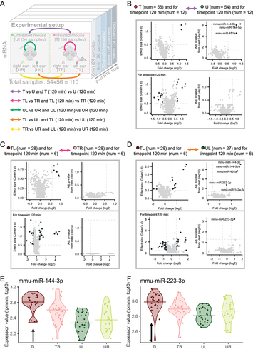
Figure 3. Group-based comparisons and time evolution of miRNA expression for mmu-miR-142a-5p, mmu-miR-144-3p, mmu-miR-144-5p, mmu-miR-223-3p and mmu-miR-451a. (A) Heatmaps of adjusted p-value from t-test (−log10), FC (log2) and AUC for manually selected comparisons. A p-value of under 0.05 is indicated by a *, of under 0.01 by ** and under 0.001 by ***. A deregulation of miRNAs by a factor of 1.5 is marked with a * and a factor of 2 with **. An AUC value between 0.7 and 0.8 or between 0.3 and 0.2 is marked by *, between 0.8 and 0.9 or between 0.2 and 0.1 is marked by ** and higher than 0.9 or lower than 0.1 is marked by ***. Promising comparisons between the treated and untreated mice are highlighted in red on the left side. (B) Heatmap plot of Spearman correlation between miRNA expressions and timepoints for the samples of the treated and untreated mice. Only miRNAs with a correlation lower than − 0.3 or higher than 0.3 are depicted. Correlation values are highlighted as negative correlated if the correlation values are < −0.3 and positive correlated if the correlation values are > 0.3. (C) Heatmap plot of Spearman correlation between miRNA expressions and timepoints for the samples of the four sample types analogous to Figure 3b. (D) Box plot over all five timepoints for mmu-miR-144-3p for each of the four sample types. The ends of the box denote the 25th percentile and the 75th percentile and the median is given as a horizontal line. The solid lines show a polynom of second degree fitted to the expression values using least-squares. Arrows indicate the overall trend of samples from treated (red) and untreated (green) mice. (E) Box plot for mmu-miR-223-3p analogous to Figure 3d. (F) Box plot for mmu-miR-451a analogous to Figure 3d. (G) Box plot for mmu-miR-142a-5p analogous to Figure 3d.
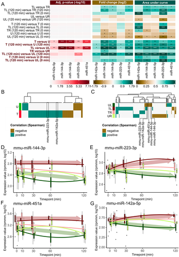
Figure 4. Connected signalling pathways and miRNA occurrence in human cells. (A) Heatmap of adjusted p-value from Hypergeometric test (−log10) for pathways originating from the KEGG database related to the five upregulated miRNAs [Citation30]. We use predicted union and a pathway is shown if it has at least two significant miRNAs. One or more asterisks indicate the significance (cf. Figure 3a). (B) a multiple sequence alignment for the miRNAs mmu-miR-144-3p, mmu-miR-142a-5p and mmu-miR-223-3p. Asterisks highlight the region for which the miRNAs exhibit the same base. (C) an alignment of the human and mouse related miRNA for the five significantly upregulated miRNAs. Asterisks highlight the region for which the miRNAs exhibit the same base. (D) Violin plot for hsa-miR-144-3p from a previously published data set [Citation31]. Every violin depicts normalized (DESeq2) expression data for specific cell types. Cell types are sorted descending by their medians, are cut after the first 50 and grouped into cell classes highlighted by different colours. Higher values indicate a more frequent occurrence of the miRNA in the respective cell type. (E) Violin plot for hsa-miR-223-3p [Citation31]. (F) Violin plot for hsa-miR-451a [Citation31]. (G) Violin plot for hsa-miR-142-5p [Citation31].
![Figure 4. Connected signalling pathways and miRNA occurrence in human cells. (A) Heatmap of adjusted p-value from Hypergeometric test (−log10) for pathways originating from the KEGG database related to the five upregulated miRNAs [Citation30]. We use predicted union and a pathway is shown if it has at least two significant miRNAs. One or more asterisks indicate the significance (cf. Figure 3a). (B) a multiple sequence alignment for the miRNAs mmu-miR-144-3p, mmu-miR-142a-5p and mmu-miR-223-3p. Asterisks highlight the region for which the miRNAs exhibit the same base. (C) an alignment of the human and mouse related miRNA for the five significantly upregulated miRNAs. Asterisks highlight the region for which the miRNAs exhibit the same base. (D) Violin plot for hsa-miR-144-3p from a previously published data set [Citation31]. Every violin depicts normalized (DESeq2) expression data for specific cell types. Cell types are sorted descending by their medians, are cut after the first 50 and grouped into cell classes highlighted by different colours. Higher values indicate a more frequent occurrence of the miRNA in the respective cell type. (E) Violin plot for hsa-miR-223-3p [Citation31]. (F) Violin plot for hsa-miR-451a [Citation31]. (G) Violin plot for hsa-miR-142-5p [Citation31].](/cms/asset/5fa24c48-6170-4120-aef8-0e538dce4b85/krnb_a_2361571_f0004_oc.jpg)
Figure 5. Single-cell quality assessment and associated gene miRNA expression changes. (A) UMAP of single-cell PBMC data coloured by cell type. (B) Cell type proportions in the data set (total: 5794 cells). (C) a graph network to display some of the target genes for miRNAs mmu-miR-223-3p and mmu-miR-451a provided by mirTarbase [Citation27]. The target genes are selected by intersecting all target genes with the significant genes (p-value <0.05) from the single-cell data set. (D) Heatmap plot shows scaled FCs (scaled by the maximal absolute FC in the bulk and single-cell data, respectively) for the miRNAs (bulk data set) and some of their target genes (single-cell data set) from Figure 5c. Red yields an up- and blue a downregulation.
![Figure 5. Single-cell quality assessment and associated gene miRNA expression changes. (A) UMAP of single-cell PBMC data coloured by cell type. (B) Cell type proportions in the data set (total: 5794 cells). (C) a graph network to display some of the target genes for miRNAs mmu-miR-223-3p and mmu-miR-451a provided by mirTarbase [Citation27]. The target genes are selected by intersecting all target genes with the significant genes (p-value <0.05) from the single-cell data set. (D) Heatmap plot shows scaled FCs (scaled by the maximal absolute FC in the bulk and single-cell data, respectively) for the miRNAs (bulk data set) and some of their target genes (single-cell data set) from Figure 5c. Red yields an up- and blue a downregulation.](/cms/asset/7fd737cb-c0d3-43a2-97c8-510ea4c49a7b/krnb_a_2361571_f0005_oc.jpg)
Supplemental Material
Download Zip (332.5 KB)Data availability statement
All sequencing data are available for download from NCBI’s Gene Expression Omnibus [Citation58] via GEO Series accession number GSE236802 (https://www.ncbi.nlm.nih.gov/geo/query/acc.cgi?acc=GSE236802)