Figures & data
Figure 1. The impact of early life stress on transcriptional response to LPS. (a) Multidimensional scaling analysis illustrating the very significant effect of exposure to 20 µg/ml LPS on the entire gill transcriptome (78,229 putative loci) of fish from all stress treatment groups. (b) Heat map illustrating the expression of all genes for which a significant interaction between acute and/or chronic stress and LPS response was identified (516 genes), in all baseline and LPS-exposed fish. Data presented are read counts for each individual normalised by library size, and by mean expression for each gene. Hierarchical clustering was performed using an Euclidian distance metric.
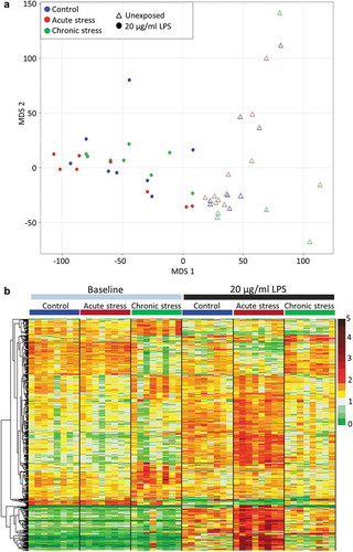
Figure 2. Visualisation of the Atlantic salmon gill methylome. (a) Average CpG methylation percentage in gene bodies and within the 1.5 Kb upstream and downstream of the transcription start (TSS) and termination sites (TTS) for each stress group. (b-c) Histograms of average methylation distribution within gene bodies and putative promoter regions. (d) Heat map illustrating percentage methylation for all differentially methylated CpGs identified in response to acute and/or chronic stress (logistic regression q < 0.01 and |ΔM|>20%, and t.test p < 0.01) in all individuals at the baseline time-point, using unsupervised hierarchical clustering.
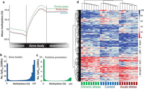
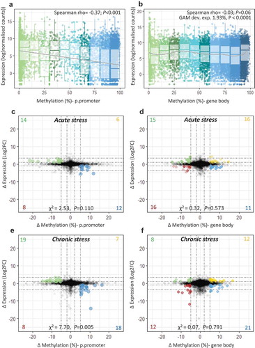
Figure 3. Integration of transcriptome and methylome. Scatterplot and boxplot displaying mean gene expression and mean DNA methylation for (a) putative promoters and (b) gene bodies in control fish (n = 8), with lines representing a linear trend (A) and a smoothed GAM curve (B). (c-f) Starburst plots displaying the effect of stress on the transcriptome and the methylome. For each type of stress relative to the control group, change in gene expression (log2fold change) is plotted against change in DNA methylation (ΔM) for (c;e) putative promoters and (d;f) gene bodies. Highlighted dots denote genes with ΔM > 5% and |FC |> 2; yellow = hyper-methylated/up-regulated, blue = hyper-methylated/down-regulated, green = hypo-methylated/up-regulated, red = hypo-methylated/down-regulated. A full list of highlighted genes is provided in Table S5-S6.