Figures & data
Figure 1. Schematic illustration of the integrative approach.
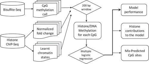
Figure 2. Relationships among DNA methylation and histone modifications in the integrated dataset. (a). Distribution of DNA methylation values in the integrated dataset. (b). Distribution of H3K4me3 normalized log fold change values in the integrated matrix. (c). Genome-wide Pearson correlations between the five histone modifications and DNA methylation values. (d). Boxplot of DNA methylation values in each learnt chromatin states (y axis). The dots within boxplots represent the medium methylation values.
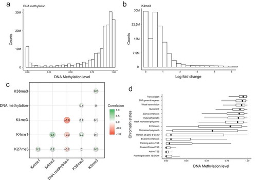
Figure 3. Evaluations of model performance. (a). Model performance based on different combinations of histone modifications as input variables. The x-axis represents the model performance evaluated by RMcFadden. (b). Scatterplot of observed DNA methylation and predicted DNA methylation values. The colour represents density counts of the dots. (c). An example genomic region of the predicated DNA methylation, observed DNA methylation and its corresponding histone modification signal. (d). Model performance in each 35 cell types. The y-axis represents the names of the cell types. The legend represents the corresponding tissue for each cell type.
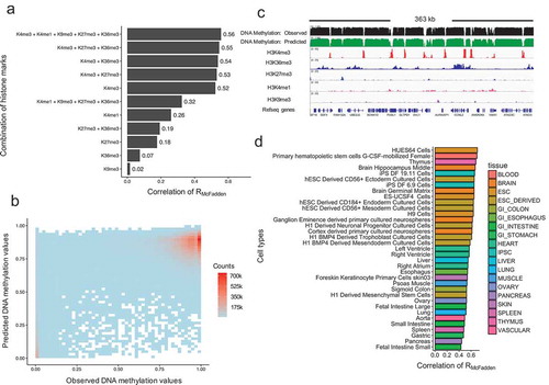
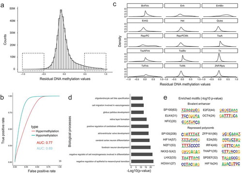
Figure 4. Characteristics of residual DNA methylation values. (a). Distribution of residual DNA methylation values (Predicted minus observed). The two squares represent the regions where residual values have variations larger than 0.5. (b). Receive operation curve (ROC) analysis of the power for the model in predicting hypo- and hypermethylated CpG sites. (c). Density plot of residual DNA methylation values in each chromatin states. (d). Gene ontology enrichment analysis for mis-predicted (high in predictions) CpG sites for repressed polycomb chromatin state regions. (e). DNA motif enrichment analysis for mis-predicted (high in predictions) CpG sites for bivalent enhancers and repressed polycomb chromatin state regions.