
Figures & data
Table 1. The cancer information.
Figure 1. The distribution of differential methylation. a. The distribution of differential CpG sites and genes. The line plot represented the number of differential CpG sites. The bar plot represented the number of genes whose promoter regions had differential CpG sites. b. The coverage of CpG sites and genes in 16 cancers. The y axis represented the number of differential CpG sites and related genes. The x axis represented the number of cancers sharing the differential CpG sites and related genes. c. The distribution of differential CpG sites in transcriptional regions. d. The distribution of differential CpG sites in island regions. e. The methylation level of differential CpG sites in different transcriptional regions. f. The methylation level of differential CpG sites in different island regions. The red and blue represented tumor and normal samples respectively.
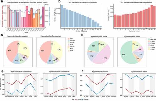
Figure 2. The analysis of methylation-related genes. a. The number of methylation-related genes through the multiple linear regression analysis. The UP and DOWN meant hypermethylation and hypomethylation compared with normal samples. b. The distribution of cancer-related functions in different cancers. c. The coverage of functions in different cancers. The red name meant strong association with cancer development. The circle meant the NES score was less than zero and the function was regulated by hypomethylation. The triangle meant the NES score was greater than zero and the function was regulated by hypermethylation. The color represented the scale of NES score. The node size represented the significance of p value.
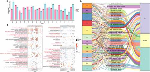
Figure 3. The analysis of top genes in functional enrichment. a. The distribution of genes in functional enrichment of different cancers with NES>0. The large bar plot represented the number of genes in functional enrichment with NES>0, and the small bar plot represented the number of functions in different cancers. b. The distribution of genes in functional enrichment of different cancers with NES<0. The large bar plot represented the number of genes in functional enrichment with NES<0, and the small bar plot represented the number of functions in different cancers. c. The methylation level of top genes in functional enrichment. The dot plot represented the average methylation level of tumor and normal samples in different cancers. The red node and green node represented tumor and normal sample, respectively. The bar plot in the bottom represented the number of cancers where the gene was differential. The orange and blue represented hypermethylation and hypomethylation, respectively. The bar plot in the right side represented the percentage of differentially methylated CpG sites in promoter region.
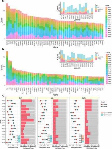
Figure 4. The immune infiltration regulated by hypomethylation. a. The GSEA result of immune infiltration. The y axis represented the NES score of GSEA result. The x axis represented the rank of infiltration-related marker genes. b. The NES result of immune infiltration. The left part represented the NES score of each significant immune infiltration result in different cancers. The right part represented the percentage of differentially methylated marker genes for each significant immune infiltration result in different cancers.
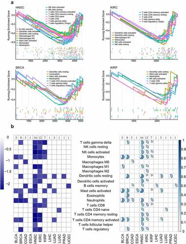
Figure 5. The characterization of KIRC subtypes. a. The heatmap of the matrix of co-occurrence proportions for KIRC. b. The methylation levels of different subtypes. c. The p value of two-sides Wilcoxon’s rank-sum test for TMB and immune scores between each two subtypes. The line represented p=0.05. d. The cumulative distribution of TMB and immune scores for patients of different subtypes. The y axis represented the cumulative percentage of score. The x axis represented the immune score and TMB.
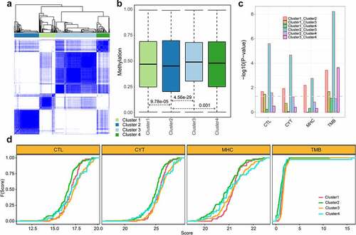
Figure 6. The functional enrichment analysis of exhausted marker genes. a. The result of biological process (BP). b. The result of KEGG pathway. The pie plot represented how many cancer types each function covered. The dot plot represented the detailed coverage information between cancer types and functions. The node size represented the significance of p value. The node color represented the number of marker genes enriched in the function.
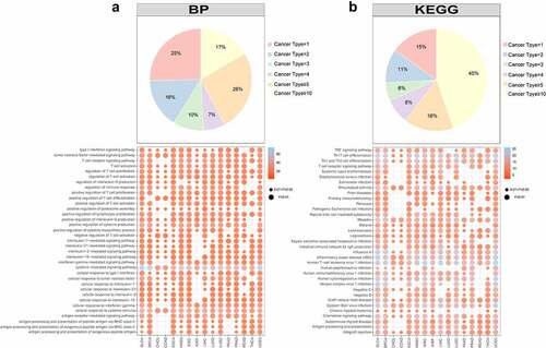
Figure 7. The PPI network of exhausted marker genes. a. The PPI network of exhausted marker genes. Yellow, blue, green and pink represented cytokine, transcription factor, inhibitory receptor and common seed factor, respectively. Grey represented the genes interacted with seed genes. b. The distribution of node degree. c. The characteristics of hub genes in PPI network. The top bar plot represented the degree distribution of hub genes, the bottom bar plot represented the count of cancers covered by differentially methylated genes. d. The regulation tendency of differentially methylated genes in different cancers.
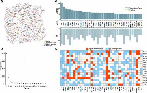
Figure 8. The survival analysis of kidney cancer. a. The volcano plot of differentially methylated sites in KIRC. The blue represented the significant CpG sites. b. The correlation among significantly differential sites. c. The survival curve of KIRC. The red and blue represented the high-risk group and low-risk group, respectively. d. The comparation of methylation levels between high-risk group and low-risk group for KIRC. E. The survival curve of KIRP. F. The comparation of methylation levels between high-risk group and low-risk group for KIRP.
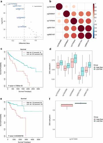
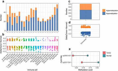
Figure 9. The differential analysis of cross validation dataset for kidney cancer. a. The number of differentially methylated sites for marker genes of immune cell in cross validation dataset. The orange and blue represented hypermethylation and hypomethylation, respectively. b. The delta value of differentially methylated sites for marker genes of immune cell in cross validation dataset. c. The number of differentially methylated sites for marker genes of T cell exhaustion in cross validation dataset. The orange and blue represented hypermethylation and hypomethylation respectively. d. The delta value of differentially methylated sites for marker genes of T cell exhaustion in cross validation dataset. e. The methylation level of differentially methylated sites for FYN between tumor and normal samples in cross validation dataset.
Supplemental Material
Download Zip (1.4 MB)Data availability statement
The data are available from TCGA database (https://portal.gdc.cancer.gov/).