
Figures & data
Figure 1. Overview of the patterns of DNA methylation across the genome in normal tissues. a) the Central Dogma of DNA methylation: CpG island regions in the promoters of genes classically acquire methylation (solid circles) in tumours, even while DNA methylation is lost (open circles) in CpG open seas. Density plots showing the distribution of thresholds across multiple genomic regions in the normal tissues at the b) lower and c) upper thresholds. Density plots showing the distribution of thresholds at the position to the nearest gene at the d) lower and e) upper thresholds.
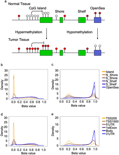
Figure 2. Box plots show the proportion of outliers contributed by sample in the a) TCGA dataset and b) GEO dataset. c) Scatterplot shows the average proportion of outliers contributed by specific normal tissue types from GEO (x-axis) and TCGA (y-axis).
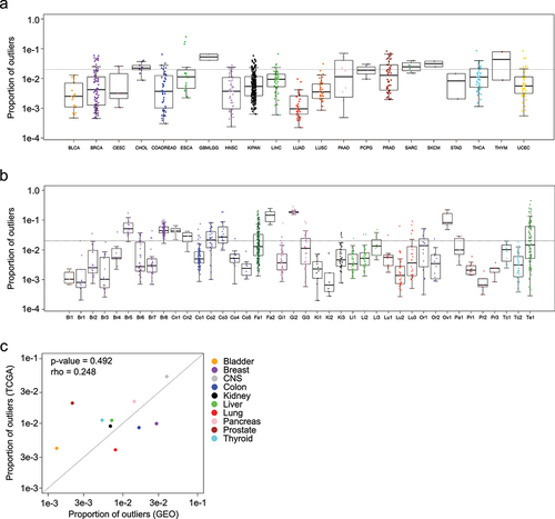
Figure 3. Characterizing outliers in blood and tumour tissues. a) The proportion of outliers detected in whole blood samples are shown in blue, in contrast to normal refernce tissues, shown in black. Horizontal dotted line is drawn at the selected threshold value of 0.02. b) Density plot showing the proportion of blood samples positive for the full set of outliers. c) Each line shows the proportion of outliers contributed by each sample in multiple tumour types and the normal tissues. Samples are arranged in increasing order, horizontal dotted line is drawn at the selected threshold value of 0.02. d) Table enumerates the proportion of samples in c) with more than 2% (at the dotted line), 3%, and 5% of probes exhibiting outliers.
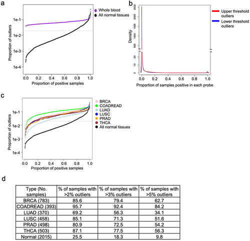
Figure 4. Distinguishing between pan-tumour and pan-normal using flagged outliers and continuous DNA methylation data. a) Receiver Operating Characteristic (ROC) analysis distinguishing pan-tumour from pan-normal tissues with three panels of markers: continuous data, flagged outlier data, and probes selected from continuous data and subsequently flagged for outliers. Heatmap shows the performance of the pan-tumour panels from the b) continuous data c) flagged outlier data, and d) continuous markers that were flagged for outliers after selection.
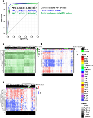
Figure 5. Principal component analysis (PCA) plots show the ability to cluster lung tumours and normal lung tissues with unsupervised a) continuous data and b) flagged outlier data, as well as kidney tumours and normal kidney tissues with unsupervised c) continuous data and d) flagged outlier data.
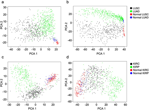
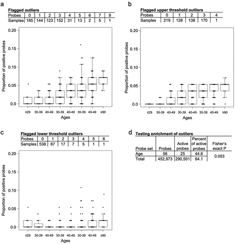
Figure 6. Box plots show the proportion of probes with altered DNA methylation across the different age groups separated by a) the total proportion of flagged outliers, b) the proportion of flagged outliers that cross the upper thresholds and c) the proportion of flagged outliers that cross the lower thresholds. d) the number and percent of active probes calculated for the age probes and non-age probes.
Supplemental Material
Download Zip (9.2 MB)Data availability statement
Data from TCGA were downloaded from the website Firebrowse.org (Supplementary Table S1) shows GSE study IDs of all data downloaded from the GEO omnibus.