
Figures & data
Figure 1. Overview of experimental design and nutrient levels in the feeding trial with growth performance. (a) a schematic diagram depicting different stages, pallet sizes, diets, and sampling points throughout the trial. (b) diagram showing targeted nutrients (blue) along with SAM and SAH (green) in the 1C metabolism that includes folate and methionine cycles. (c) barplots showing levels of four 1C nutrients (B6, folate, B12, and methionine) analysed for both 3 mm and 4 mm pellets for three diet groups (ctrl, 1C+, and 1C++). (d) line plot showing the growth rates in body weights (g) for three diet groups along with p-values calculated by ANOVA.
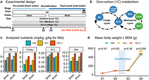
Figure 2. Clustering analysis of gene expression differences among three diets. (a) a PCA plot displaying the clusters of three diet groups - ctrl (blue, semi-transparent), 1C+ (yellow, semi-transparent), and 1C++ (red, semi-transparent) – using 27 RNA-seq samples including nine samples from each group. Top 1000 high variance genes were used as input data. (b) a dot plot showing the DBSCAN result in a PCA format with two identified clusters, DEG C1 (blue) and DEG C2 (red), on the pooled set of DEGs generated from three pair-wise comparisons (1C+ vs ctrl, 1C++ vs ctrl, 1C++ vs 1C+). (c) line plots showing normalized read counts as expression levels for three diet groups with the total averages for DEG C1 (blue) and DEG C2 (red) clusters.
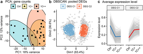
Table 1. Enriched KEGG pathways by ORA and GSEA.
Table 2. List of DEGs with a stringent LFC threshold (|LFC| > 2).
Figure 3. Global and regional DNA methylation landscapes along with SAM/SAH ratio. (a) box plots showing SAM and SAH levels (nmol/g) with SAM/SAH ratio for three diet groups. P-values are calculated by ANOVA, and red stars on the top indicate statistical significance from the base mean by t-test. Dotted horizontal lines indicate base means. (b) a t-SNE plot displaying the clusters of three diet groups - ctrl (blue, semi-transparent), 1C+ (yellow, semi-transparent), and 1C++ (red, semi-transparent) – using 27 RRBS samples. (c) a ridge density plot showing average methylation rates of 157,201 CpG sites for three diet groups. (d) a schematic diagram showing the definition of three different genomic regions – gene body (GB, green), promoter (P, blue), and flanking regions (flank, red) along with intergenic regions (IGRs). (e) ridge density plots showing average methylation rates for three diet groups in four different genetic regions. (f) a running average line plot showing average DNA methylation rates of all RRBS samples within 5000 bp up- and down-stream around TSSs. The running average lines were calculated separately for five different genetic regions – RS (red), P (dark yellow and green), and GB (blue and pink).
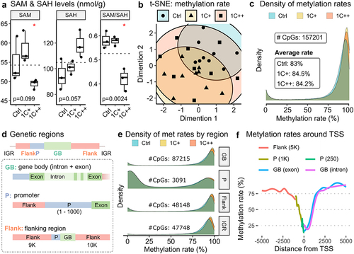
Figure 4. Distributions and counts of DMCs identified by three pair-wise comparisons. (a) violin plots showing distributions and counts of non-DMCs, hypo DMCs, and hyper DMRs in four different genomic regions for three comparisons. The x-axis represents the percentage differences of methylation rates. (b) stacked barplots showing the number of DMCs per gene, 1 DMC (red), 2 DMCs (green), and greater than or equal to 3 DMCs (blue), in three different genomic regions for three comparisons. The x-axis represents the proportions of DMC counts in percentage.
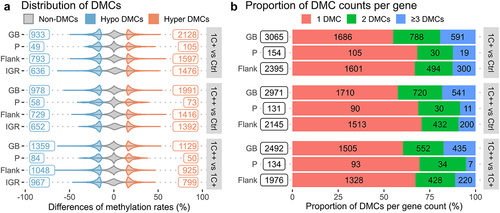
Table 3. List of top three DMCs identified by three different comparisons.
Figure 5. DNA methylation landscapes in five gene expression groups and six different genomic regions. (a) a density plot showing the distribution of gene expression calculated from normalized read counts from RNA-seq samples. Red vertical lines represent threshold values to define five different gene groups. (b) a barplot showing the count of genes in the five gene expression groups - none, very low, low, med, and high – defined by different gene expression levels. The ‘none’ group contains genes without any expression. (c) ridge density plots displaying distributions of methylation rates for five different gene groups in six genetic regions.
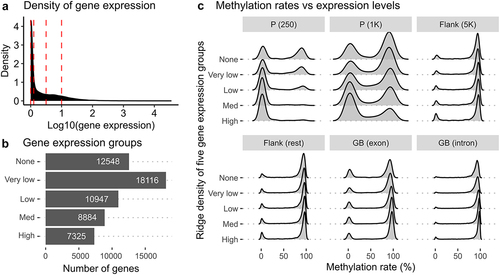
Table 4. List of genes that have DMRs around their TSSs.
supp.docx
Download MS Word (347.5 KB)Data availability statement
Raw read data for both RNA-seq samples (PRJNA680426) and RRBS samples (PRJNA642024) have been uploaded to the Sequence Read Archive (SRA) on the NCBI website. To ensure easy access to these resources, we have prepared seven data files in a tabular format, which have been uploaded to a public data repository (https://figshare.com/s/9ab1ed68cfa1debe29d4). Additionally, basic descriptions of the data and columns can be found in Supplementary Tables S16-S22.