Figures & data
Fig. 1. Hydrostatic Carnot heat engine. (a) Carnot cycle with typical atmospheric parameters: hPa,
K (isotherm AB),
K (isotherm CD),
hPa. Work output at the warmer (colder) isotherm is equal to heat input (output). BC and DA are adiabats. (b, c) The same cycle in spatial coordinates
,
in (b) horizontally isothermal atmosphere (
K) and (c) in the presence of a horizontal temperature difference (
K). (d) Differences in pressure at height
for atmospheric columns above points
and
, where pressure and temperature follow eqs. (9) and (8) with surface pressure and temperature at points
and
equal to
hPa,
K and
,
; thin solid blue curve:
hPa,
K; dashed red curve:
hPa,
K; thick solid red curve:
hPa,
K.
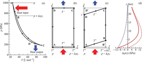
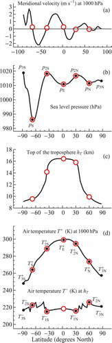
Fig. 2. Long-term mean zonally averaged meridional velocity, sea level pressure and air temperature at 1000 hPa calculated from MERRA data. Black, thick blue and pink dashed curves denote annual mean, January and July data, respectively. Black circles in (a) indicate velocity maxima;
,
and
are the Hadley cell outer and inner borders (for details see Appendix D).
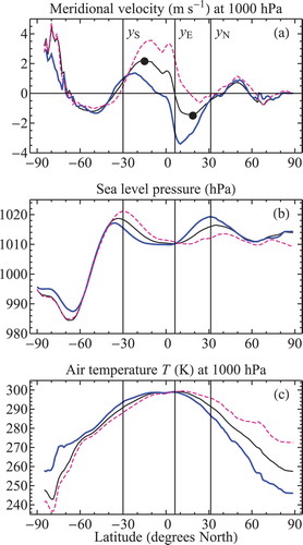
Fig. 3. Heat pumps and heat engines. (a) A Carnot heat pump (cycle EFGHE) bordering with a Carnot heat engine (cycle ABCDA). See for details. (b) The meridional circulation cells on Earth as approximated by eqs. (27) and (28). Arrows show the direction of air movement. Empty red circles indicate the latitude of cell borders as determined from meridional velocity values (see in Appendix D). Black circles show where temperature and pressure values used in eqs. (27) and (28) were calculated: for we have
,
;
,
;
,
(see b and c in Appendix D). The vertical dimension is height
, the horizontal dimension is sine latitude, which accounts for cell area.
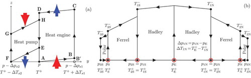
Fig. A1. Vertical profiles of the observed (solid pink) and theoretical (dashed brown) pressure differences (cf. d) between the borders of (a) Southern Hadley cell in July, (b) Northern Hadley cell in January, (c) Southern Ferrel cell in July, and (d) Northern Ferrel cell in January. During these months the cells have maximum power output (see the insets, see key below). The blue curves indicate estimated kinetic power generation: the product of the mean meridional pressure gradient within the cell by the mean meridional velocity as dependent on height
as a proxy measure. All variables are divided by their value at the surface;
is height above sea level. The small filled circles denote the theoretical pressure difference at the top of the troposphere
(mean
within the cell is shown) and the observed pressure difference at
, the height where kinetic energy generation in the upper troposphere is maximum. The data are the long-term mean NCAR/NCEP climatology (see Appendix D). The insets show the monthly variation of the theoretical kinetic energy generation for each cell (thin black lines), eqs. (27) and (28), compared with the monthly variation of the observed kinetic power output in the same cell (thick gray lines) according to the data of figures 2 and 7 of Huang and McElroy (Citation2014). The monthly values are divided by the annual mean (for kinetic energy generation the annual mean value is shown on the graph).
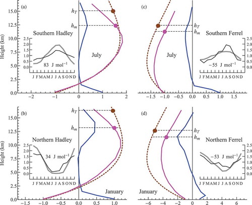
Fig. A2. Annual mean latitudinal profiles of the air temperature lapse rate on different pressure levels in the tropics. Curve 1 in (a) shows the mean lapse rate between 1000 and 925 hPa; curve 11 – between 150 and 100 hPa. Panel (b) shows the relative horizontal variation – at each pressure level the lapse rate at a given latitude is divided by the mean lapse rate at this level (averaged between 30°S and 30°N). The equator has a higher lapse rate than the 30th latitudes in the lower and upper – but not the middle – troposphere. The data are long-term mean NCAR/NCEP climatology (see Appendix D).
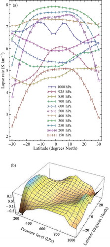
Fig. A3. Relationships between surface temperature and pressure differences and the meridional extension of the Hadley system. (a–c) Dependence of on
in (a) Northern Hadley cell, (b) Southern Hadley cell, (c) Hadley system as a whole:
,
(). (d–f) Dependence of
(d),
(e) and their ratio (f) on the total extension of the Hadley system (
) (degrees latitude). Solid lines denote linear regressions
for the terciles of
, each containing 144 values, for
(a, b),
(c) and
(d–f). Regression parameters are shown in each panel starting from the first tercile.
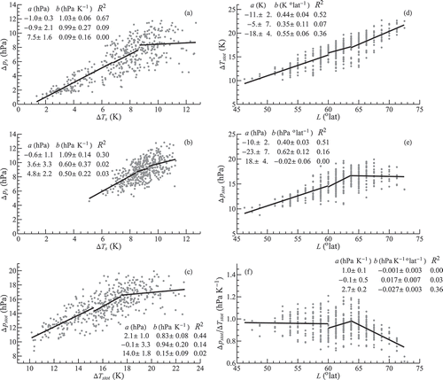
Fig. A4. Kinetic energy generation at different altitudes
in the lower atmosphere versus Hadley system size
as determined from eq. (22) using the established relationships between
and
from and .
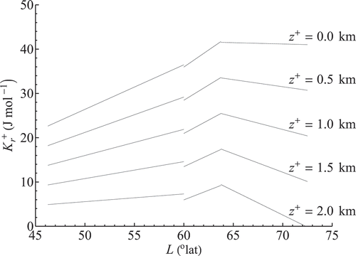
Fig. A5. Annual mean values of parameters used to calculate global kinetic energy generation. Empty red circles denote cell borders defined in (a) as the points where meridional velocity changes sign. Black circles show temperature and pressure values used in eqs. (27)–(29) (see also ).